The World’s Best Packaging: Dieline Awards 2020 Winners Revealed
By
Published
Filed under

By
Published
Filed under
Dieline Awards, now in our 10th year, is the world’s leading packaging design competition.
Presented by Adobe Dimension, and sponsored by Neenah, Designalytics, and Arconvert, Dieline Awards 2020 recognizes the absolute best and brightest designers and agencies creating product packaging throughout the world, raising awareness of the enormous value that goes into brand packaging design.
This year, we received over 1,400 entries, with recipients hailing from 21 countries. Overall, this year’s selection of winners shows a commitment to innovation, using plastic-free packaging materials, and human-centric design, all a clear marker for what lies ahead when it comes to the future of branded packaging and a preview of the world to come.
While the lion’s share of the winners in the global competition came from American designers and studios (21), the second-most hailed from Canada (7) followed by a three-way tie from Russia, China, and the UK (6).
The jury for the awards featured a who’s who from the world of design—luminaries like Debbie Millman of the Design Matters podcast, Design Army co-founder and CCO Pum Lefebure, Sean Adams of Art Center College of Design, RoAndCo founder Roanne Adams, and Chobani CCO Leland Maschmeyer—all of whom combed through submissions while locked down under quarantine. Awards were judged across five categories—creativity, marketability, innovation, execution, and on-pack branding, going through two rounds of rigorous critique and appraisal.
Through every award—all 94 of them—you’ll not only see a clear snapshot of where the packaging industry currently is, but where it’s going.
So, without further ado, here are Dieline Awards’ top winners for 2020.
This year’s overall Best in Show winner went to design and branding agency Superunion for Figlia, an Italian olive oil by Agricola Dargenio. The limited-edition olive oil was released to promote the first female CEO of the company, Emanuela Dargenio, and it comes in a handmade ceramic bottle with a wood top, a primal, back-to-basics design that gets at the core of what packaging is.
The bottles are handmade, no two are alike, and the human-centric design found inspiration in the female figure, representing a future that is unmistakably female. Speaking of the design, Superunion claimed that it was a project “celebrating family, femininity, and the uniqueness of nature.”
Figlia’s win marks the 7th year in a row that the overall Dieline Award-winner went to a sustainable project. The bottles can also get used long after they have fulfilled their original purpose as they were intentionally left unadorned, creating both a distinct work of art and a beautiful ceramic piece to display in the home.


Dieline’s Editor’s Choice Award exists because we didn’t want our judges to have all of the fun sifting through countless innovative-and sometimes genuinely beautiful-projects. But the award is also there because it gives us a clear snapshot of our times, something that captures the zeitgeist of the industry. Of course, it might not make much sense to give out an award to a project whose sole mission is to make packaging disappear, but that’s why we love it so much.
We’re huge on material innovation, and in the world of packaging, there’s no bigger story. Every brand wants to talk the talk when it comes to going plastic-free or using more recycled content in the next decade, but it will take real innovation and backbone to make those commitments a reality. Notpla has the potential to be that kind of material.
Developed by the Skipping Rocks Lab start-up, this edible and biodegradable material comes from seaweed and plants, breaks down within 4-6 weeks, and gives us a glimpse of a world free of packaging design. Superunion helped give this transformative material a new identity, one that could enthrall brands with its promise to change the world, while also highlighting how you can apply it to some of our typical, everyday encounters with packaging.
Can it replace a water bottle? Yes. Can you fill it with ketchup and serve it up alongside a burger and fries? Yup. What about scotch? Yes, even scotch too. Best of all, it completely disappears when you’ve finished.


Countless studios dazzled us this year with some of the most impressive packaging and branding products we’ve highlighted on these pages, but there was one agency that stood tall among a handful of worthy contenders.
Also, we’ve talked about them twice now just on this feature.
This is the year of Superunion. With four Dieline wins this year, including Editor’s Choice and the coveted Best in Show, who else could it really be? With 750 designers in 23 offices spread across 18 countries, they’re a veritable design powerhouse-turned-Voltron. Not only have they shown us the power of human-centered design with Figlia, but they’ve provided brands with a realistic substitute for a plastic-free future.
We can’t wait to see what they do next year.


For this year’s Rebrand of the Year, one project stood out among the rest because they answered a relatively simple question—can you make a box in the shape of a watering can?
Reimagined by the UK’s Together Design, Haws wanted to reposition themselves in the home and gardening segment with a grand redesign that would create an iconic shape for retail and attract younger consumers interested in horticulture.
Well, the world’s oldest watering can manufacturer got more than they bargained for, and they revitalized their entire visual identity. The illustrations on the packaging resemble patent images, and they utilize a bold type for a striking wordmark. Additionally, Haws now uses 20% less packaging than they did before. The boxes are 100% recyclable, and because of the shape of the packaging, it’s easier to store and ship while also reducing the cost of shipping.


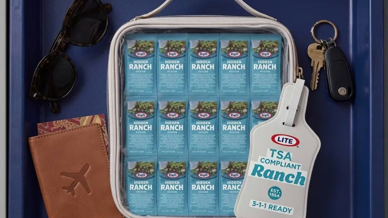
Every year, we use 855 billion plastic packets. You know, the ones filled with ketchup, mustard, or soy sauce, or even the sample-size beauty products filled with shampoo or lotion? They almost seem like an afterthought since plastic bottles and straws tend to suck all of the oxygen out of the room.
Now in our second year of honoring plastic-free innovations in packaging alongside non-profit advocacy group A Plastic Planet, we were thrilled that this year’s award went to Swedish brand consultancy Grow for Pearl, a fiber-based alternative to plastic sample packets prevalent throughout the beauty and skincare industry. The paper pods were developed along with BillerudKorsnäs and Syntegon and found inspiration in the natural shape of sea urchins. The shells for the project are both elegant and seemingly delicate, utilizing 3D properties that give consumers a tactile experience.
“The plastic packet sachet has always been considered too hard to replace, which is why Pearl is our winner,” said Sian Sutherland, co-founder of A Plastic Planet. “We look forward to seeing many great examples of Pearl and its sister Grow, using different bio-coatings to give it the qualities needed. Not only does this innovation give the opportunity for powders, gels, and liquids to be sold as single-dose without plastic, but the producer has elevated sustainability with a huge dose of beauty.”


The problem with most packaging is that once you’ve opened something up, you toss it in the trash—ideally, it makes its way into a recycling bin, but we digress.
Designer Meng Zhang developed the packaging for this Dubai chocolate brand, and artfully showcased chocolate making as its own mystery. What’s more, inside the chocolate bar, consumers will find 18 patterned stickers that they can apply to the outer packaging, allowing them to repurpose it later as a bookmark or a coaster and creating a more sustainable brand with multiple purposes. The gorgeous illustrations come printed on an uncoated recycled paper stock, which only further emphasizes the brand’s natural approach to chocolate making and circular means of producing packaging.


Arconvert is a global leader in the production of self-adhesive materials for the labeling industry. By combining the beautiful textures and colors of the face-stocks produced by the parent company Fedrigoni Papers to top-performing adhesives, water and greaseproof technologies, sustainable solutions and security features to overcome issues of counterfeiting, Arconvert’s products not only meet the highest aesthetic requirements but also represent the state of the art of technological innovation for high-end products labeling and brand protection.
The imaginative, three-dimensional label designed by Italian agency Spazio Di Paolo for No Man’s Space Eclipse Gin by Brand Breeder reaches out to the consumer, interacting with him and attracting his gaze from a distance.
While minimalistic, it’s simultaneously a luxury label—sustainable luxury—as Eclipse comes printed on Cotone Bianco and the brand new Cotone Nero Felt by Arconvert, both tree-free papers made of 100% pure fibers of cotton, a yearly renewable plant.
This charming label plays with the concept of physical space as a symbol of freedom and the possibility to overcome one’s own limits. Exactly as Mario Di Paolo, founder and creative director of Spazio di Paolo, always does by going beyond mere aesthetics and turning his labels into revolutionary inventions.
Eclipse is a little masterpiece, and yet it isn’t meant to dress just a few numbered bottles. This label design hides the technological innovation necessary to replicate it on an industrial level and apply it automatically on millions of bottles, which is critical considering wine and spirits’ massive volumes. Many designers around the world regularly copy Mario di Paolo’s labels, however, in most cases, the imitations remain feasible just for limited productions, for if it is easy to copy the graphic design, it is not so easy to understand the engineering process behind the design and reapply it on an industrial level. A challenging project like Eclipse, could not but be printed by a technologically advanced label producer like Tonutti Tecniche Grafiche based in North-East Italy, a company that usually helps Mario Di Paolo in developing his ideas and launching new trends.


The Designalytics Effectiveness Award was created to help elevate the role of package design by spotlighting the immense financial impact that it can have on consumer brands. Winner selection was entirely data-driven, based on sales performance in the marketplace, as well as rigorous quantitative consumer testing. This year’s award went to Beardwood&Co for their redesign of pet food brand Hill’s Science Diet.
Designalytics’ evaluation revealed that pet owners are twice as likely to prefer purchasing Hill’s Science Diet’s new packaging to the old—a finding confirmed by retail sales data. During the six months following the redesign, the brand grew 17.3% compared to the six months prior, representing an annualized increase of approximately $100 million.
“Subjective evaluation drives far too much of the creative process today,” said Steve Lamoureux, founder of Designalytics. “Ultimately, package design is measured not by its artistic brilliance, but by the consumer response it provokes. Based on this objective measure, the new Hill’s Science Diet packaging is, without a doubt, a truly successful redesign.”


FIRST / SRISANGDAO RICE / DESIGNED BY: PROMPT DESIGN / THAILAND / CASE STUDY


FIRST / GOTHAM GREENS / DESIGNED BY: GANDER / USA / CASE STUDY


FIRST PLACE / MOO DRINKABLE YOGURT / DESIGNED BY: MOUSEGRAPHICS / GREECE / VIEW CASE STUDY


FIRST / MANO PIZZA / DESIGNED BY: GOODS / NORWAY / CASE STUDY


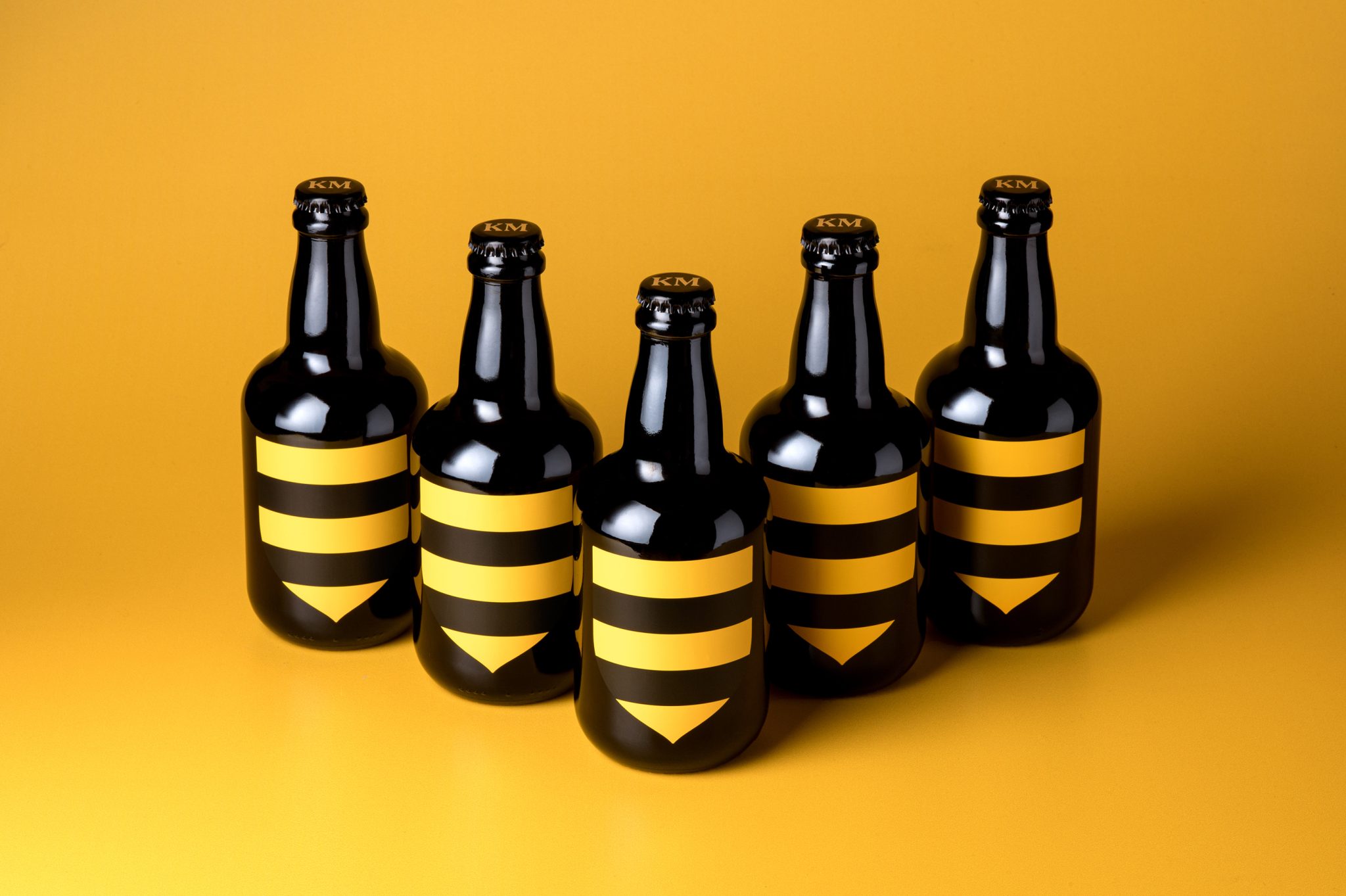
FIRST / AHELEON / DESIGNED BY: KM CREATIVE / GREECE / CASE STUDY


FIRST / COLOREAT / DESIGNED BY: BACKBONE BRANDING / ARMENIA / CASE STUDY


FIRST / GOGO QUINOA PUFFS / DESIGNED BY: PIGEON BRANDS INC. / QUEBEC / CASE STUDY


FIRST / 4Life MINERAL WATER / DESIGNED BY: PROMPT DESIGN / THAILAND / CASE STUDY


FIRST / DRINKFINITY / DESIGNED BY: PEPSICO DESIGN & INNOVATION / USA / CASE STUDY


FIRST / MOUNTAIN TEA – SONG / DESIGNED BY: LIN SHAOBIN DESIGN / CHINA / CASE STUDY


FIRST / ROTULO DO VELHACO (“OLD ROGUE LABEL”) / DESIGNED BY: STUDIO BAH / BRAZIL / CASE STUDY


FIRST / TREAD SOFTLY / DESIGNED BY: DENOMINATION / AUSTRALIA / CASE STUDY


FIRST / ÆCORN APERITIFS / DESIGNED BY: PEARLFISHER / USA / CASE STUDY


?FIRST / SOURCE ONE / DESIGNED BY: AETHER NY / USA / CASE STUDY


FIRST / WuDu / DESIGNED BY: SHENZHEN LINGYUN CREATIVE PACKAGING DESIGN CO. LTD. / CHINA / CASE STUDY


FIRST / MEDMEN [STATEMADE] / DESIGNED BY: MATTE / USA / CASE STUDY


FIRST / HI BAR / DESIGNED BY: WERNER DESIGN WERKS / USA / CASE STUDY


FIRST / WHO GIVES A CRAP PLAY EDITION / DESIGNED BY: GARBETT / AUSTRALIA / CASE STUDY


FIRST / VYVYD STUDIO / DESIGNED BY: ESTABLISHED / USA / CASE STUDY


FIRST / BRITE / DESIGNED BY: DEPOT BRANDING AGENCY / RUSSIA FEDERATION / CASE STUDY


FIRST / ADIDAS ‘THE PACK’ / DESIGNED BY: HOVERS OVER WATER / USA / CASE STUDY


FIRST / gita ROBOT PACKAGING SYSTEM / DESIGNED BY: PIAGGIO FAST FORWARD / USA / CASE STUDY


FIRST / A SWEET NEW SUITE OF PACK DESIGN FOR AUSTRALIAN SUPERMARKET COLES / DESIGNED BY: HULSBOSCH / AUSTRALIA / CASE STUDY


FIRST / CINCO JOTAS ACORN-FED 100% IBÉRICO HAM / DESIGNED BY: MORILLAS / SPAIN / CASE STUDY


FIRST / LICOR 43 MADE OF SPAIN 2019 LIMITED EDITION / DESIGNED BY: BATLLEGROUP / SPAIN / CASE STUDY


PLASTIC-FREE INNOVATION AWARD / THE PUCK / DESIGNED BY: PACKED, LLC / USA / CASE STUDY


PLASTIC-FREE INNOVATION AWARD / HELLO PRODUCTS TOOTHPASTE TABLETS / DESIGNED BY: HELLO PRODUCTS / USA / CASE STUDY


FIRST / FAUST OLIVE OIL / DESIGNED BY: VOLTA BRAND SHAPING STUDIO / PORTUGAL / CASE STUDY


FIRST / HOTEL TANGO DISTILLERY PACKAGING / DESIGNED BY: YOUNG & LARAMORE / USA / CASE STUDY


FIRST / LIL’LAMB BABY DETERGENT PACKAGING CONCEPT / DESIGNED BY: KATE ZAKHAROVA / RUSSIAN FEDERATION / CASE STUDY