PROCRASTINATORS REJOICE: Dieline Awards 2023 Extended to March 17th – REGISTER NOW
Featured image for Designed To Attract A Young Consumer, GoGo Quinoa - Puffs Is Bold, Healthy And Fun

Designed To Attract A Young Consumer, GoGo Quinoa - Puffs Is Bold, Healthy And Fun

by Jessica Deseo on 02/01/2020 | 3 Minute Read

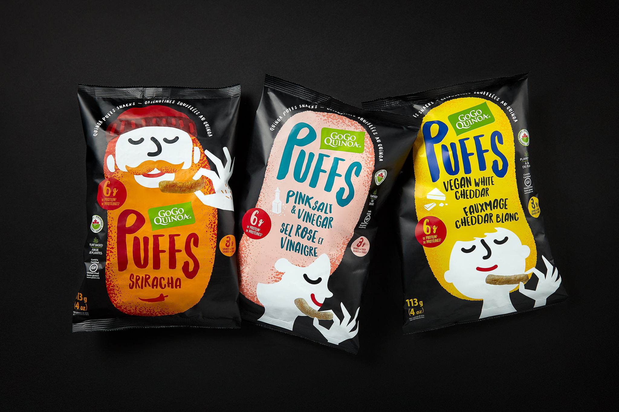
For the first time in Canada, they wanted to enter the organic and natural salty snack category with quinoa puffs snacks, a healthy option that answers to the latest consumer trends in terms of nutrition and sustainable economy. As the opportunity is especially strong with Millennials and especially Gen Z consumers, the design needs to be attractive to this target.

Editorial photograph

The relationships Gen Z have with brands are much more personal than older generations because they see brands as an outward representation of themselves. The connection they feel is an emotional one (source Mintel Canada, Sept 2019) We had a good product and a credible brand. We therefore had an opportunity to convey a good story and bring meaningfulness, differentiation and emotion to natural food aisle/categories. We wanted the design to evoke «the goodness inside» with a modern, optimistic and uplifting approach. We undeniably wanted to offer a fun, inventive and inspiring product experience for this nourishing snack that goes beyond the functional attributes we know about healthier products. We left behind traditional functional packaging design cues to inject some humanity and dynamism to the design.

Editorial photograph

This trio of flavors is illustrated by characters as colorful as the flavors they represent. Whether it’s the high hair or long beard, this imagery is rooted in the shape of the product itself. The way to show the product is different and really pops out as characters actually hold a quinoa puff in their hands. The bold colors of the characters on the black background create a very strong shelf impact. In addition, it brings a good dose of dynamism and ease product recognition. It also brings taste appeal in a different manner. It’s a snack after all!

Editorial photograph

We also wanted to communicate the superior product benefits which are organically displayed on the front and back of packaging to allow ease of reading. The design of the back panel was also important to visually communicate the storytelling of the product and the brand. We created a link with the principal imagery where a romance invites the consumer to learn more about the benefits of quinoa. The illustration is fun and portrays a handmade look & feel. Again, the organic typography echoes to the natural aspect of the product. We also wanted to drive taste appeal and capture the texture of the product with the beautiful photos showing on all sections of the back panel.

Editorial photograph

The packaging platform creates rupture in the category in order to differentiate itself and be memorable.

The shipper case was also created to maximize the impact in-store once they are displayed. We developed a unique design that uses a "billboard effect" approach, which creates a continuity of brand imagery from one box to the other, and from one side to the other. A dotted path, reminiscent of the back of the packaging, is traced to continue in all directions.

Editorial photograph

The PUFFS product descriptor is prominent and dominant on the package to easily understand the type of snack. The flavour is at the second level of reading to facilitate the identification and navigation of a product to another. We also added easily decodable iconography to support navigation and taste appeal: a piece of cheese, a sriracha pepper, a bottle of vinegar and grains of salt. Handwritten typography, used for the sub-brand name and description, communicates the naturalness of the product and accentuates healthier brand perception.

Editorial photograph

You may also like