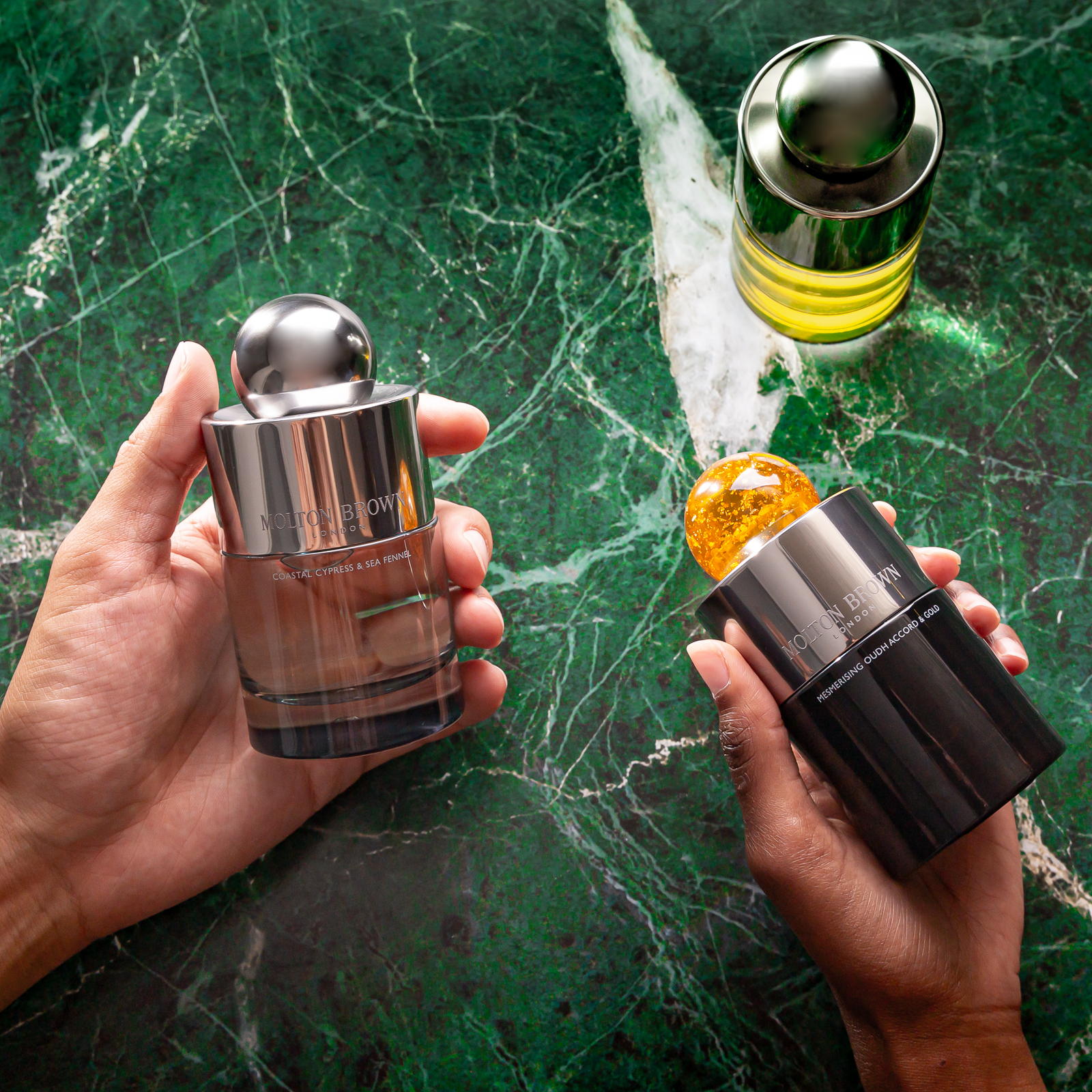
Molton Brown Fine Fragrance Collection

Published

THE PROBLEM:

The Molton Brown finne fragrance category was not performing to expectations. The scents were created by master perfumers, using ingredients of the highest quality. But the perfumes just weren’t selling.

The reason was packaging:

Editorial photograph

1. It didn’t stand out from the rest of the brand’s vast offering, with the bottle silhouette borrowed from the brand’s range of body and bath products.

2. The perceived value was low, with an overall lack of detailing, jarring colours and a total absence of textures.

3. It had been copied by large diffusion brands, at much lower price points, to the detriment of the original Molton Brown design.

THE BRIEF:

Together with the brand, we established three clear objectives:

1. To reclaim a luxury positioning for the brand’s fine fragrance category.

2. To establish credibility in the fine fragrance market.

3. To tell the brand’s story: born in London in the 1970’s, with a progressive outlook characteristic of the period.

Editorial photograph

MY DESIGN:

1. First I had to address the silhouette.

But more importantly it is an expression of individuality, a concept key to the brand’s approach to scent.

But although the shape is radically different, it borrows from the brand’s design language.

B. Tactility:

2. I re-interpreted the Lens, one of the brand’s key assets.

By turning it into a bold spherical cap, the Lens became the main feature of the bottle.

For the Eaux de Parfum, each scent has its own cap colour. This helps with range navigation.

The production process means each cap displays unique patterns, so no two bottles are the same.

The concave mirrored surface to the top of the bottle creates distorted reflections reminiscent of the psychedelic imagery of the 1970’s: a reference to the brand’s origins and an expression of perfume’s unique ability to alter perceptions and create our own reality.

3. I achieved a heightened level of luxury, using three main strategies:

I created a form that stands out amongst the brand’s vast range of products. That instils a clear hierarchy between all the product categories.

Editorial photograph

A. Weight:

The glass base is thick, with the shoulders covered in a metal sheath. So the bottle feels heavier than expected.

By using raised inks (on the glass), laser-etched motifs (on the spray collar), embossed hot-foiled branding and debossed repeat pattern textures (on the pack).

C. Sophisticated use of colour:

One colour for all Eaux de Parfum (core brown), and another for all Eaux de Toilette (Stone). That’s it.

A departure from the garish rainbow previously used by the brand. Instead, a true sense of a collection of luxury perfumes. It’s the brand that comes first.

4. I made it refillable:

Molton Brown stores are able to refill these bottles, which provides many benefits:

A. Better for the environment, as each bottle can be used several times.

B. Better for footfall, as customers come back to the store for refilling. Hello, cross-selling and up-selling.

C. Better for loyalty, as customers are less likely to switch fragrance.

Editorial photograph

5. I designed to support the commercials:

A. The aluminium cap, rather than unique resin.

B. The glass lacquering to the base only, rather than all-over.

C. The folding board box, rather than the two-part rigid board presentation pack.

It is contemporary, yet looks like it could have come straight out of the 1970’s.

Eau de Parfum vs Eau de Toilette. Two versions of the same bottle.The silhouette is preserved, so they belong firmly in the same family. But subtle differences in treatment for the Eau De Toilette allow for efficiencies, and margin optimisations:

Editorial photograph

6. The Outer pack:

So it stands out, but it still belongs.

All of which makes it ok for the one to retail at a lower price than the other.

Editorial photograph

7. A collaborative process.

Crucially, I was also involved throughout the entire development process, creating a bridge between the Marketing and the Production functions. Enabling true collaboration. Because it’s not what I design. It’s what we make. I love working this way, because I truly believe the development process is a creative one. Key to the viability of the end result. And that’s why I like to get hands-on. Go to the factory. Talk to the machine operator. Check the production line.

I created two proprietary colours (Brown and Stone), and worked with the paper mill in the UK to develop two bespoke papers. The addition of embossed logos and debossed all-over patterns create texture and tactility, which consumers associate with quality. The colour is dictated by the category (Brown=EDP and Stone=EDT) rather than by SKU (as was the case in the past, creating a confusing and garish rainbow display at point of sale).

Instead, I unified this for a luxury collection aspect, which puts the brand first. The Molton Brown fine fragrance category was not performing to expectations. The scents were created by master perfumers, using ingredients of the highest quality. But the perfumes just weren’t selling. The client knew what they needed to achieve. They did their homework in ensuring this was clearly communicated, then trusted me to deliver. Embraced the creative process.

Editorial photograph

Editorial photograph

Editorial photograph

This placeholder is removed when the ad slot is configured.

This placeholder is removed when the ad slot is configured.

This placeholder is removed when the ad slot is configured.

This placeholder is removed when the ad slot is configured.

This placeholder is removed when the ad slot is configured.

This placeholder is removed when the ad slot is configured.