Treblasé Is Bringing Italian Design History Back to the Bar
By
Published
Filed under
By
Published
Filed under
Right now, there is a genuinely exciting counter-movement happening in Italian aperitivo culture, where a new generation of brands is turning away from the spritz-ification of everything and reaching back into regional history to find something with actual roots.
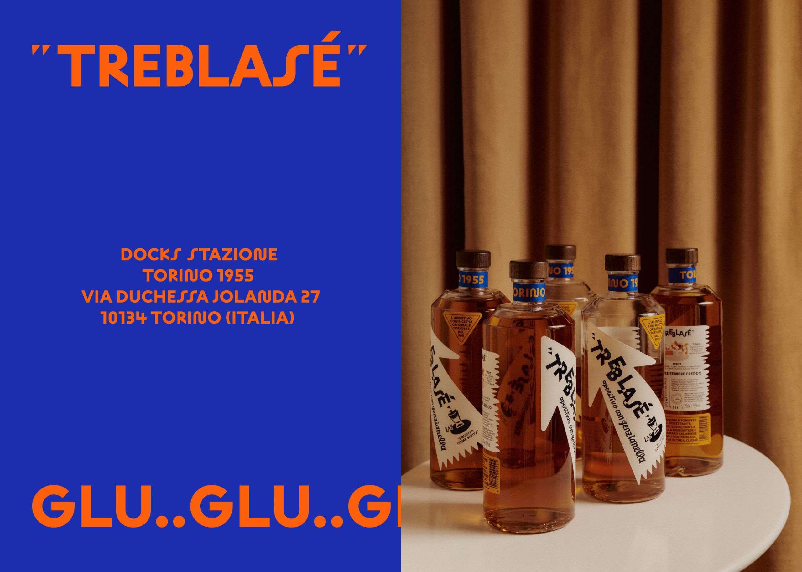
Oslo-based studio OlssønBarbieri designed the identity for this Turin aperitivo, Treblasé, drawing directly from Italian Futurism, specifically the graphic language of Fortunato Depero, whose 1926 Campari poster famously blurred the line between advertising and art, and which somehow also looks completely current.
Treblasé is different from the wave of craft aperitivo bottles crowding the shelf right now because it earns its historical references through specificity. Every typographic choice, color, and even the onomatopoeic phrases like bla-bla and glu-glu pulled from the Futurist literary tradition of Parole in Libertà, build a design system that is unmistakably Torinese while feeling like something you have never quite seen before.

Treblasé builds on a family legacy rooted in Turin’s aperitivo culture, where togetherness, craft, and accessibility have long gone hand in hand. In 1930, Simonetta Bosso’s grandparents moved to Turin and opened Trattoria Bottiglieria Bosso. Through warm hospitality and fair prices, the trattoria quickly flourished, enabling the family to acquire La Ditta Foglia, a liqueur distillery located at the Docks of Porta Nuova. Nearly a century later, Simonetta approached us with a clear ambition: to rediscover and reinterpret her family’s heritage for a contemporary audience. The task was to relaunch the family’s Genzianella recipe as a modern aperitif—one that honours its origins while deliberately moving away from the ornate, 19th-century visual language traditionally associated with classic Turin vermouths.

In 1926, Fortunato Depero famously submitted an advertising poster for Campari Squisito al Seltz to the Venice Biennale, elevating advertising to art. The image depicted a group of avventori—people frequenting a bar—almost a replica of a family photograph from Famiglia Bosso Trattoria. Our goal was to borrow from the Futurist vernacular to create a visual language rooted in the history of aperitivo, reinterpreted through a contemporary lens. Typographically, black-and-white contrasts, overlapping all-caps bold type, and dynamic composition evoke a playful and energetic tone. The arrow—unmistakably Depero—symbolizes direction and intention. Onomatopoeia, inspired by Parole in Libertà, echoes literary and visual Futurism, offering an approachable, playful voice through expressions such as bla-bla and glu-glu. The colour palette is inspired by Genzianella, a deep-blue alpine wildflower rooted in Piedmontese culinary and drinking traditions. A crucial ingredient in Vermouth of Torino, it adds characteristic bitterness and an orange note to the liquid. The back label suggests three ways to enjoy the aperitif. The bottle is lightweight, with a single-material cork and threads carved directly into the wood rather than a plastic insert. Treblase positions itself at the intersection of heritage and reinvention, speaking to a contemporary aperitivo culture while remaining unmistakably Torinese in spirit.

Treblasé takes the aperitivo in a new direction. In recent years, the spritz has achieved international success, becoming a symbol of conviviality and relaxed elegance associated with the Italian way of life. In Italy, however, this phenomenon has sparked a counter-movement: new Italian brands are looking inward, rediscovering historical roots, forgotten recipes, and locally sourced ingredients. This wave reflects a desire to reclaim depth and identity within aperitivo culture, transforming standardised formulas into a richer landscape of regional expression. Within this context, Turin holds a particularly significant role. As one of the cities where the aperitivo ritual was born, Turin represents the cultural foundation of Italian aperitivo culture. Its heritage is shaped by botanical expertise, alpine and Piedmontese ingredients, and a long tradition of café society, where taste and conversation naturally intersect.

This intersection of design history and drink culture explains why the visual language of aperitivo often nods to Futurism, and specifically Fortunato Depero, whose work captures the energy and optimism of aperitivo culture. Too often, however, these references are used superficially, without true cultural connection or interpretation. Rooted in history yet designed for contemporary consumption, Treblase reinterprets the aperitivo through the lens of place—celebrating Turin’s legacy while contributing to the evolving language of modern Italian aperitivo.
The arrow belongs to Futurism and to the symbolism of Fortunato Depero. The typographic effects, both positive and negative, also belong to the Futurist language. A new product born in Turin emerges as a conscious response to this moment: a bridge between global recognition and local authenticity. Rooted in history yet designed for contemporary consumption, it reinterprets the aperitivo through the lens of place—celebrating Turin’s legacy while contributing to the evolving language of modern Italian aperitivo.