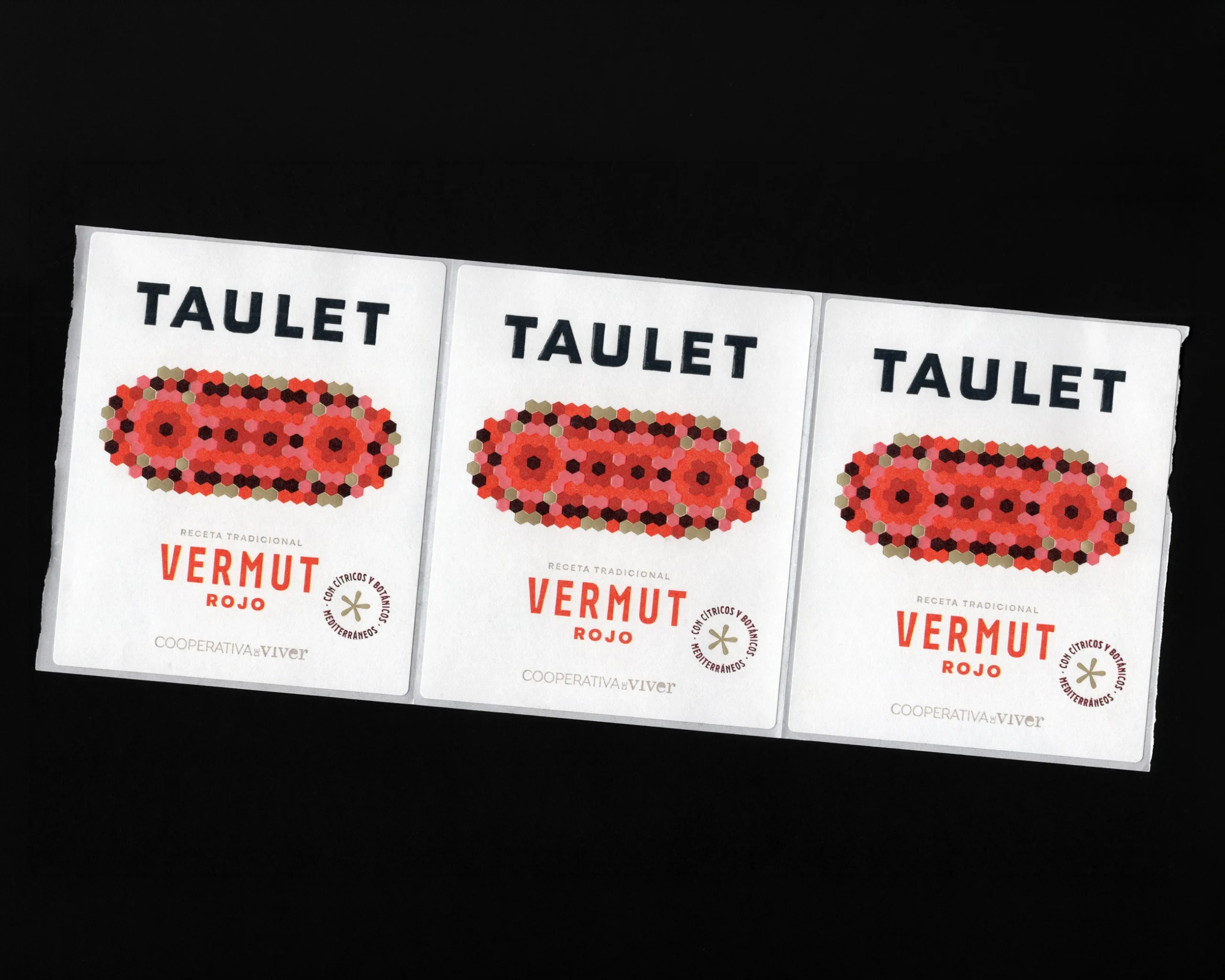
Taulet, designed by Dailos Pérez Studio, takes maximalist energy and roots it straight in Mediterranean floor tile tradition. The centerpiece illustration is a cluster of hexagonal shapes in terracotta, blush pink, deep plum, and gold, arranged into a symmetrical medallion that mirrors the tiles found in early 20th-century Mediterranean homes, though with all that glowing color packed into tiny geometric segments, it honestly reminds me a little of Perler beads.
But the nod to Modernist tile work carries the most weight here, tying the bottle back to the patterned floors of old cafes and family kitchens where the gatherings actually happen. The straightforward black serif logotype on the front label keeps things grounded and confident, while the back label flips into a deep maroon with fine linework details that feel almost like an engraved dinner menu. It is a smart way to bring cultural specificity into a category that often leans on vintage clichés.


















