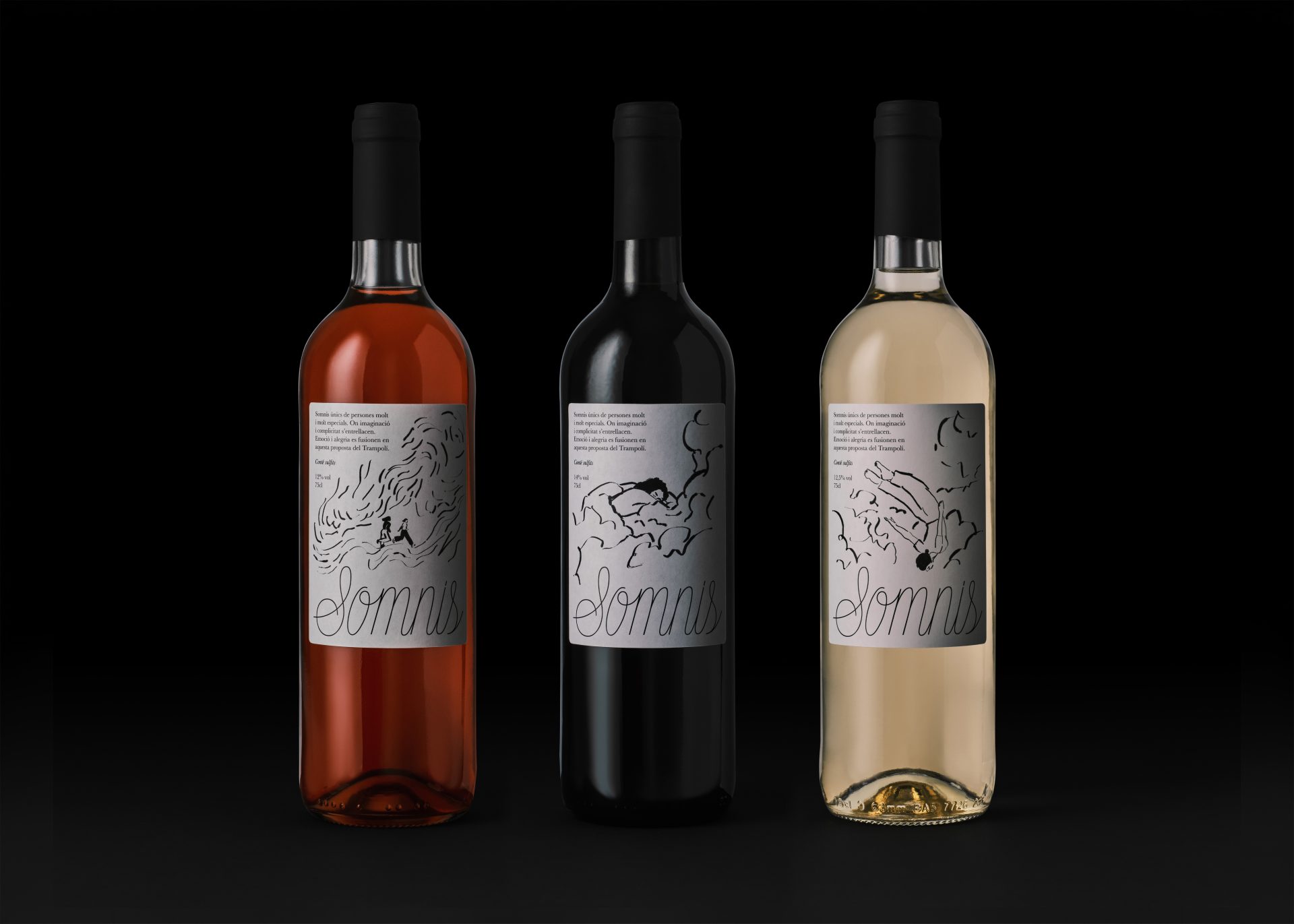
I have a soft spot for packaging that leans hard into loose, hand-drawn illustration. There’s something whimsical about trading polished illustrations for something rawer and more personal, and Somnis, designed by Estudi Jordi Masdeu, captures it with real warmth.
Each label features a different sketchy, ink-line illustration: two figures resting on a hillside for the rosé, a curled-up sleeping form tangled in soft cloud-like scribbles for the red, and a floating, dreamlike tumble of birds and a falling figure for the white. So loose it looks almost like unfinished pen strokes that feel like they came straight out of someone’s dream journal. The looping cursive Somnis logotype sits below each scene, soft and a little imperfect, echoing the artwork’s handwritten quality. Set against plain, kraft-colored labels with small serif text, the system stays intimate and soft.