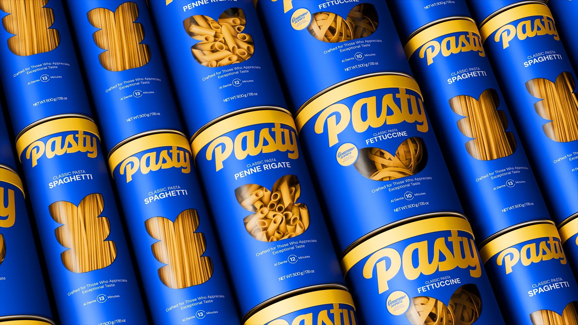
We’re so used to seeing pasta packaging, cellophane bags, and rustic farmhouse branding that Venore Creative‘s approach for Pasty almost throws me off. The deep ocean blue paired with sunny gold immediately reads Mediterranean, but instead of leaning into old-world rustic cues, the combination feels closer to a summer poolside cocktail than a nonna’s kitchen.
The logotype itself is where the pasta metaphor shows up, with soft looping letterforms in the word Pasty that mimic the curl of an actual noodle, giving the wordmark a hand-drawn quality against the otherwise clean, minimal layout. A cutout window on each canister shows off the actual pasta shape inside. Spaghetti, penne, or fettuccine.
The whole system trades heavy comfort food cues for something bright and youthful.

















