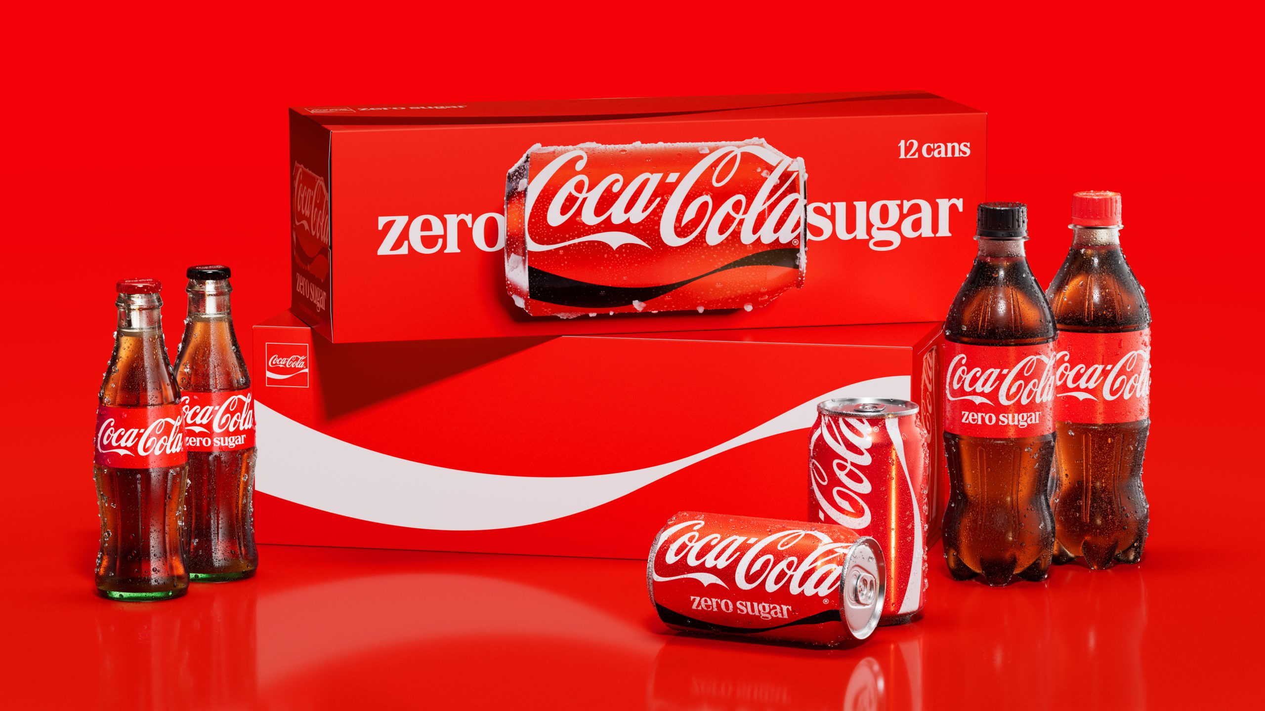
- Coca-Cola is rolling out a unified global visual identity system that features vertical wordmarks on cans, horizontal can imagery on multipacks, and a redesigned Coke Zero Sugar look utilizing white logos and serif typography.
- Developed in collaboration with JKR, Superultrarare, and Brody Associates, the refresh leverages Adobe-powered “Design Intelligence” tools (Project Fizzion) trained on the brand’s archives to scale capabilities and ensure consistent global design governance.
For over 100 years, Coca-Cola has set the standard in how soft drinks—hell, every drink—are branded and marketed. As the legend goes, in 1915, the Coca-Cola Bottle Association issued a challenge to glass bottling companies across the US, seeking a vessel “so distinctive that it could be recognized by touch alone and so unique it could be identified when shattered on the ground.” Go even further back, and Frank M. Robinson, bookkeeper and partner of Coca-Cola inventor John S. Pemberton, thought the brand name sounded nifty, and that two “Cs” would look pretty swell. He wrote out the name in a Spencerian script, and they had a trademark.
The rest, of course, is history. Plenty of brands will try to tell you that they’re iconic, and rest assured—they’re absolutely not. Coca-Cola? That’s actually iconic. And you can thank a glass manufacturer and the guy in payroll (who was a marketing genius).

Fast forward 140 years, and the world’s biggest beverage company is still playing in the sandbox using those genuinely iconic assets. And today, the brand has announced a new global visual identity system—one that seeks not only to further amplify those design elements that pretty much everyone in the world knows, but also to usher in what they call “a new era of brand consistency” across the 200+ markets where the soft drink is sold.


Coca-Cola by it’s very nature doesn’t have to reinvent the brand or do something drastic (that’s why Pepsi exists), they need only elevate what’s already there, whether it’s the aforementioned Spencerian script, the ribbon, the Arden Square, or their red and white palette, and the brand intended to make them even more prominent across retail and packaging, and, well anywhere Coca-Cola lives.

“This evolution celebrates our legacy while looking to the future, delivering a single, bold brand experience that reinforces Coca-Cola’s heritage and confident global presence,” said Rapha Abreu, Global Vice President of Design at The Coca-Cola Company, in a press release. “For over a century, Coca-Cola has been more than a drink; it’s been a global symbol of optimism and authenticity. Now, with one seamless visual identity, we can deliver one recognizable brand experience to consumers.”

As the old adage goes, it takes a village to refresh a global giant, and Coca-Cola is no exception: it was a collaborative effort across the board. The global packaging system was courtesy of The Superultrarare, while the global brand identity was developed alongside JKR. Brody Associates handled typography, and new photography standards were set by Guy Aroch, Anna Palma, and Martin Wonnacott.
“The original brief was to create a platform identity for a new campaign,” said Dave Balsamello, creative director at JKR. “Pretty quickly, we all realized there was something bigger to solve. It had been nearly a decade since Coca-Cola had set standards for its brand. Most guidance had been centered around individual campaigns or platforms, and because of that, there was a need for more consistency.”

The central idea behind the updated global identity system rests on the idea to “make Coca-Cola more Coca-Cola,” and the change is immediately noticeable—not because they’ve tweaked the wordmark or anything like that. Instead, they’ve just moved things around in a pleasing enough fashion.
The most notable change can be found on the cans: the wordmark no longer sits horizontally and has reverted to vertical, which tends to happen every 5-10 years, it seems (vertical is best—facts). Multipacks, meanwhile, have removed the wordmark that stretched out across the body and replaced it with a can lying on its side. Flip it over, and the ribbon gets the whole panel of the box with the square in the upper left corner.

Coke Zero, incidentally, has ditched most of the black (save for the cap on bottles and the black ribbon). Now, the logo appears in white, as does an enlarged “Zero Sugar,” which is now set with a serif type. Will it give my elderly Coke Zero-loving father pause? Perhaps.

Coca-Cola has also brought back the Arden Square. Designed in 1969 by Lippincott & Margulies (now Lippincott), the mark was introduced during an era when the beverage brand was also rapidly expanding.

“When people think about Coca-Cola, a handful of memorable brand assets immediately come to mind: the iconic red, the Spencerian Script, the Dynamic Ribbon, the Contour Bottle, even the product itself. Those are the symbols people recognize, trust, and love. Our ambition was to double down on those distinctive assets and make them even more iconic,” Abreu told DIELINE. “Making Coca-Cola more Coca-Cola became our guiding principle from day one. It reflects the belief that iconic brands don’t need to reinvent themselves; they need to reinforce what makes them unmistakable.”


“That philosophy shaped every design decision,” he added.” We simplified where needed, amplified our distinctive assets, and built a system that creates a more consistent Coca-Cola experience, whether you’re looking at a can, a digital experience, retail, equipment, or a campaign. The result isn’t a new Coca-Cola. It’s a more iconic Coca-Cola, designed for the future while staying true to everything people already love.”


The larger question here, of course, is how that new identity will perform in the market and be used in the coming years. The brand has invested heavily in what they call “Design Intelligence” tools (i.e., Project Fizzion), and has worked closely with Adobe to ensure brand governance and scale its design capabilities with AI models trained on the brand’s vast archives.

The beverage maker has also introduced its immersive Brand Center to support the global rollout and considers it the brand’s digital home. Anyone who works on Coca-Cola, whether it’s marketers and designers or agency partners, can dive into every aspect of the brand and learn how to bring it to life consistently. In essense, it’s a playground where all of the core design assets and visual principles to packaging, equipment, retail experiences, and fleet standards live. Ideally, anyone who designs for the brand will no longer have to navigate a disconnected ecosystem or brand guidelines.
Coca-Cola’s updated identity is rolling out starting today in select markets across Europe, the Middle East, and India, with Latin America and Asia to follow. The rest of the world, including North America, won’t see it until 2027. It’s doubtful that any of this will cause confusion. After all, it’s Coca-Cola.