How does a brand modernize without losing the nostalgia that made people love them in the first place? It’s the question everyone wants the answer to right now.
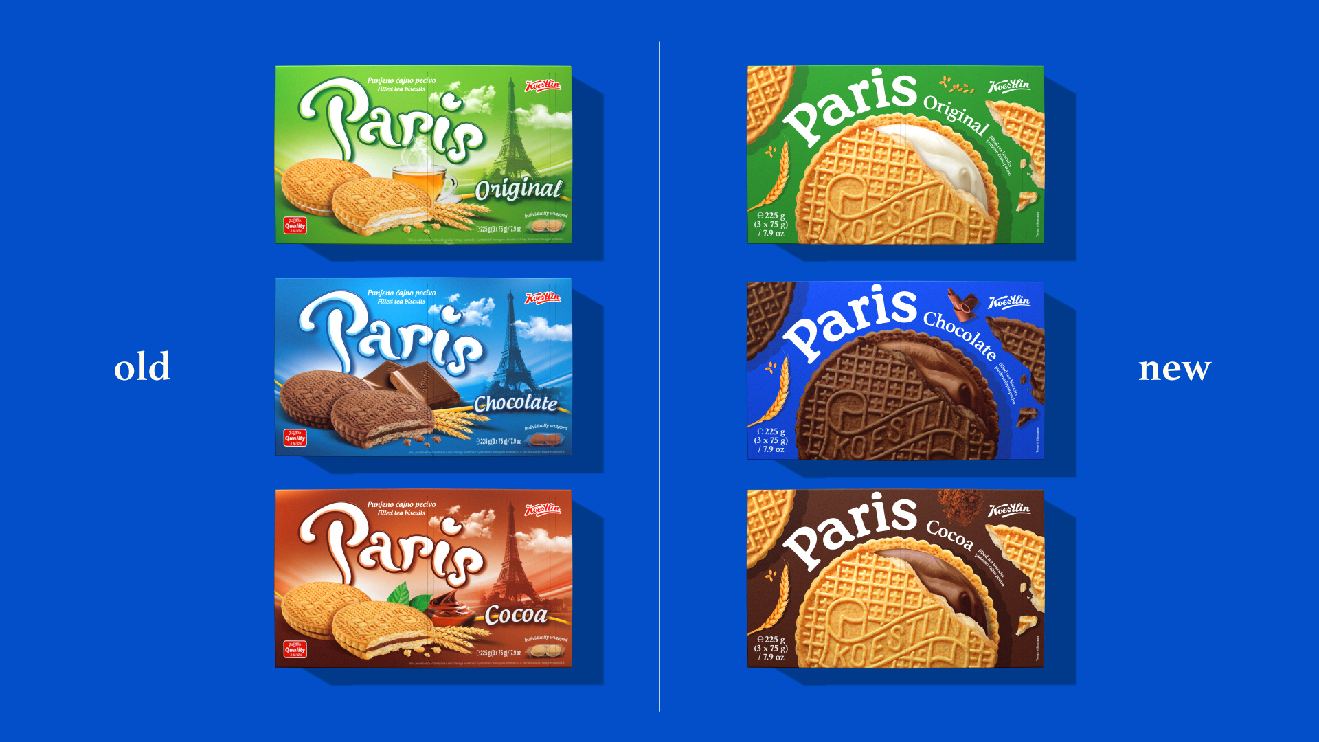
Imago Ogilvy‘s redesign for Paris balances the refresh by putting the cookie front and center on every box. A giant, almost cropped photograph of the signature waffle-textured biscuit fills most of the packaging, its lattice pattern and embossed Koestlin logo doing double duty as both product shot and decorative graphic, so there is barely any need for illustration since the food itself becomes the artwork.
The Paris wordmark keeps a friendly, rounded script quality that feels a little vintage and handwritten, a nod to the brand’s long history without tipping into anything overly old-fashioned. It is a product-forward approach that trusts the cookie to sell itself rather than layering on extra imagery, which feels refreshingly direct for a category that often overcomplicates its packaging.