Häagen-Dazs Updates Ice Cream Brand With Chase Design Group
By
Published
Filed under

By
Published
Filed under
Marketed as a premium product from the beginning, for 61 years, the ice cream brand Häagen-Dazs has long been an example of affordable luxury and attainable indulgence. Elements like the gold-colored and fanciful cartouche frame around “Häagen-Dazs,” rendered in an oh-so Continental geometric sans-serif, have been a recipe for success historically for the brand. But the permanent freezer aisle resident saw that luxury branding has evolved, and they decided it was time to update the packaging.
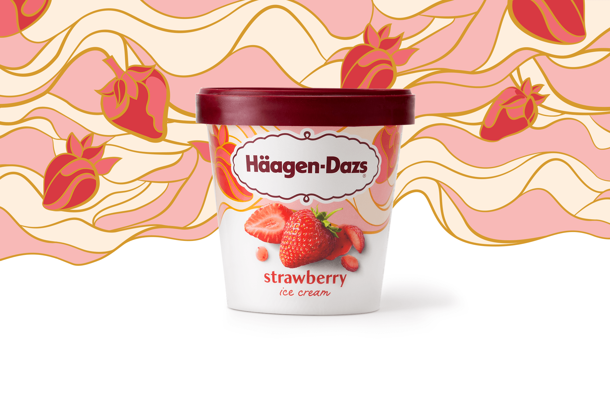
Häagen-Dazs enlisted Chase Design Group to help them with a contemporary interpretation of the brand’s character. Core brand elements, such as white, gold, and burgundy—colors long associated with luxury—are retained, as is the cartouche frame. Ingredients get presented using superb photography that highlights quality and taste. The agency replaced the intricate gold tapestry with stained-glass-like backgrounds featuring ice cream ingredients where the gold gets used to border the individual pane-like pieces. Each flavor receives its own distinct backdrop as well, adding depth to the brand while visually enhancing the line when presented together, such as in-store.
Get unlimited access to latest industry news, 27,000+ articles and case studies.
Have an account? Sign in