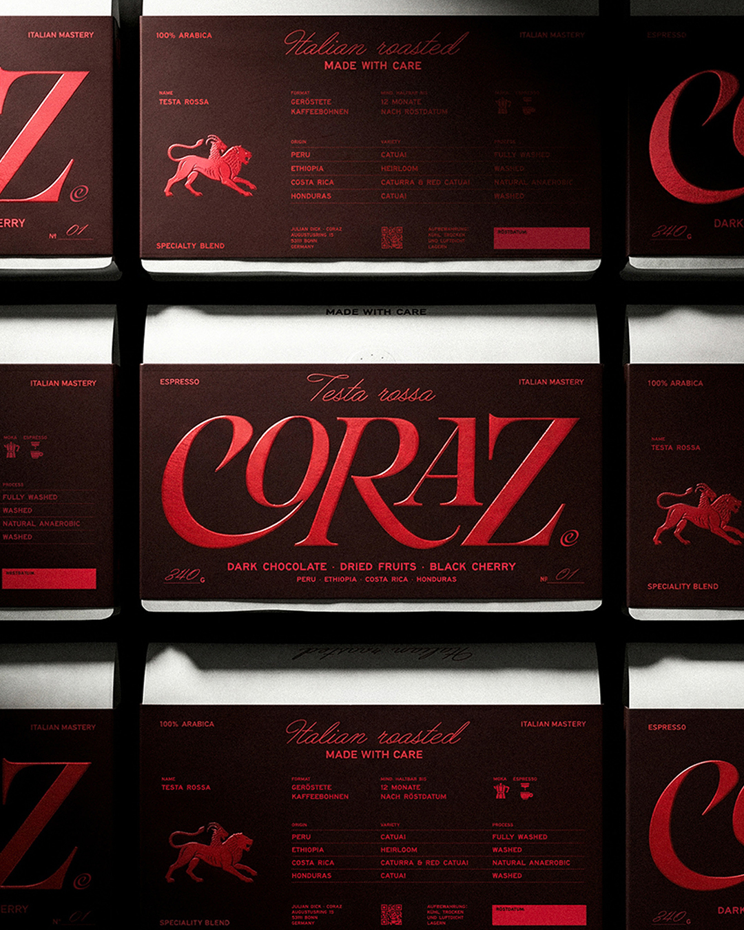
Specialty coffee can sometimes lean a bit sterile or, on the opposite side, ostentatious, so Andrea Ricciarini’s work on Coraz feels like a welcome return to a world of romantic design.
The deep espresso brown paired with a rich, blood red creates a velvety, candlelit atmosphere on the label. The giant script logotype features swooping curves on the C and Z that recall old Italian signage and vintage liquor labels, giving the design a worn-in glamour. The kraft-colored stand-up pouches strip everything back to a single delicate cursive line reading Italian roasted, letting the logo carry the weight. It is a smart way to stand out, proving that a little theatrical Italian flair can absolutely feel sophisticated, not kitschy.
Designer Andrea Ricciarini dives into the design strategy below.


















