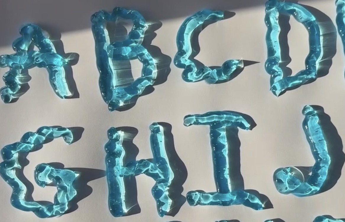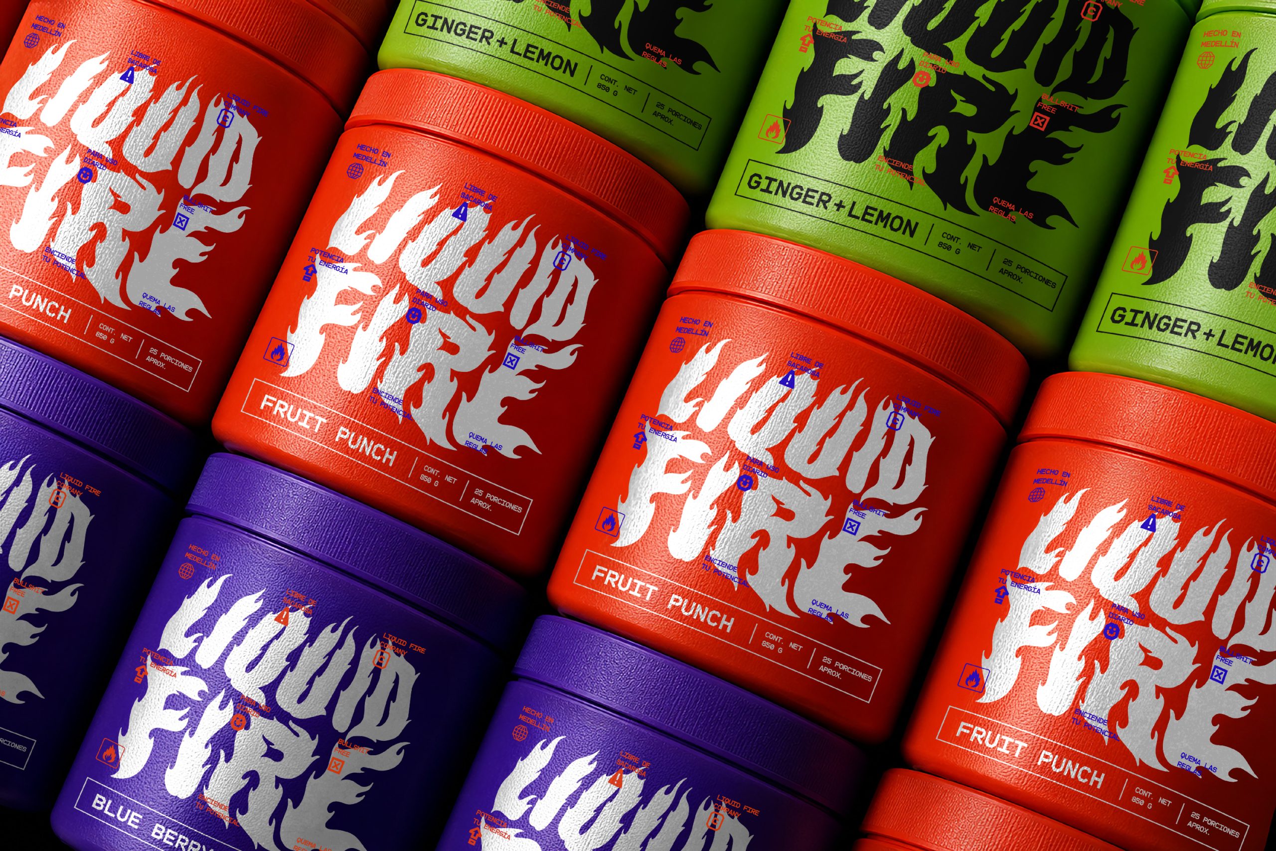
Pre-workout packaging is often pointlessly aggressive, but Diggin‘s work on Liquid Fire is more about visually representing an inner fire. The hand-drawn logotype looks like it was clawed out of flame, dripping and jagged, giving the whole line a homemade intensity that feels more like graffiti. A shark skull sits on the lid of every jar, a small but sharp symbol of instinct and hunger that ties back to the brand’s overall shark mindset.
What is really meant to throw people off, in the best way, is the color choice. Instead of the usual black and red fire cliches, Liquid Fire leans into electric blue, green, purple, and orange, cold tones used to represent something hot and explosive, which creates a fun contradiction on shelf. Warning icons, safety symbols, and stamped microcopy scattered across the packaging give the whole line an industrial, almost punk attitude that no clean-label supplement brand would ever dare to try.