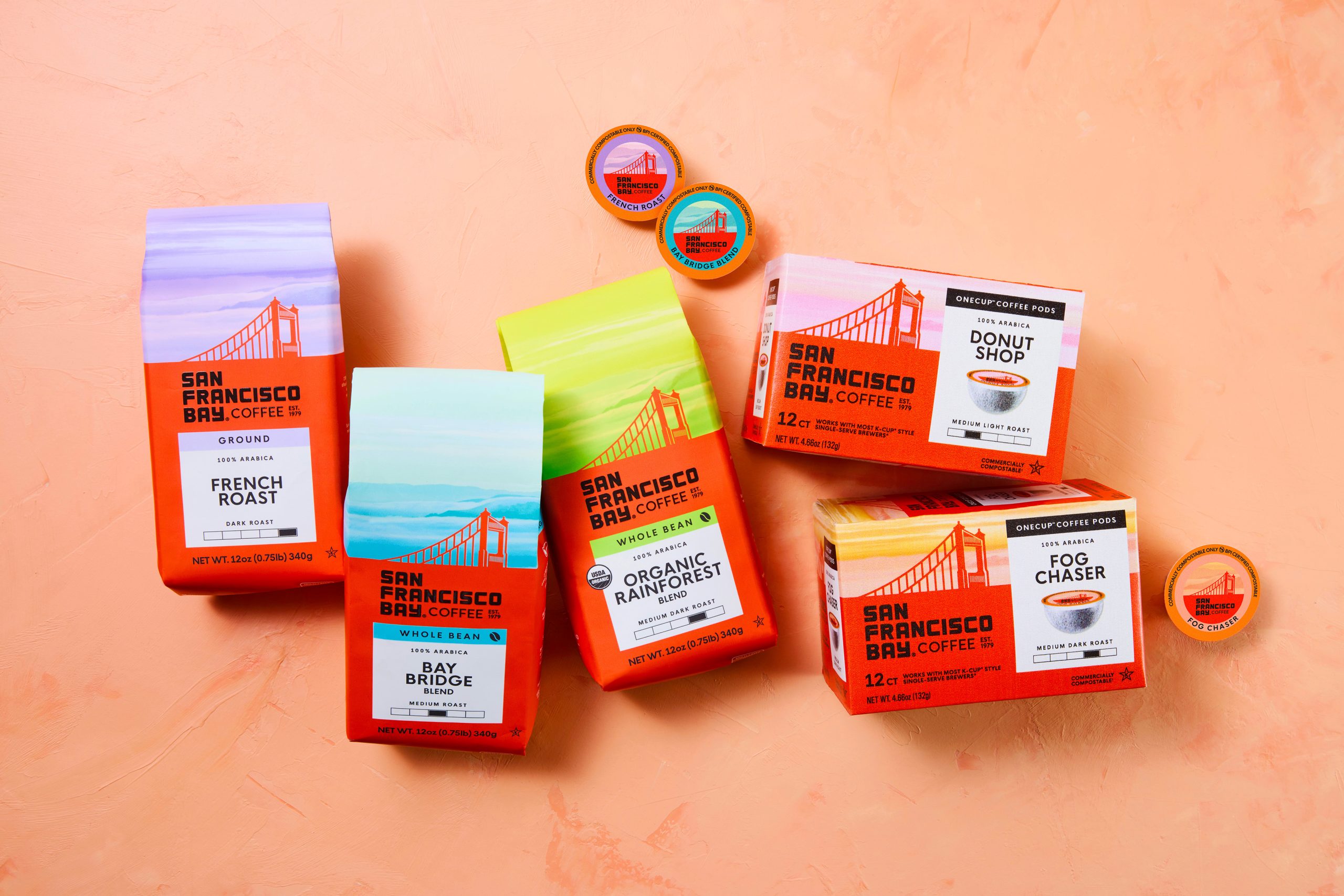
Personally, I love it when a coffee bag trades matte earth tones for more drama, and this redesign for San Francisco Bay’s Coffee, courtesy of The Creative Pack, does just that by turning the Golden Gate Bridge into the hero of the pack.
The bridge lifts off the top third of every bag in a graphic orange silhouette, set against a sky that shifts color by roast, so the fog itself becomes a wayfinding device rather than just pretty scenery. That signature orange red comes straight from the bridge’s real International Orange paint, a color chosen decades ago specifically to stand out against ocean fog, and here it does the same job on a crowded coffee shelf. The chunky, condensed black logo is grounded and legible beneath all that atmosphere, giving off a confident attitude rather than the rustic script so many roasters lean on.
Most coffee packaging in this price tier still splits between minimalist kraft paper and busy farm-to-cup illustration, so a system built on one recognizable landmark and a full spectrum of sky gradients gives this brand a fresh presence without abandoning the San Francisco story that built it.