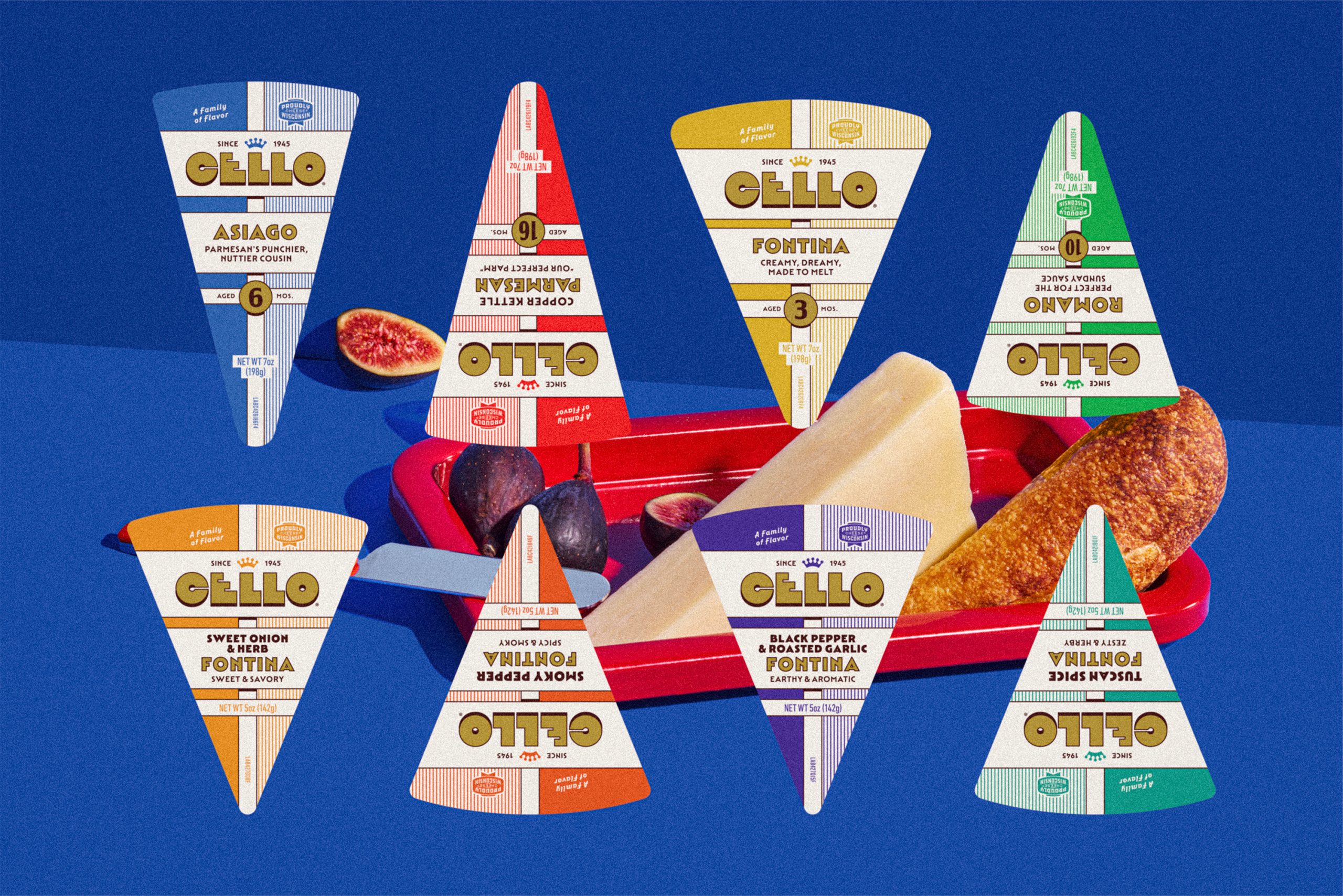
Specialty cheese packaging has almost always leaned into the depths of the brand’s origin. Which I get, but it can also lead to designs looking dated and all too similar to one another.
Young Jerks‘ redesign of Cello proves the importance of moving in the opposite direction. The old design played it extremely safe with a plain gray label and typography that could pass for any deli cheese on the shelf. The new look, however, pulls straight from classic diner menus, with a gold crown mark and thick pinstripe borders. There’s a different color to mark each variety, blue for Asiago, forest green for Romano, warm orange for Fontina, and deep red for Parmesan, turning the whole lineup into a color-coded system that’s quickly recognizable in any cheese section. The chunky, slightly worn typography leans into a nostalgic Americana feel, giving the whole line a genuinely fun personality that the original design never had.
I’m a big fan of cheese, and now a huge fan of Cello.

















