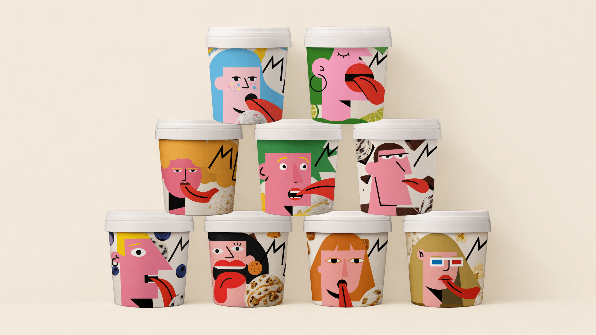
Playful maximalism is something we’re all craving a little more of, but Egor Aleksandrov‘s conceptual work for MELT turns it into something even more than that.
The real showstopper is the giant red tongue-shaped scoop that sits right on top of every lid. It would be impossible to miss on a shelf, and it turns a mundane act like opening your pint into a little moment of delight. The flavor illustrations lean into a cubist cartoon world with lopsided pink faces, wandering eyes, jagged lightning bolt hair, and tongues that stretch out to lick giant scoops of ice cream. For the fruitier flavors, like the blueberry and pineapple pints, the mood shifts into something sketchbook-like, with loose hand-painted fruit and a warm cream backdrop that feels closer to a farmers market illustration. The hand-lettered MELT logo, with its dripping little serif on the E, ties both worlds together and keeps the whole system feeling like it was made by someone having a good time.