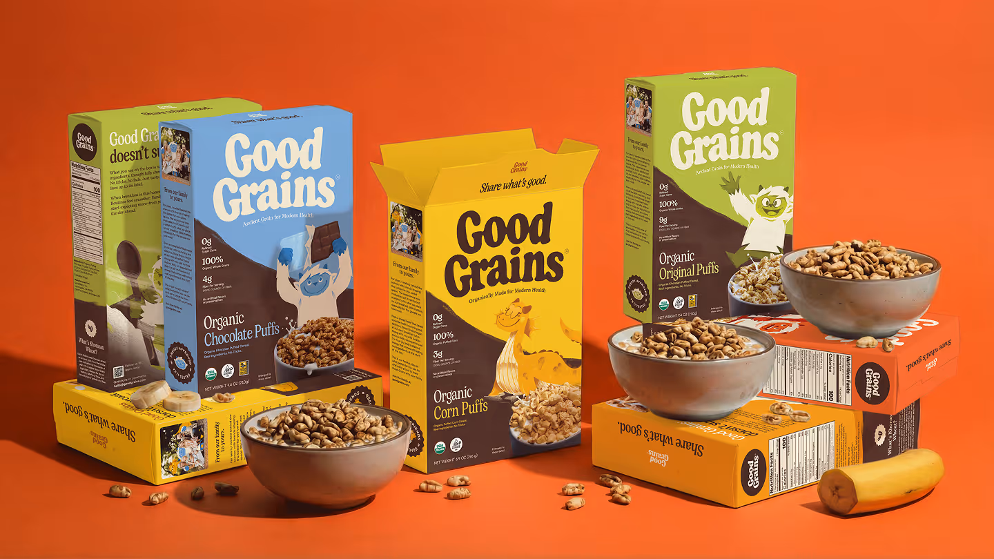
- Good Grains by Gel proves that organic cereal can be just as visually exciting as it is nutritionally honest, with character-driven yeti illustrations and a rich earthy color system that speaks to parents and kids equally.
- With ingredient transparency at its core and a joyful illustration style that rivals the best of the candy aisle, this is a cereal rebrand the breakfast category has been waiting for.
Cereal boxes—but especially the sugary stuff—have always resembled candy, and for obvious reasons. But Good Grains looks like how cereal should actually taste. Designed by Gel, the brand centers its entire visual system around ingredient transparency and character-driven warmth.
The visual language is appetizing and joyful without resorting to the neon overload that the category usually defaults to. The yeti character has a distinct color treatment and personality pose for each flavor, from a chocolate-holding blue yeti to a fiery cinnamon version wielding a red staff.