- Blant-based brand Epik Eats is reframing the category with a loud and proud rebrand from Pigeon
- Using a bright fuchsia and yellow color palette and big, bold typography, the new Epik Eats packaging breaks the subdued and restrained mold that dominates the plant-based aisle
Tofu is a famously low-key sort of food, positioned within a plant-based category that’s similarly restrained. Epik Eats is here to rewrite that narrative, bursting onto the shelf with an explicitly bold and brazen redesign meant to break the mold and shatter industry expectations.
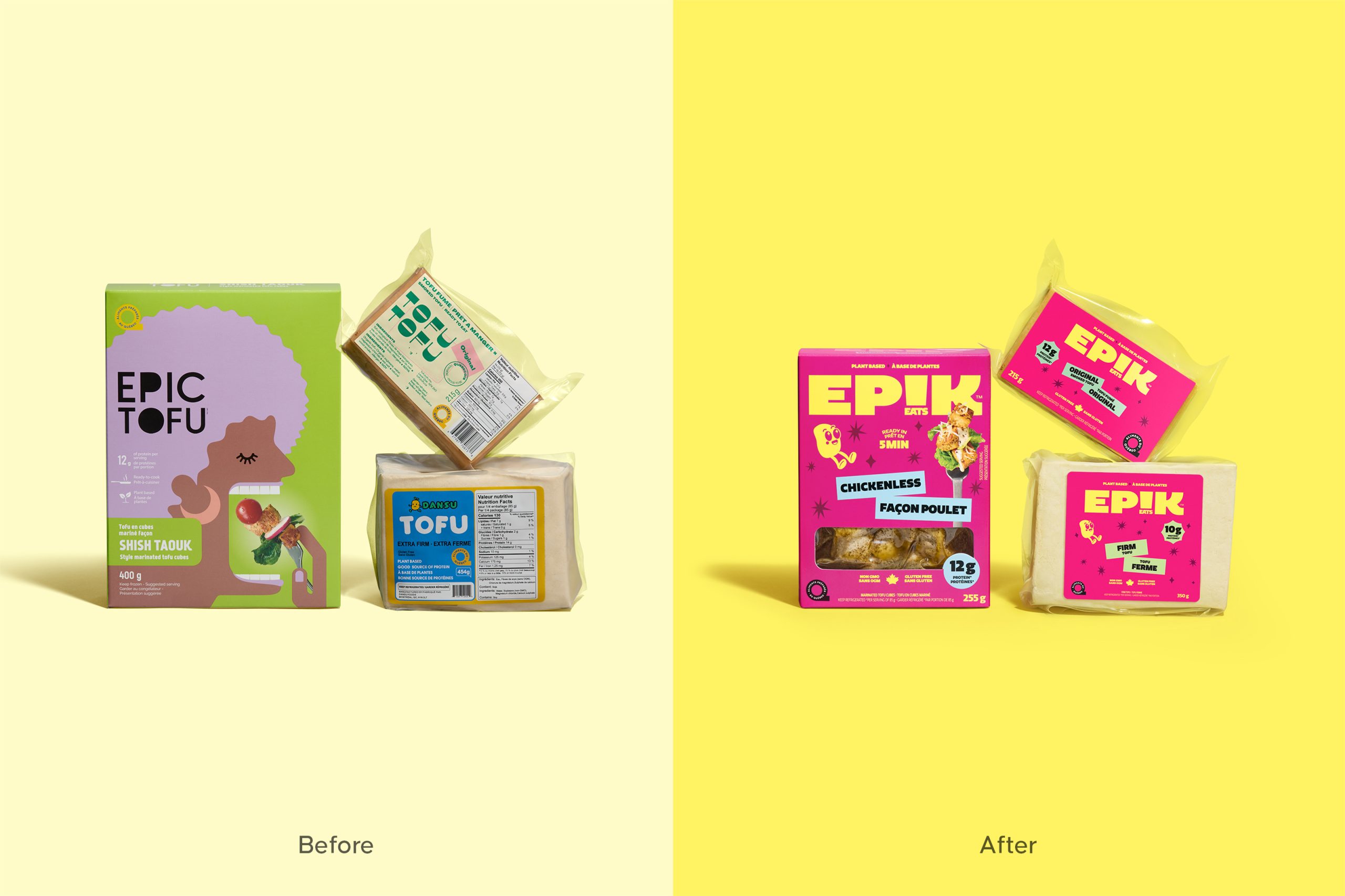
From the agency Pigeon comes a reframing of what a plant-based brand can be—and how it can look on the shelf. Instead of the typical subdued wellness aesthetic that dominates the plant-based aisle, Epik Eats pops with a bright fuchsia box adorned with a chunky wordmark in a sunny yellow. Embedding the “Eats” portion of the brand name within “Epik” to make the “i” into an exclamation point is clever and cheeky, not gimmicky or forced. The move also impressively retains the name’s readability, while adding to the brand’s expressive and loud ethos.
Who says tofu can’t be epic?

CHALLENGE
In a plant-based category more crowded, beige, and cautious than ever, Epik Eats entered as a start-up with no media budget, where packaging wasn’t just a touchpoint, it was the only marketing. While industry giants dominated visibility, most brands blended into the same soft-toned, wellness-driven language.

At the same time, consumers were increasingly curious about plant-based eating, yet still perceived it as bland, functional, and joyless. Epik’s products, inspired by the founder’s grandmother’s recipes yet reinvented for modern convenience, were truly innovative (tofu pasta noodles, marinated tofu made for real cooking). But in a category this saturated, being good wasn’t enough. We needed to shout that we exist. The challenge was clear: create a brand that could radically stand out while feeling real, craveable, and culturally relevant, not niche, not ornamental, but undeniably alive.
STRATEGY
The strategy embraced boldness not as decoration but as survival. Epik Eats positioned itself as “the tofu with attitude,” unapologetically expressive, flavour-first, and impossible to overlook. The creative platform, “epicness for all,” fused cultural energy with culinary enthusiasm: globally inspired, grandmother-approved, but made for today’s fast, flavour-seeking lifestyle.
The brand needed to communicate three messages instantly on shelf: this is delicious, this is effortless, and this is different. That meant leading with emotion, humour, and colour where others hid behind virtue and restraint, not rejecting category codes but rewriting them with joy and swagger.

Guided by this vision, the following principles took shape:
•Make plant-based exciting by leading with flavour, joy, and appetite, not wellness restraint.
•Treat visibility as survival, using fearless form and colour to dominate shelf space.
•Build a brand voice that’s human, modern, and culturally fluent, more street food energy than health food clinic.
•Stay accessible and flexible, designed for the flexitarian majority, not just the plant-based elite.
CREATIVE SOLUTION
The tofu with attitude
At the heart of the identity stands the Epik wordmark, an oversized typographic statement set against a vivid magenta backdrop. Its bold yellow fills create an unmistakable sense of contrast and visibility, instantly cutting through the beige tones that dominate the category. The exclamation mark within the logo doubles as a symbol of enthusiasm, while the smiling mascot adds warmth, humour, and approachability.

The design celebrates flavour in every detail. Transparent windows showcase the real, marinated tofu or soy noodles within, reinforcing authenticity and appetite appeal. Bright colour blocking, cheeky flavour cues, and lively typography work together to project confidence and joy. The result is packaging that feels as expressive as the food it contains.
EXECUTION
The design system was built for clarity, consistency, and flexibility across the full range. Colour-coded flavour bands and bold protein callouts make navigation intuitive, while recipe photography and simple icons communicate preparation ease and versatility.
Every composition balances energy with structure, guiding the eye from product name to serving suggestion in a clear, engaging flow. The visual language translates seamlessly from tofu to noodles, maintaining a cohesive presence both on shelf and online. Across all touchpoints, the design radiates optimism and flavour, ensuring instant recognition and emotional connection.

IMPACT
Epik Eats reclaims the plant-based aisle with bold design and joyful confidence. The vivid contrast of magenta and yellow forms a unified brand block that commands attention and disrupts category conventions. Each element, from the oversized wordmark to the playful mascot and cheeky flavour cues, expresses a vibrant personality that consumers can instantly connect with.
The result is a brand that doesn’t just sell tofu, it sells excitement. By transforming restraint into energy and flavour into identity, Epik Eats proves that great design can make plant-based food as bold and satisfying as its name suggests.