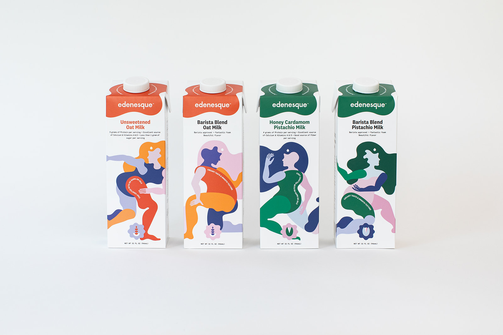
- Edenesque’s rebrand by Perpendicular is rewriting what alternative milk design can look and feel like.
- Flavor-coded palettes, hand-drawn figures, and hidden details make this one of the most exciting designs in food and beverage right now.
Most alternative milk packaging is playing it safe with clean white minimalism and leaf icons, but Edenesque’s packaging by Perpendicular is the refreshing disruption we’ve been craving. The design pulls from mid-century figurative illustration, think Matisse cutouts meets contemporary character design, where hand-drawn human figures stretch and curve on the carton, feeling warm rather than corporate.
What makes this design actually different, though, is that it treats the carton as a space for community and motion, trusting shoppers to respond to art and humanity rather than functional callouts, which, in 2026, with consumers craving brands that actually feel like something, is exactly the right move.