Zaytas Redesign Packs a Crunch into New Look
By
Published
Filed under

Published
Filed under

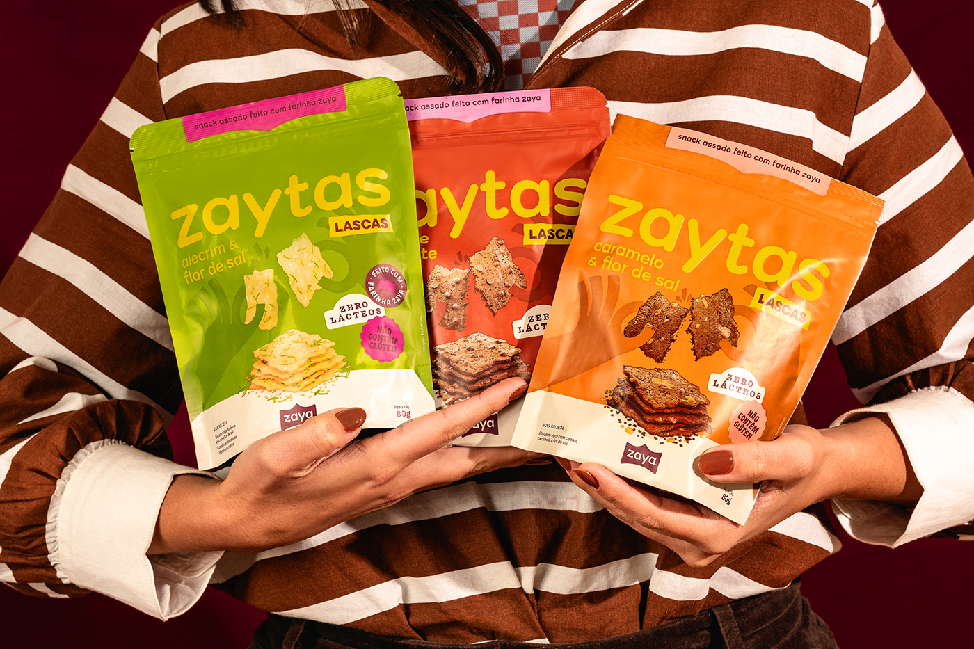
Zaya’s redesign for its snack brand, Zaytas, leans into a crisp, typographic system.
MELT Design swaps the old clinical blue-and-white look for a lineup that feels pulled from vintage pantry staples and early print ephemera with big letterforms, confident spacing, and a palette that channels grocery-aisle optimism. The brand identity reads more like a playful food magazine than a typical better-for-you snack.
Add project credits with Dieline PRO | Log in
Get unlimited access to latest industry news, 27,000+ articles and case studies.
Have an account? Sign in
To provide the best experiences, we and our partners use technologies like cookies to store and/or access device information. Consenting to these technologies will allow us and our partners to process personal data such as browsing behavior or unique IDs on this site and show (non-) personalized ads. Not consenting or withdrawing consent, may adversely affect certain features and functions.
Click below to consent to the above or make granular choices. Your choices will be applied to this site only. You can change your settings at any time, including withdrawing your consent, by using the toggles on the Cookie Policy, or by clicking on the manage consent button at the bottom of the screen.