You Gotta Give: Wildhawk’s Packaging May Cause Post-Shake Confidence
By
Published
Filed under
By
Published
Filed under
Packaging that leans solely on bold, sans serif type and a duo of strong colors will always stand out.
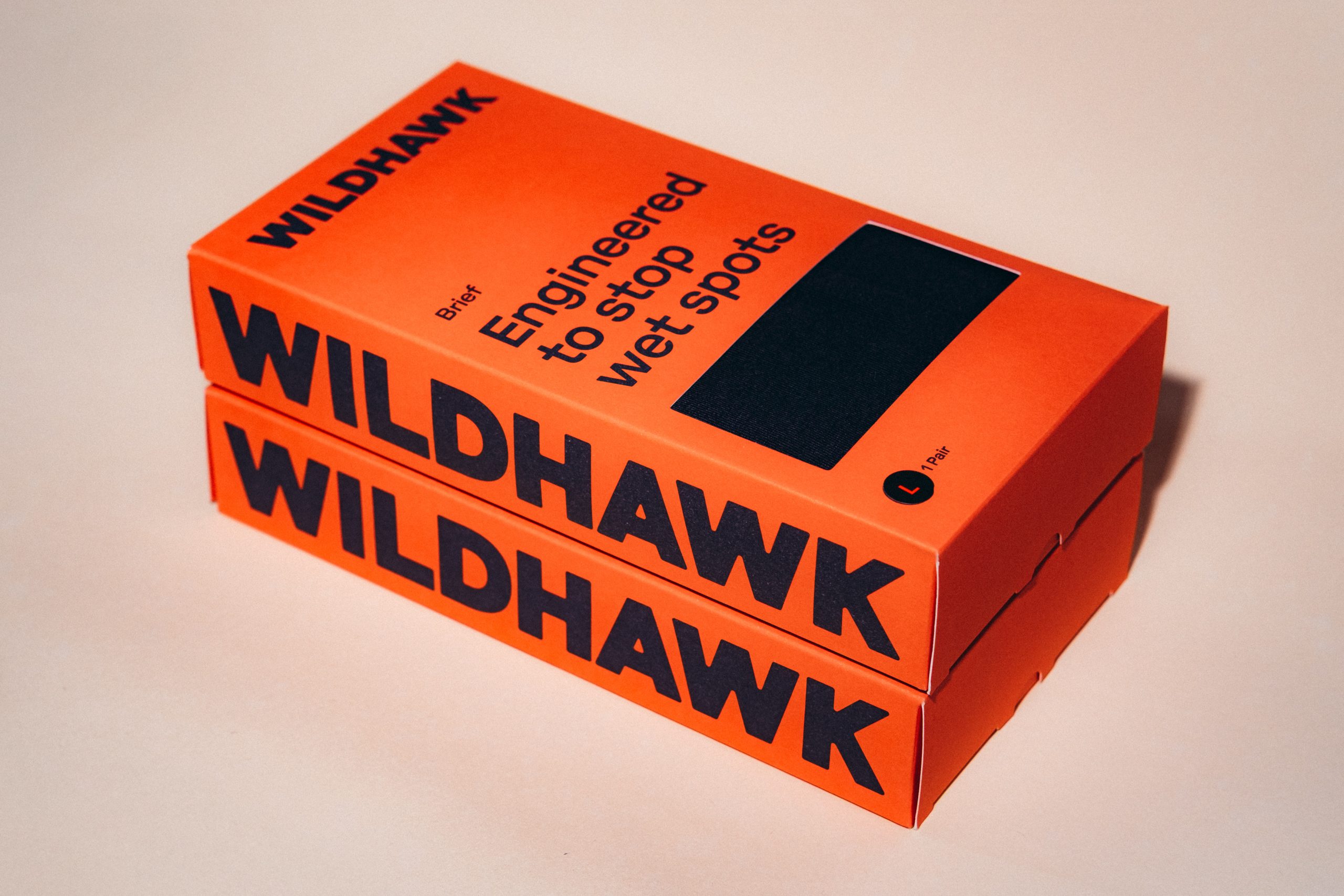
For Wildhawk, Red Antler‘s approach leans heavily into typography as the main visual language, with oversized, unapologetic letterforms wrapping the box and turning the brand name into a full-fledged, confident identity. Additionally, the electric orange color instantly shifts the conversation.
Supporting graphics and diagrams introduce the product’s technical innovation in an informative way. What makes this stand out is how it reframes a sensitive topic through confidence and design clarity, creating a product that feels like a smart upgrade rather than a quiet fix, and inviting a new audience into the category with ease.

Wildhawk’s leakproof underwear was created to solve a problem that millions of men experience daily: drips, dribbles, and light bladder leaks that create uncomfortable dampness. In a category that treats customers like patients instead of people, we set out to design packaging that communicates serious technical performance while normalizing this almost universal experience.
While the existing category caters primarily to men over 50 experiencing bladder leakage, we targeted younger men looking for a fix for daily comfort, not a medical solution. The incontinence market is dominated by medical-looking packaging tucked away in pharmacy aisles, using language that’s either vague or clinical. Research showed us that men experiencing light spots or mild leaks want a solution without making it feel like something’s wrong with them.

Our brief was to create packaging for Wildhawk’s first retail product: premium men’s underwear engineered with a proprietary absorption system—which we named TurboDry™—that dries instantly and neutralizes odor. Despite its high-performance technology, the underwear is soft and ultra-comfortable, looking and feeling like a pair you’d reach for even without the functional benefits. The packaging needed to reflect that duality.
We started with language. Our research revealed that men experiencing leaks use everyday words to describe their problem: drips, dribbles, wet spots. They don’t think in terms of “absorbency ratings” or “incontinence solutions.” We crafted copy that sounds like how men actually talk, replacing euphemisms and medical jargon with clear, confident, relatable language.

The physical packaging is a single-pair box engineered to connect with consumers in multiple retail environments. The box features a diecut sensory window so customers can touch the super-soft fabric before buying, and it’s printed on coated matte stock in Wildhawk’s signature bold orange with one spot black for type and graphics. To build credibility and consumer trust, we included product visualization on the packaging so customers can see exactly how the technology works. The result is packaging that feels like a premium apparel brand, not something you’d find on the shelves of a pharmacy.
Most packaging in this category either hides the product’s purpose behind vague language and design, or leans so hard into clinical credibility that it reinforces the stigma it’s trying to overcome. In contrast, Wildhawk’s packaging is honest about what the product does, proud of how well it does it, and confident that it will make customers’ daily lives better. It presents performance with clarity and dignity.
At the heart of this packaging design is respect. Respect for the problem, for the solution, and for the men who deserve daily comfort.