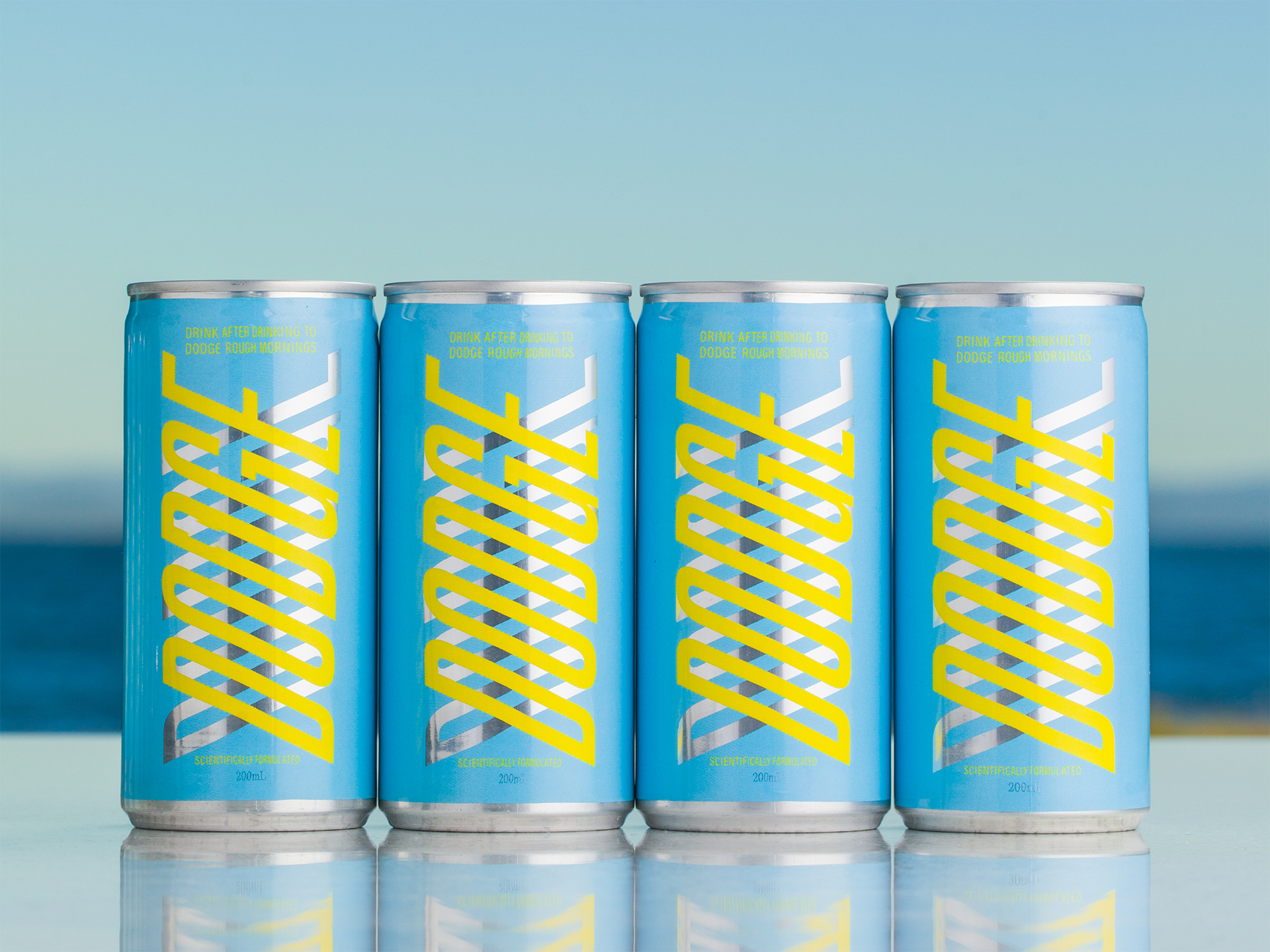
Take one look at Dodge’s can design, and you’ll instantly want to know more about the brand. Created by Megan Perkins, Dodge’s packaging system beautifully incorporates a type system that sets the brand in motion. Additionally, the yellow and blue color palette feels energizing without being anywhere close to draining. The simplicity paired with thoughtful design elements puts this can’s packaging above the rest.

Branding and packaging for Dodge, a new to market CPG brand entering the emerging functional beverage sector. Developed in partnership with Monash University Food Innovation this all natural, Korean pear drink is something you drink after drinking to dodge rough mornings. Freedom of movement is the central idea, visualised through a dynamic, slanted typographic system that dodges, and changes direction across the range. The bold yet playful solution is designed to appeal to young go-hards and young parents alike, with an eye-catching and distinct presence on the shelf.