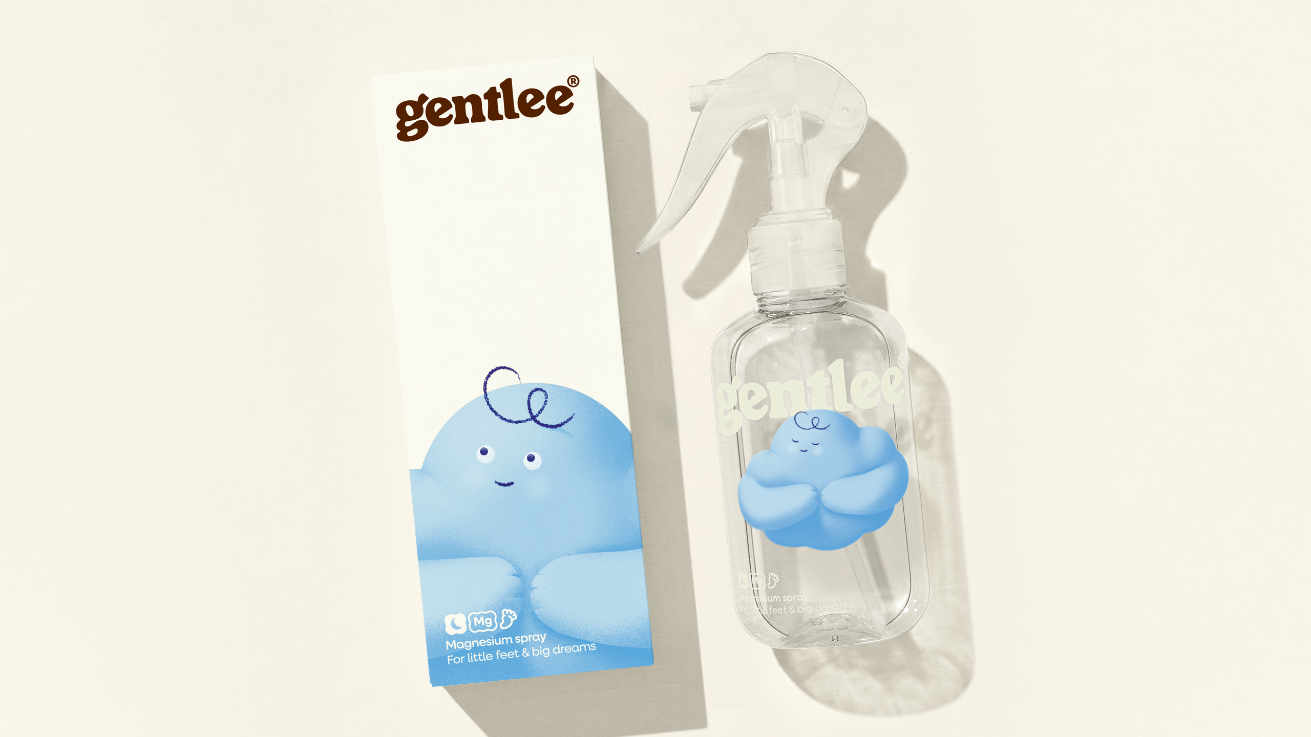
I love discovering packaging that knows its audience before I even read a word.
With Gentlee, WeWantMore created a design system that translates the emotional landscape of bedtime into a soft yet contemporary visual language. The typography leans into rounded, friendly letterforms that feel approachable, allowing parents to trust the product while still speaking gently to children.
The cloud character introduces a tender, illustrative touch, acting as a comforting companion rather than a decorative mascot. The result feels fresh and optimistic, like a new chapter in how products for young families can show up with empathy and intention.

At the heart of Gentlee’s packaging design is the emotional reality of bedtime for young families. Gentlee launched with a single hero product: a magnesium foot spray created to support quality sleep in children. Our role was to build the brand and packaging identity from the ground up—developing a positioning, name and visual system that could live credibly in the wellness space while feeling gentle and comforting in a child and baby context.
The challenge was to speak to two audiences at once. The packaging needed to reassure parents through clarity, trust and composure, while also feeling soft, friendly and familiar to children. Bedtime is an especially sensitive moment, one where overstimulation, harsh design cues or overly clinical language can work against the experience. Gentlee needed to stand apart from a landscape dominated by pharmaceutical aesthetics or overly cute sleep clichés, without adding noise to an already delicate routine.

From consumer research and interviews, one insight emerged consistently: when children sleep well, parents do too. Bedtime is not just functional, it is an emotional pressure point that shapes the next day for the whole household. This reframed Gentlee® not as a problem-solving product, but as a calming companion within a nightly ritual.
That insight became the foundation for the brand’s core positioning: Peaceful nights. Joyful days. From there, we designed the packaging to communicate reassurance rather than urgency.
Creatively, we rejected the predictable visual language of children’s sleep products: moons, stars, dark palettes and overt “sleepiness.” Instead, we explored calm through light, warmth and sensory softness, challenging the assumption that bedtime brands must look nighttime to feel soothing. The packaging design uses gentle tonal gradients and tactile-inspired textures to evoke comfort and care, creating a quiet shelf presence that feels modern and emotionally uplifting.
On-pack copywriting became an essential part of this experience. Short, poetic lines such as “for little feet and big dreams” reinforce the emotional tone of the ritual. This brings warmth and imagination to the moment, while remaining grounded in parental trust.

To connect directly with children, we introduced Claude, a cloud mascot defined by soft curves and quiet charm. Claude acts as an emotional bridge between parent and child, helping transform the product into something familiar and welcoming rather than medicinal. This character also establishes a broader brand world that can extend naturally across future bedtime rituals and product lines.
Typography and illustration were crafted to feel friendly but composed, balancing childlike warmth with parental trust. Every visual element was designed to reduce friction at bedtime—nothing sharp, loud or distracting—allowing the pack to support calm without disappearing.

Beyond the pack itself, we brought Gentlee to life as a tactile brand presence within the bedtime routine. From soft-touch objects like a bedside lamp to pajamas and children’s storybooks, the identity was designed to extend naturally into the physical world—becoming part of the ritual rather than just a product on the shelf.
Gentlee’s packaging identity is ultimately a considered response to the shared emotional experience of bedtime in young families. Grounded in parental insight, it translates calm into a scalable visual system designed to grow beyond a single hero product. The result is packaging that balances softness with confidence—quiet, intentional and built to last.