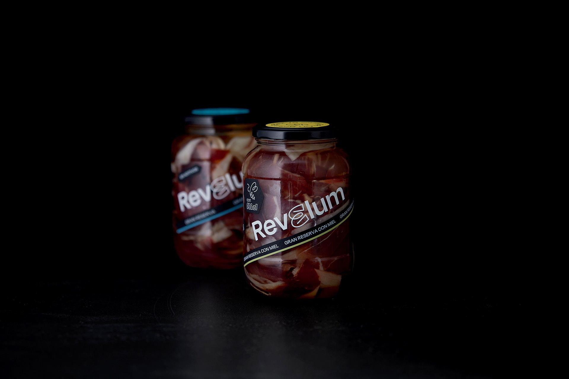
Typography takes the reigns in Revelum’s ham packaging designed by Brandsummit. While ham isn’t typically found in a jar, at least in America, Brandsummit’s packaging feels sleek while balancing a hint of trendy design. Keeping the label simple and solely focusing on playful stickers and personality-packed typography, there’s a definite level of intrigue.
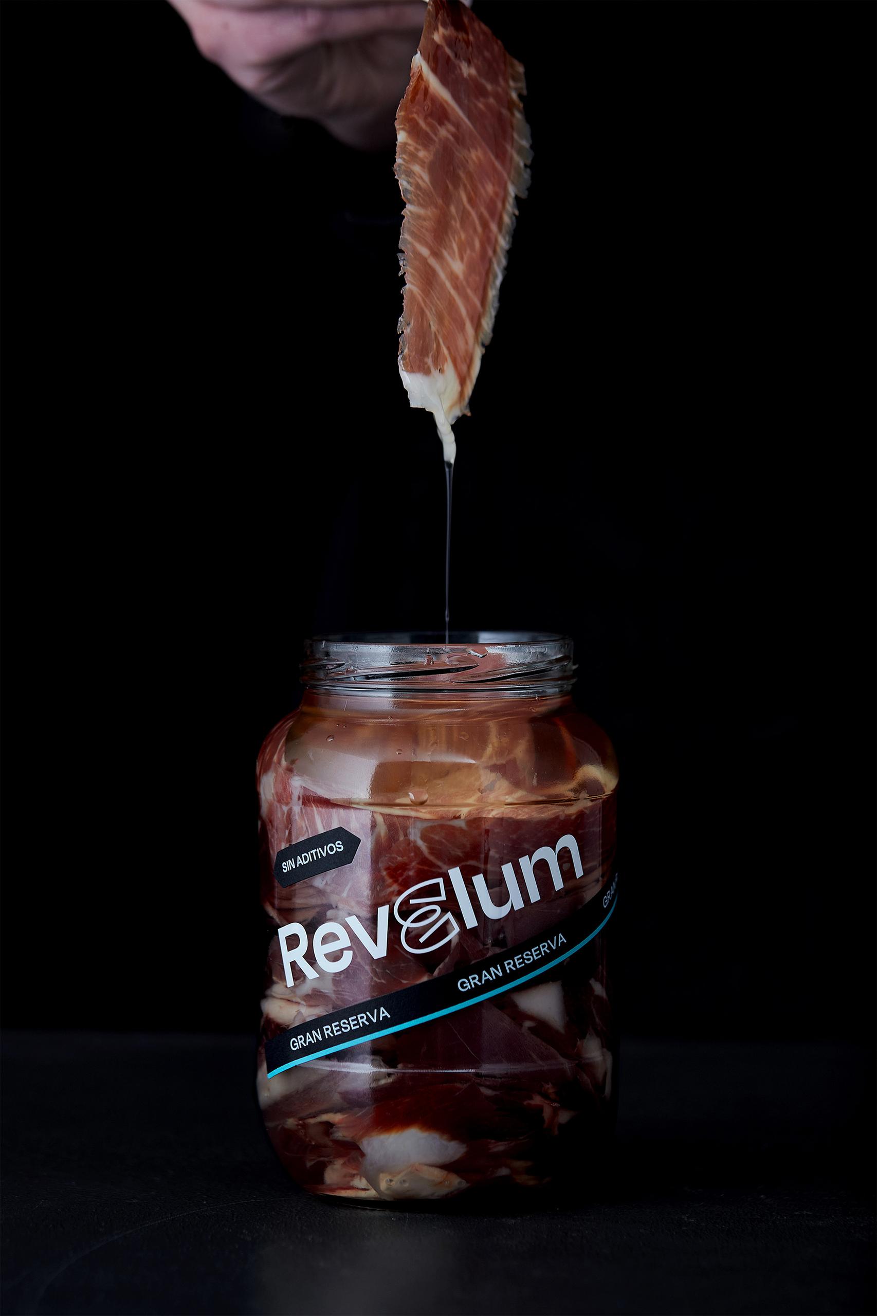
A new patent has been born: real ham, cut by knife, submerged in vegetable oil, in a glass container. Simple but surprising, a way of eating ham like never before, deserved a branding and packaging that broke the category. This is how Revelum was created. An identity that recalls urban art, marked by contrast, combining elements, stickers, fonts and colours that give the brand a lot of versatility and its own personality. You already know: Discover the already known ham.