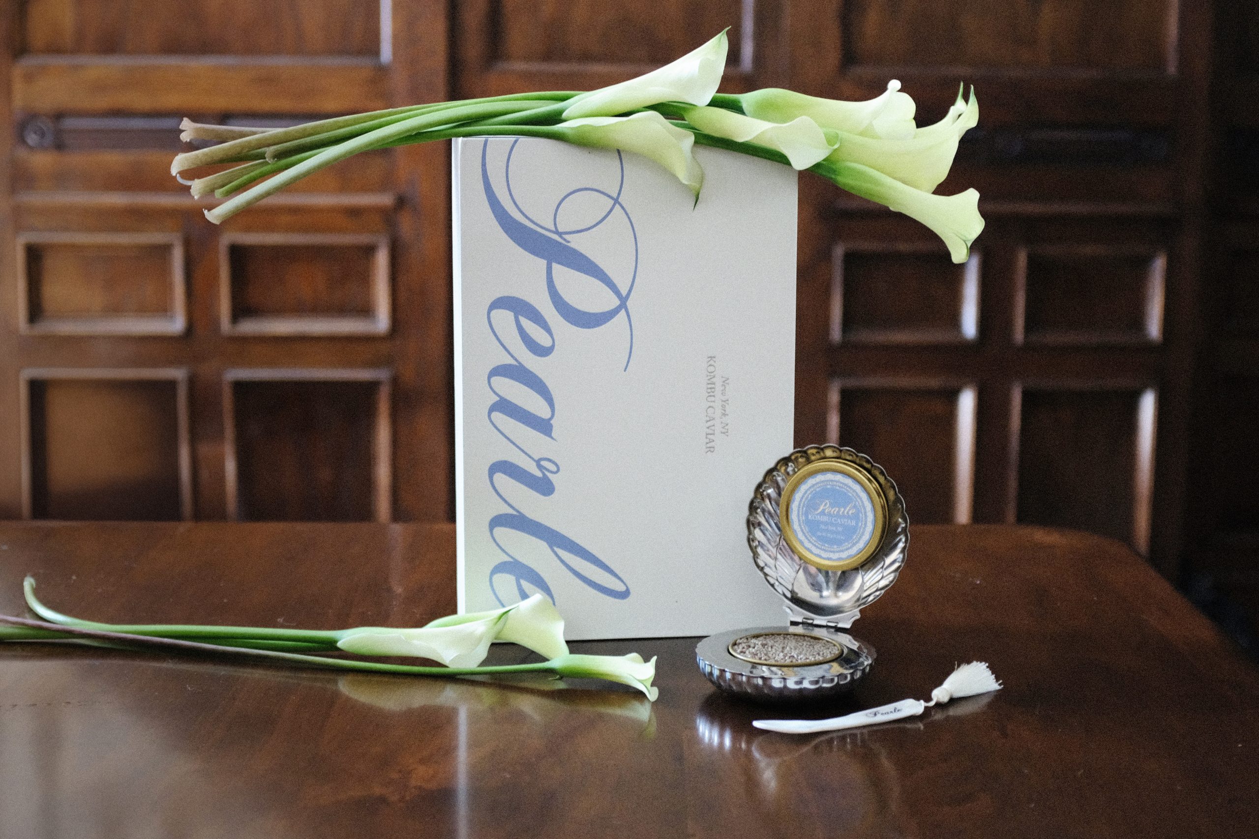
Is caviar packaging taking a page out of cosmetic packaging’s book? Pearle’s design by Sweety & Co might be the prettiest proof of it. The tin is nestled inside a hinged silver scallop shell that opens like a vanity compact, finished with an engraved script wordmark and a tasseled mother-of-pearl spoon.
That soft periwinkle label with its lacy border goes against all the black and gold currently on the caviar shelf, pulling instead from Wedgwood china, powder rooms, and the coquette revival rippling through CPG. Then there’s the oversized calligraphic script spilling down the outer box like a wedding invitation, romantic and a little theatrical but not tipping into camp territory. The whole thing makes a plant-based caviar look like a treasured antique, which is something I never previously would have thought possible.