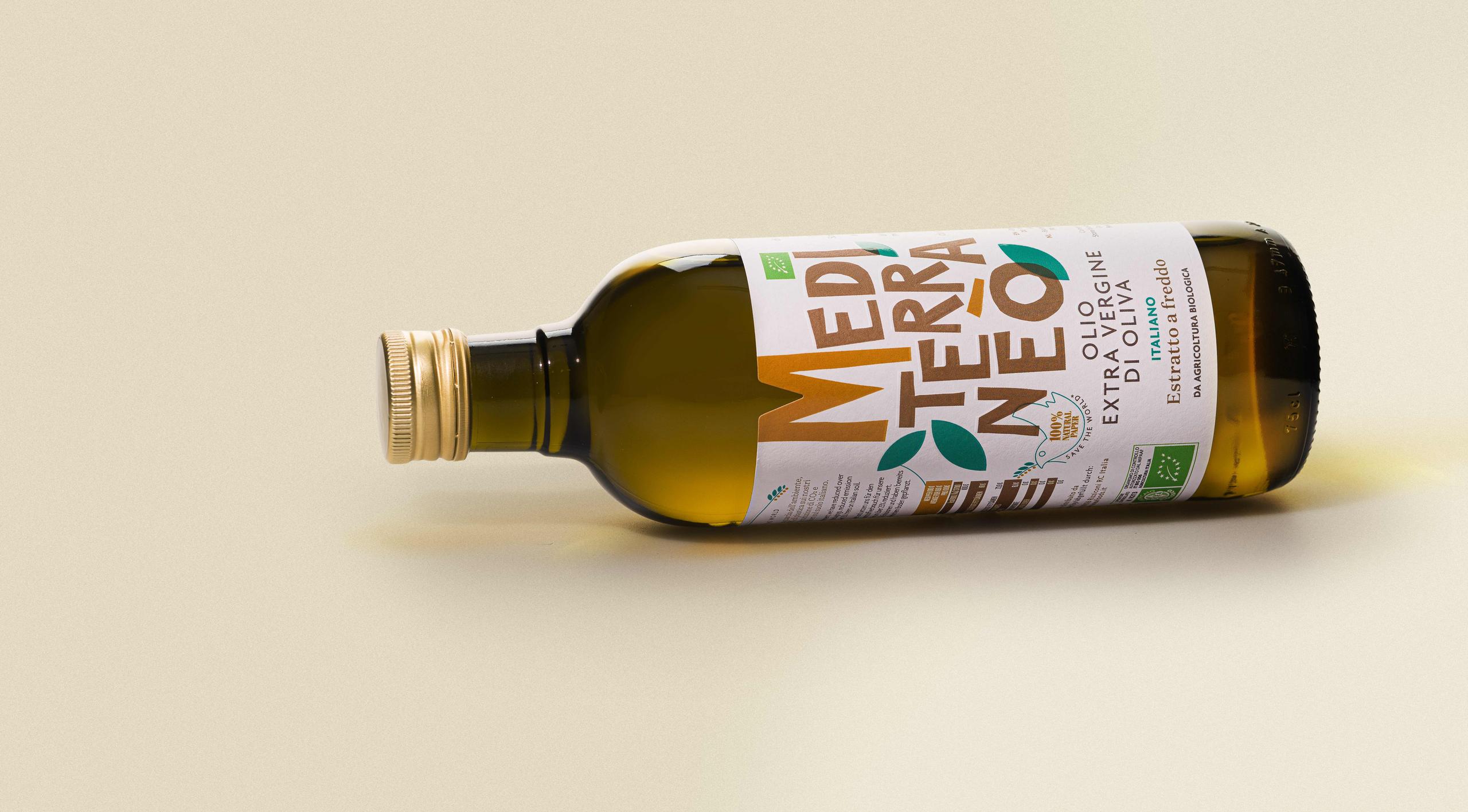
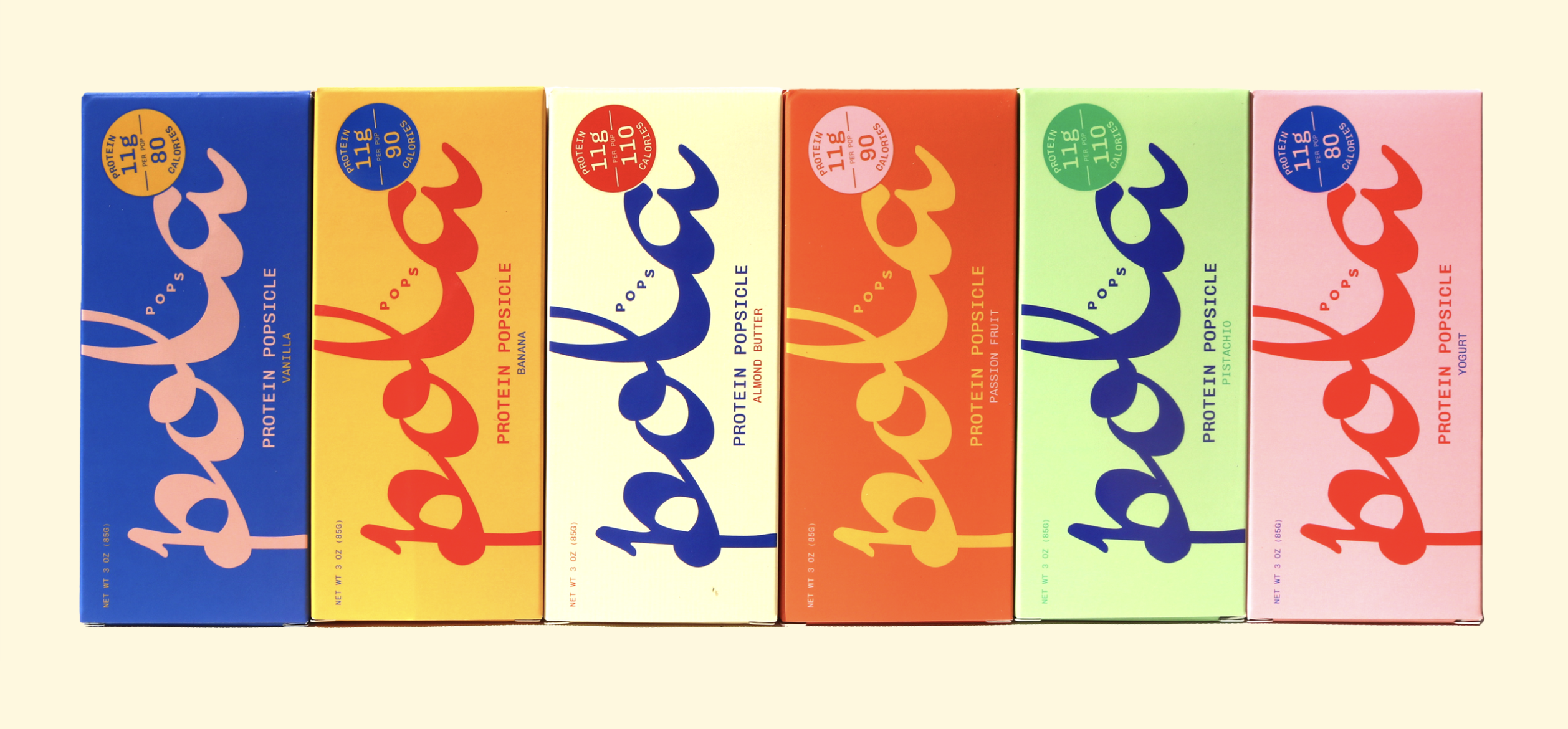
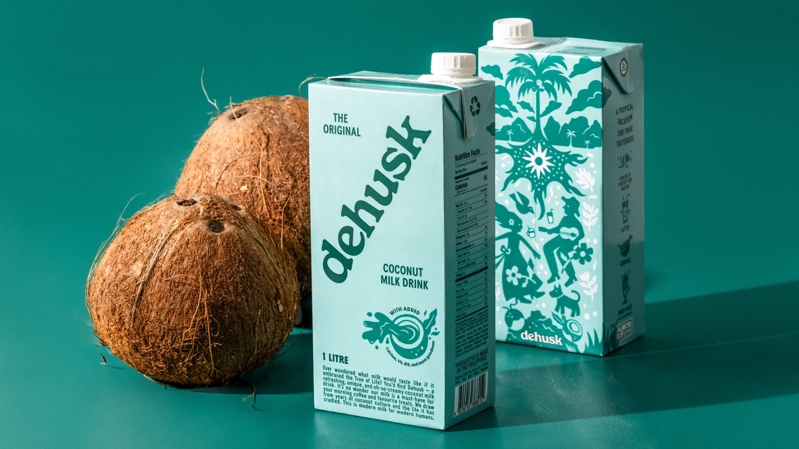
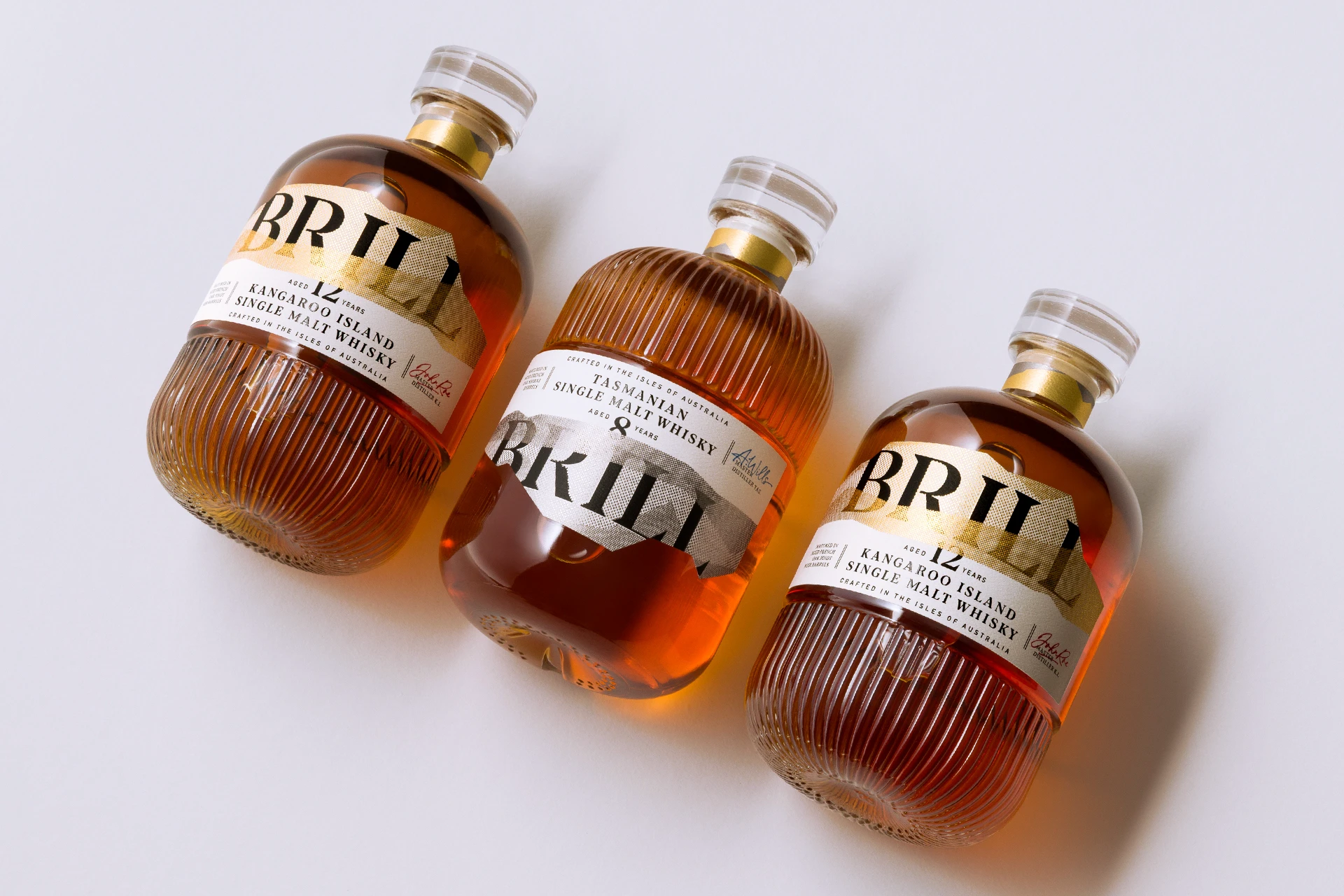
Featuring predominantly earthy, neutral tones, the design on each bottle of Mediterraneò olive oil is both traditional and striking. The font choice and M-shape cut on the label provide a playful twist and showcase for A & P’s unique vision. The combination of matte paper and shiny print are representative of both the extra virgin olive oil’s quality and the brand’s ethos with regards to being environmentally-friendly. Every aspect of the bottle’s design is intentional and detailed.
Now we just need some bread to dip into it.