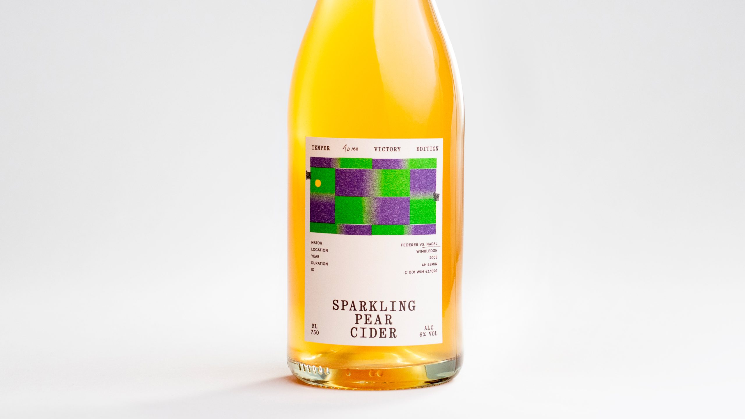
The 2008 Wimbledon final between Roger Federer and Rafael Nadal lasted four hours and 48 minutes, stretched across five sets and rain delays before Nadal won as darkness closed over Center Court.
Hono Studio turned that tennis marathon into something unexpected for TEMPER, translating the final point into sixty individual frames and giving each of sixty cider bottles its own moment in the sequence. The green and purple court is distilled into chunky geometric blocks with a tiny orange ball, then risograph-printed by Herr & Frau Rio, giving the image the grain, imperfect registration, and tactile character associated with independent printmaking. Instead of the orchards and fruit drawings, the label feels more like an experimental editorial design, with match data surrounding the court like an archival sports document. It taps beautifully into the fascination with limited editions and collectible packaging, but takes the idea one step further by having the bottles assemble into one of tennis history’s most memorable points. It’s sports, data, and design all wrapped up for cider. That’s the kind of whimsy I love to see. packaging
















