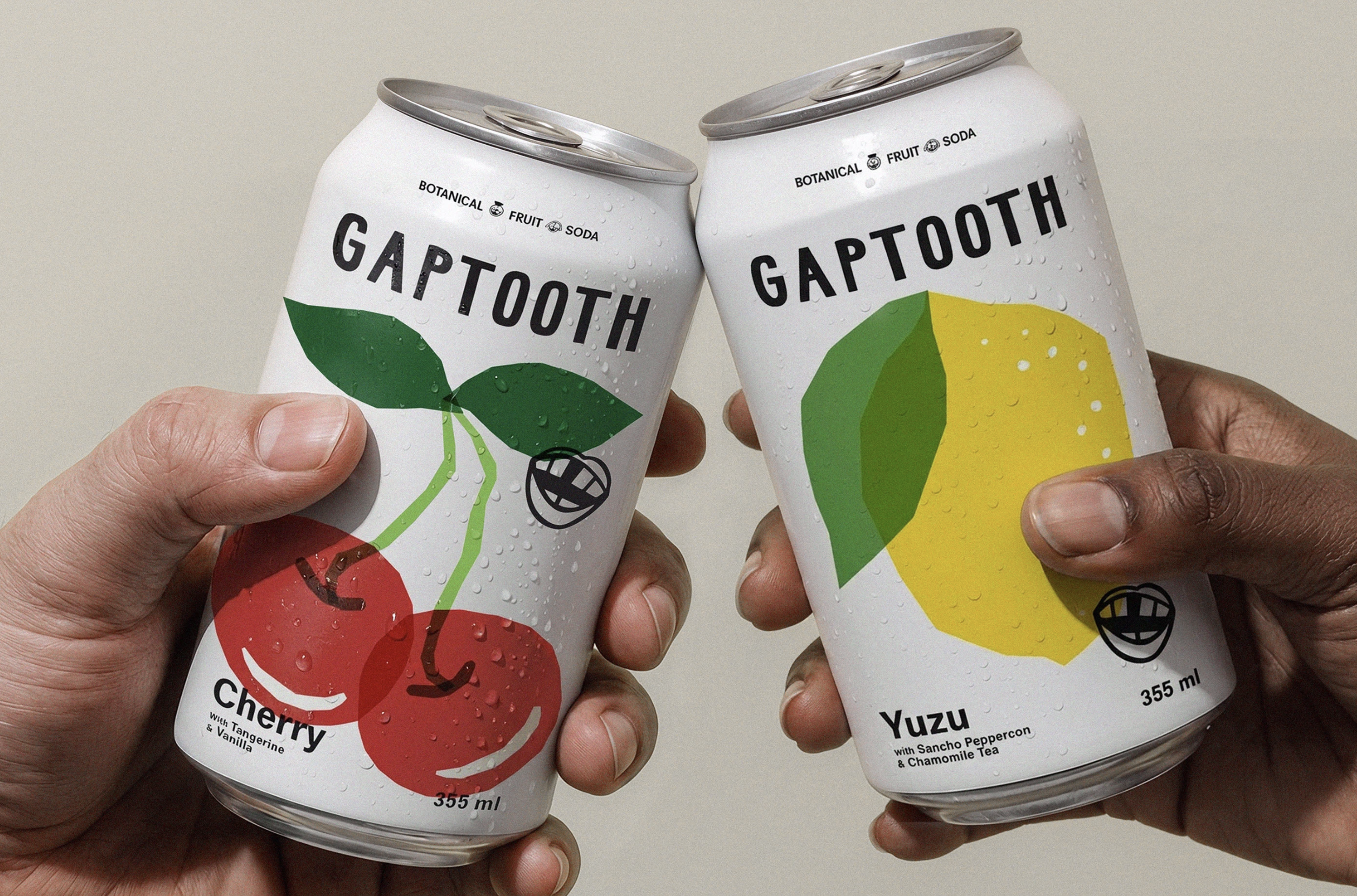
Soda packaging design seems to be either ultra-polished or overly wellness-coded. Gap Tooth Soda, designed by Saint-Urbain, leans into personality in a refreshingly human way.
The design agency built a system that celebrates imperfection, using simple fruit illustrations that are slightly offbeat and playful. The typography is clean and direct, with an unfussy sans serif that lets the name sit confidently while giving the artwork space to shine. The illustrations feel almost like cut paper shapes, nodding to folk art and everyday creativity rather than polished commercial imagery. What makes this stand out is how it brings back the fun and personality of soda without relying on nostalgia, creating something that feels current and charming.