Dauren Serikbayev Branding studio

Zigi-Su redefines the premium water archetype by challenging the industry’s obsession with “weightlessness.” While competitors pursue ethereal transparency, Zigi-Su explores the profound tension between fluidity and mass. Sourced from a 500-meter artesian depth, the water carries the geological memory of stone and immense tectonic pressure.

The concept is a sculptural manifestation of the “artesian gorge” – a dialogue where water is not a passive liquid, but an active, carving force. By moving from conventional packaging to sculptural storytelling, the brand positions itself as a source of primal energy. It is a tribute to the journey from darkness to light, transforming an ancient geological process into a bold, architectural statement. Zigi-Su does not merely illustrate purity; it embodies the raw, unyielding power of its origin, offering a defiant alternative to the visual monotony of the category.

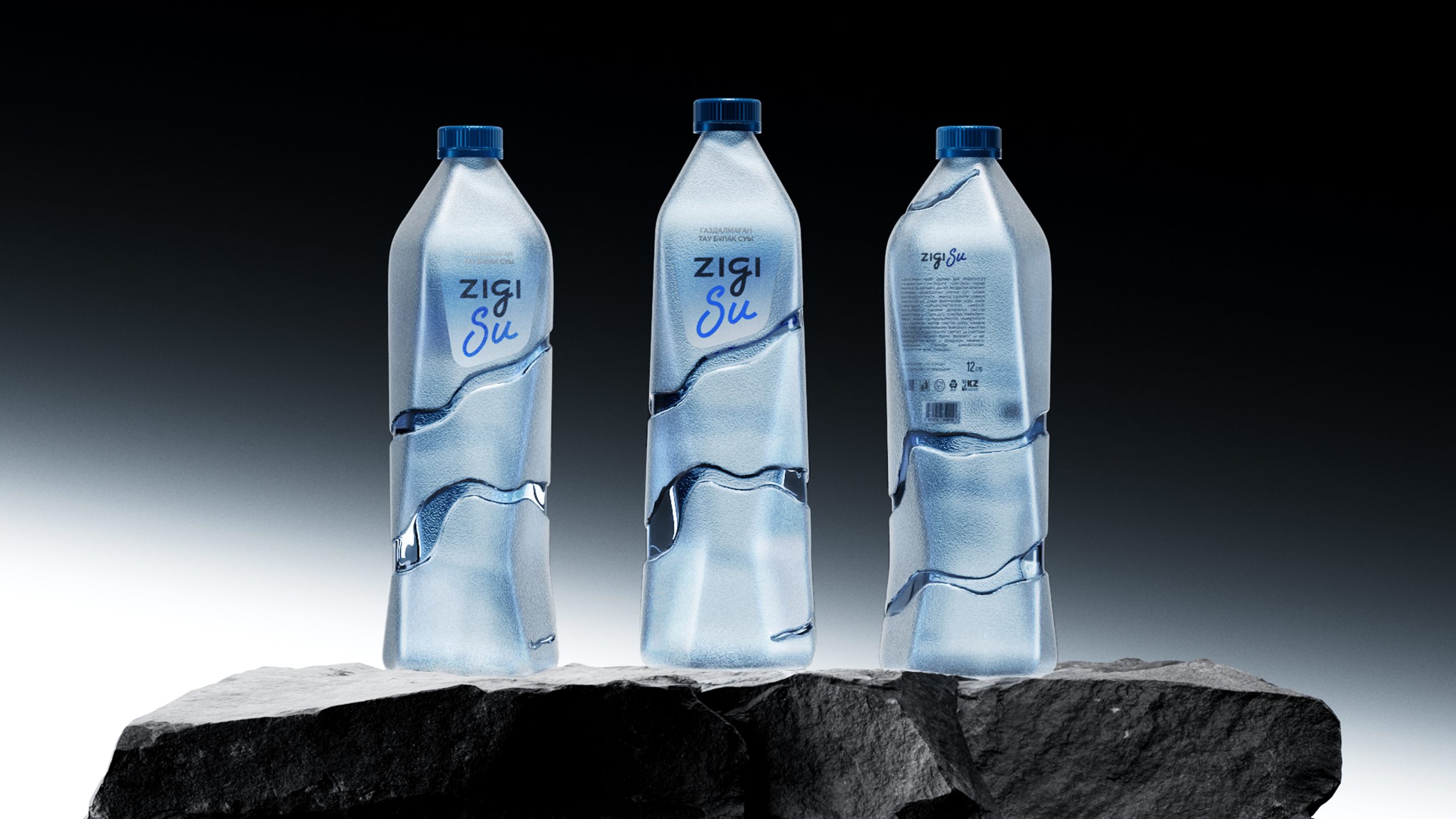
The bottle is conceived as a monolithic volume disrupted by deep, organic fissures, referencing stone fractured by hydraulic force. The execution relies on a sophisticated dual-texture strategy: a matte, mineral-finished surface evokes raw rock, while high-clarity transparent fractures reveal the liquid within. This “visual reveal” mirrors a hidden spring breaking through the Earth’s crust.
This design elevates the user experience into a sensory artifact. The irregular fissures provide a unique ergonomic grip, creating a tactile connection between the hand and the geological narrative. By stripping away traditional labels and utilizing minimal, debossed typography, the materiality leads the conversation.