‘C’ is for Beer: Auge Design Brews Up a Bold Identity For Castello
By
Published
Filed under
By
Published
Filed under
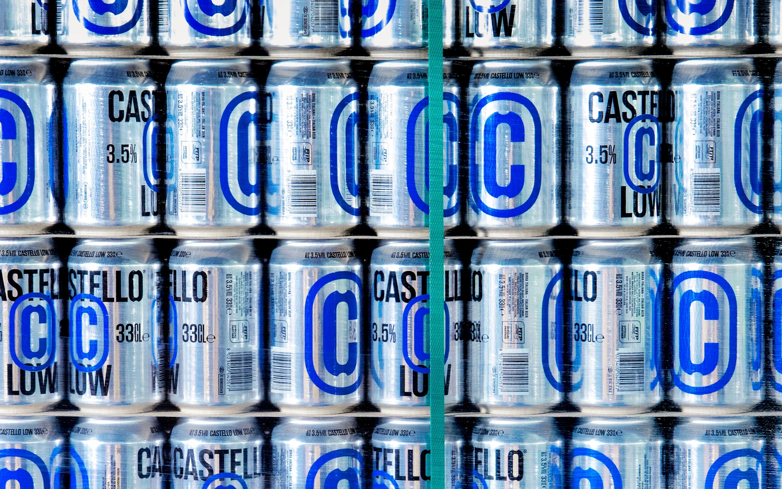
Birra Castello’s identity leans on a single oversized C that functions almost like industrial signage.
Auge Design uses the letter as an anchor, scaling it across cans and bottles so it reads instantly from a distance. The electric green and blue accents cut sharply against the aluminum and dark glass, giving the lineup a high-visibility energy. The result is a system that feels engineered for shelves, stadium coolers, and anywhere else attention is up for grabs. It’s editorial and high-energy, yet manages to be elevated and sleek.
Andrea Mastroluca, Associate Creative Director of Auge Design, gives more insight into the design process below.

What was the client’s brief for this project?
The client requested a rebrand to reposition Birra Castello as a strong, distinctive brand. In a market crowded with competitors that build their identity around heritage and local roots, Castello takes a different direction—choosing not to talk about history, but about the beer itself.
How did you execute the brief, and what were some of the strategic design elements that you built into the brand?
Our new strategic approach cuts through unnecessary storytelling and marketing noise to focus on what truly matters: a well-crafted, authentic beer that speaks honestly and directly with its audience.
To translate this vision into design, the new identity expresses Castello’s no-frills attitude, delivering a clean, bold, and democratic graphic language. The main visual system is built around an essential typographic structure, centered on the new Castello “C” badge, which serves as a strong and instantly recognizable brand symbol.
A simple and contemporary typeface supports a straightforward tone of voice, reinforcing the brand’s honest and unpretentious nature, while the color palette retains Birra Castello’s iconic black and expands it with vibrant color variations across the range.
That same sense of strength and clarity extends to the can design. The decision to keep it in raw steel captures the brand’s honest, unpolished character, while the metallic finish adds a cool, powerful edge that perfectly reflects Castello’s new visual attitude.
Every visual component, from the logo to the packaging and communication materials, follows a principle of clarity and directness, allowing the product to stand out on its own without unnecessary embellishment.

What was the most challenging part of the design process?
The biggest challenge was finding the right balance between simplicity and distinctiveness. Stripping the identity down to its essentials risked losing character, so the process focused on creating a minimal yet bold and recognizable system that could still express personality and stand out in such a crowded market.
What is your favorite part of the final result?
What we love the most is the easy boldness of the new identity, which gives the brand a confident, impactful presence on the shelf, especially when seen across a wall of bottles or cans, where repetition creates a powerful and distinctive visual statement.

CASE STUDY
Birra Castello is an Italian brewery that stands out for its direct and transparent approach. It speaks to genuine, straightforward individuals who value real taste without compromise. No frills, no artificial storytelling, just good beer.
The client requested a rebrand to reposition Birra Castello as a strong, distinctive brand. In a market crowded with competitors that build their identity around heritage and local roots, Castello takes a different direction, choosing not to talk about history, but about the beer itself.

Our new strategic approach cuts through unnecessary storytelling and marketing noise to focus on what truly matters: a well-crafted, authentic beer that speaks honestly and directly to its audience. The new identity translates this vision into a clean, bold and democratic graphic language that reflects Castello’s no-frills attitude.
The visual system is built around an essential typographic structure, centered on the new Castello “C” badge, a strong and instantly recognizable symbol. A simple, contemporary typeface supports a straightforward tone of voice, reinforcing the brand’s honest and unpretentious nature, while the color palette retains Birra Castello’s iconic black and introduces vibrant variations across the range. That same strength and clarity extends to the can design: the raw steel highlights the brand’s honest, unpolished character, while the metallic finish adds a cool, powerful edge that reflects Castello’s new visual attitude.


Executive Creative Director: Davide Mosconi
Associate Creative Director: Andrea Mastroluca
Designer: Federica De Cesare , Stefano Romano
Strategy Director: Luca Buonamici
Strategist: Beatrice Angiola
3d Artist: Sara Bigagli
Photo: Liver Studio


