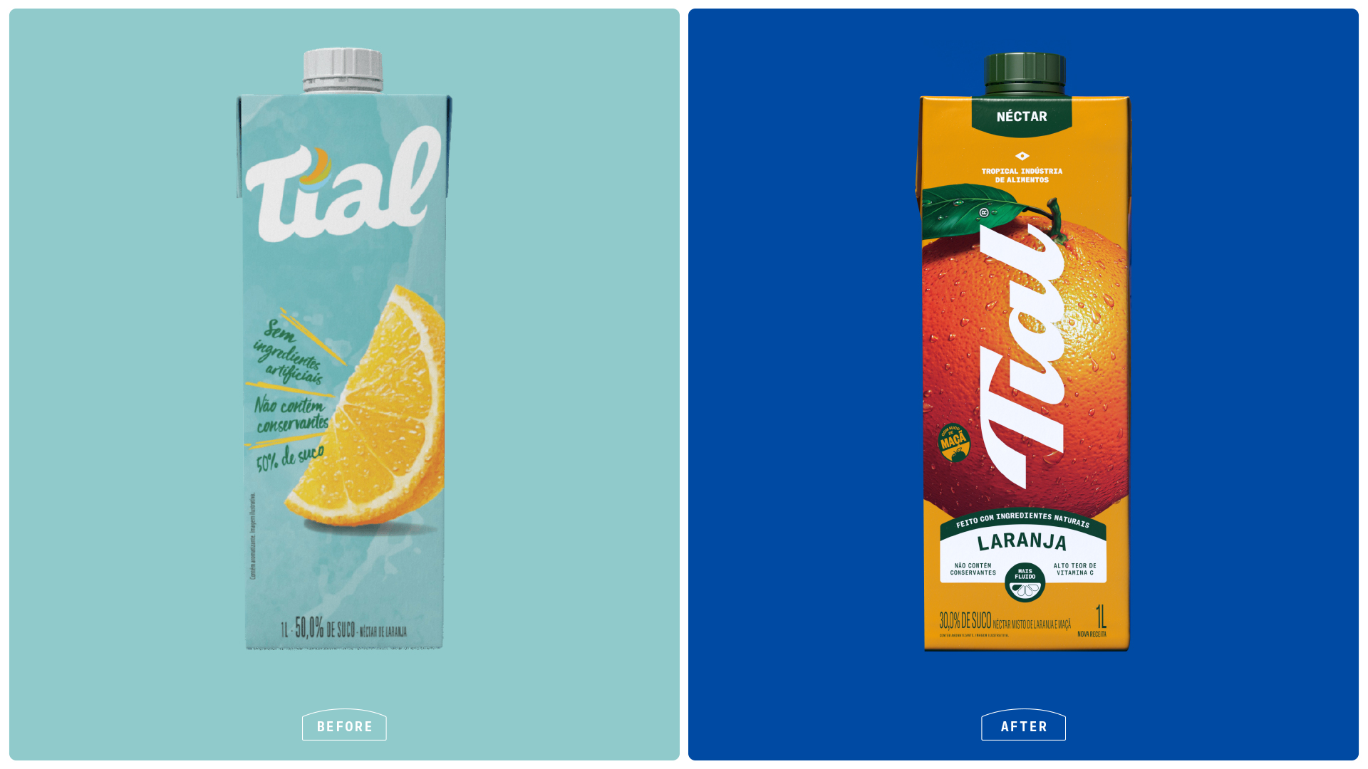
Brazil’s street markets, hand-painted signs, and overflowing fruit stalls are full of inspiration, and Tial’s redesign by HardCuore honors that culture at the scale it deserves.
Where the previous packaging sat quietly behind pale blues and a modest fruit illustration, the new system puts oversized photographic fruit in complete control of every carton, with each variety filling the entire face of the pack, making guava, passion fruit, mango, and pineapple feel irresistible. The Tial script logotype runs diagonally across the fruit in flowing white, directly referencing the handwritten signage of Brazilian open-air feiras, while the cobalt blue of the 100% juice line and the warm golden amber of the néctar range create a two-tier color system.
This is fruit as pure appetite appeal, and it is one of the most joyful and confident juice rebrands we’ve seen recently.

Tial is Brazil’s first preservative-free juice and a brand deeply rooted in the country’s culture. As part of its repositioning, the challenge was to reconnect Tial with its essence while evolving its visual identity and packaging system for a more contemporary and competitive market — without losing its popular and familiar character.
The starting insight was simple: Brazil is passionate about fruit. It appears in music, art, street markets and everyday expressions. Fruit is not just food; it is part of the country’s visual and sensory culture. The question became: how could this cultural truth be transformed into a distinctive brand asset?

The answer was Fruitagonism — a creative concept that places fruit at the center of everything. In the new packaging, fruit takes absolute protagonism, expressed through bold scale, vibrant color and indulgent presence to amplify freshness and appetite appeal. The system embraces a popular tropical aesthetic, celebrating Brazil’s everyday visual codes with clarity and impact.

The logo evolved through an organic redesign, respecting its legacy while refining forms with a more contemporary rhythm. Surrounding graphic elements draw inspiration from Brazilian street markets — handmade signage, fruit crates and the language of open-air fairs — bringing authenticity and warmth to the packaging.
Color plays a structural role in the system. A tropical palette of leaf green, ripe fruit yellow and sky blue evokes freshness and natural origin. Applied through strong color blocking, it enhances flavor navigation and builds a distinctive, high-impact shelf presence.
On shelf, the new architecture improves clarity and recognition. Fruit visuals identify flavors, color blocks organize product lines and the system balances cohesion with individual SKU differentiation. The result is a packaging design that feels expressive, confident and unmistakably Brazilian.
Fresh, natural and bold, Tial reclaims its space with a visual universe where fruit is not decoration — it takes center stage.