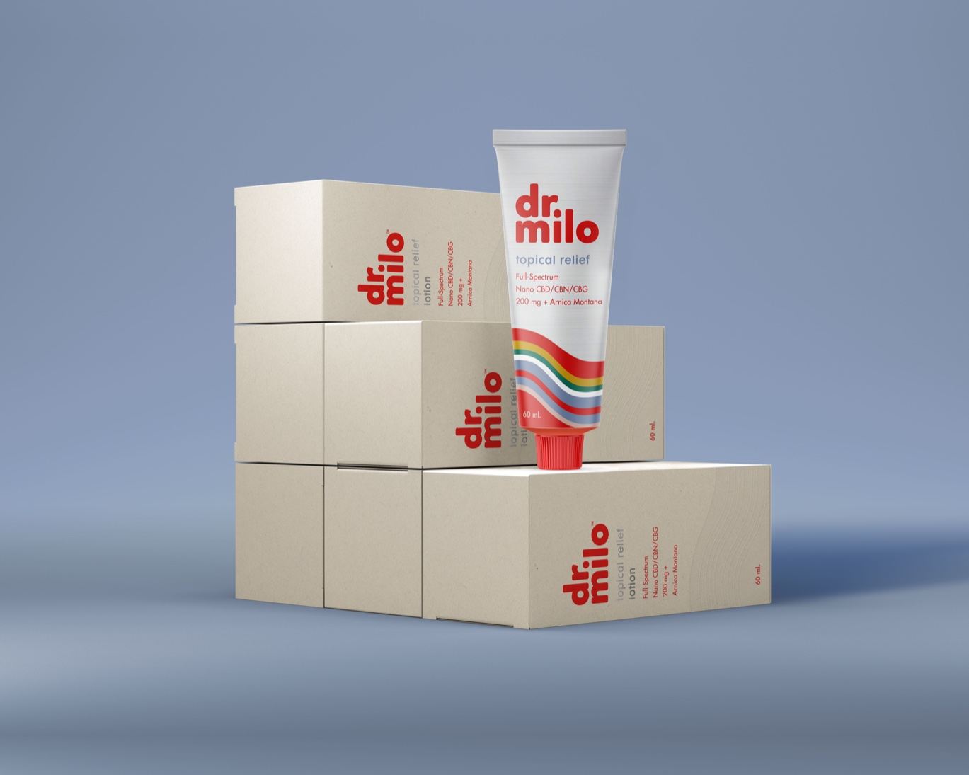
Dr. Milo is a pain relief serum with packaging that’s much more lighthearted than the purpose behind the brand. Through bright red, lively typography, and an aluminum tube, the brand’s packaging beautifully balances an approachable attitude that’s also highly trustworthy and restorative. While the design is simple, it certainly has a playful side creating standout packaging in a sea of dull medical designs.
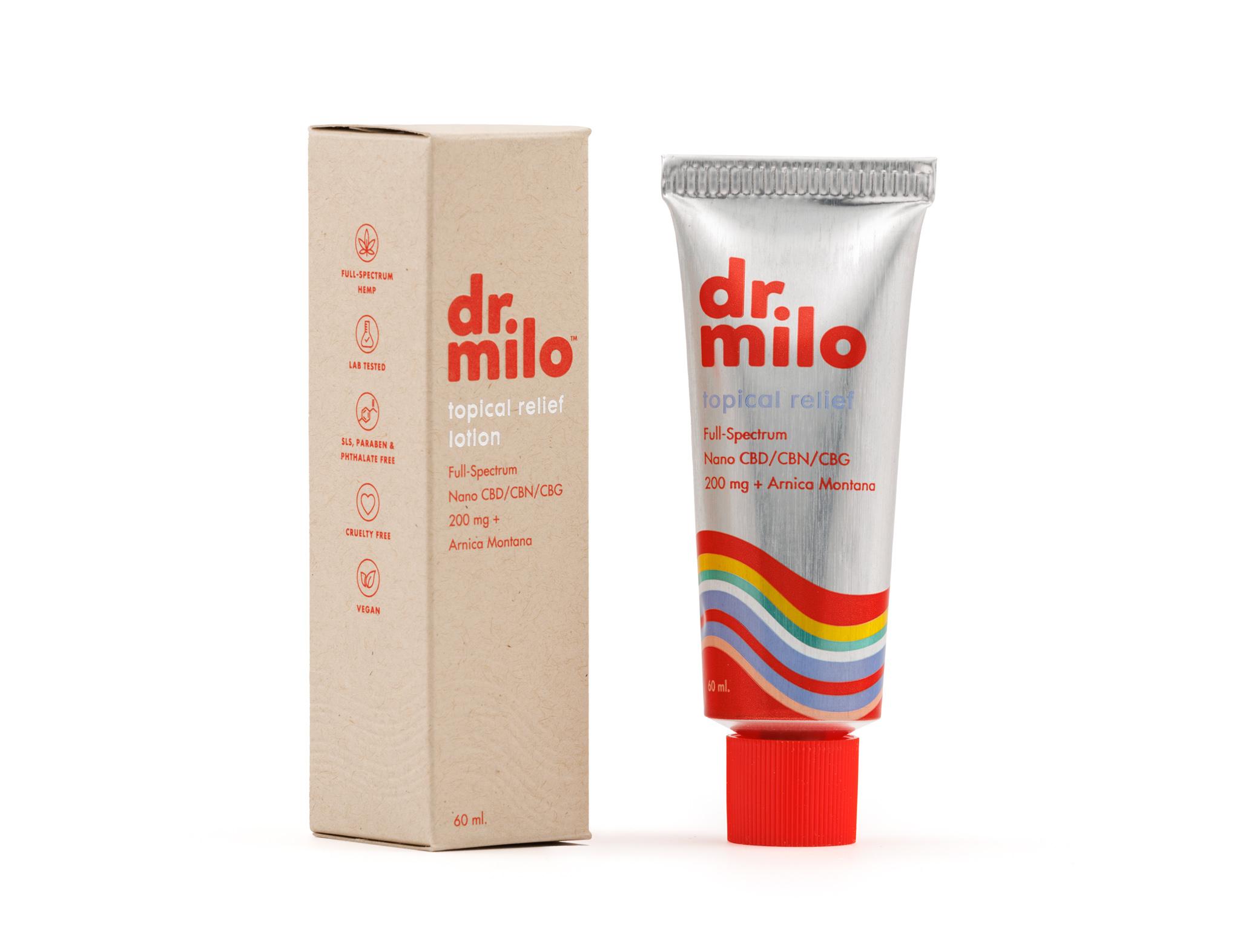
Our target was to create a more fun pain relief tube with a 70’s vibe for the older generation while staying poppy and fun. Our primary stacked logo is a custom font, our wave design was inspired by an australian psychedelic rock band and the bright red poppy brand color was inspired by the red cross to convey healing. We’re apart of 1% for the planet, and give back to Regeneration International to promote regenerative farming practices which is great for hemp farmers in America. We’re a Woman owned, family operated, hemp business.