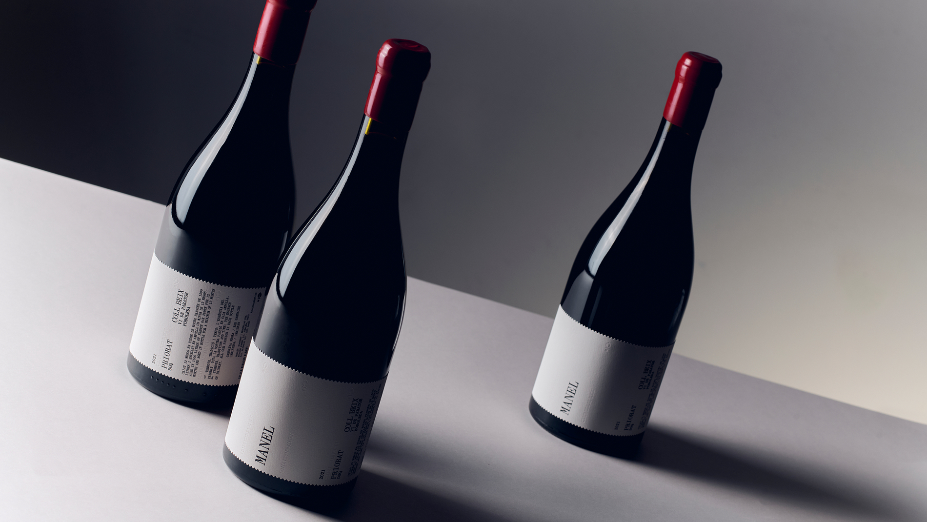
Priorat is one of only two regions in Spain, alongside Rioja, to earn the country’s top DOQ status. So when Celler Hidalgo Albert asked Atipus to update its Manel label, there wasn’t much room to get it wrong. The studio kept the winery’s original symbol, now blind-embossed into thick, textured paper, but stripped everything else back to typewriter-style text in Catalan and English, on a label with a serrated edge that looks like it was torn.
I love how quiet this is. There’s something so sleek and confident about a plain white label with a red wax top. The details only reveal themselves up close, which makes sense because I think some of the most engaging wine packaging trusts drinkers to lean in just a little to the self-importance of it all. Right? Maybe.