The hydration category is drowning in the same icy blue minimalism, so when a can shows up wearing electric pink, citrus green, it quickly stands out.
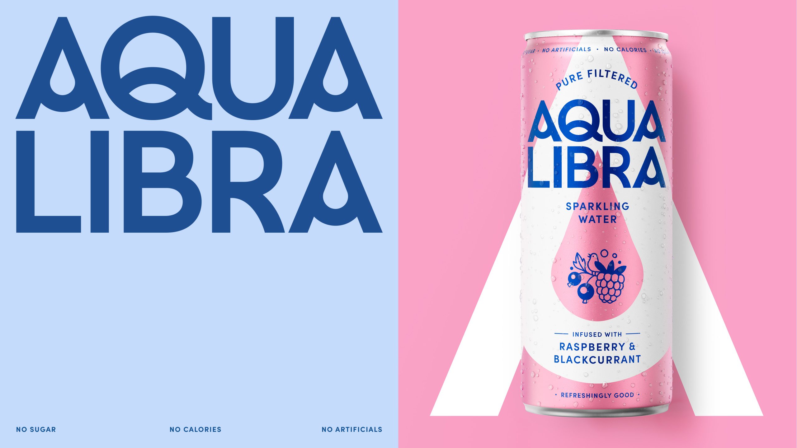
Magpie Studio‘s redesign for Aqua Libra translates the brand’s “Refreshingly Good” positioning into a playful yet elevated visual language. The typography leans into a wide, compressed sans serif for the Aqua Libra wordmark, which commands the upper half of the can with real confidence. The multipack boxes, where those same illustrations explode across the entire surface in vivid flat color combinations of hot pink, orange, and chartreuse, turn a stack of boxes into something a bit more interesting.

Rethinking Everyday Choice
Drinking water is good for us, but it is rarely something we feel excited about. Research revealed that only 5% of adults genuinely enjoy the taste of plain water, highlighting an opportunity to create a more flavour-led and emotionally engaging experience without relying on sugar or artificial ingredients. Aqua Libra set out to reimagine how water could look, feel and perform on shelf — making hydration something people actively want to choose.

As the UK’s fastest-growing infused sparkling water brand, Aqua Libra was already responding to shifting health and wellness behaviours. However, despite growth, brand awareness remained low, and its previous packaging wasn’t fully expressing the brand’s philosophy or helping it stand out in increasingly crowded retail environments.

Helping Water Win Attention
Working closely with Aqua Libra, a new strategic positioning — Refreshingly Good — was defined to celebrate the joy of water in all its forms, elevating hydration from a habit into a positive feel good choice. Packaging became the primary vehicle for expressing this shift, designed to balance clarity, character and shelf impact.
The brief was to build recognition and connection through the packaging and wider world.
At the heart of the new identity sits the signature droplet ‘A’, a symbol of refreshment and trust that anchors the system across every touchpoint. It is drawn from a refreshed wordmark that is bold yet sophisticated, finished with subtle liquid-inspired details. Around it, playful illustrations — created with Chris DeLorenzo — celebrate different moments of water, with each flavour inspired by a distinct environment, from open oceans and quiet lakes to everyday encounters with rain and sun, helping the brand feel engaging and emotionally resonant each time.
A Joyful World of Water
Rather than relying on flavour cues alone, the illustrations reward closer interaction. On single cans, illustration captures a focused moment — a snapshot of flavour and environment — while on multipacks and larger canvases, these moments expand into richer, more immersive worlds. This layered approach allows the illustrations to work both individually and collectively, building recognition while encouraging discovery and emotional engagement over time. A more emotive illustration style differentiates Aqua Libra in a category dominated by flavour-led cues, establishing a more lifestyle-driven and distinctive visual language.

The illustrative style is deliberately handcrafted. Loose, free flowing linework creates a sense of rhythm and fluidity that mirrors the movement of water itself. Imperfections are embraced to give the illustrations a human, tactile quality that feels warm and approachable, helping Aqua Libra feel alive, optimistic and full of character.
Taking cues from lifestyle and wellness brands rather than the soft drinks category, the brand system is expressive, optimistic, and distinctive. A flexible toolkit of illustration assets scale up and down across applications, from contained scenes on-pack to broken out moments of positivity and world-building in key visuals. Together with uplifting copy and sun-soaked lifestyle imagery, the brand creates a clear and compelling sense of optimism and positivity around everyday hydration.
Aqua Libra’s refreshed identity reimagines what water can look and feel like. The result is packaging & a wider brand world that invites people to pause, engage and connect — transforming drinking water from something people feel they should do into something they genuinely want to choose.


