
–196 is a long-established Japanese RTD chuhai brand with deep cultural presence and a loyal following built over decades. Throughout its history, the brand evolved into two dominant sub-lines: a 9% high-alcohol series centered on the idea of “blowing away stress” through powerful impact, and a 7% sugar-free series known for its sharp, intense refreshment. Both lines were unapologetically strong in character and highly successful, earning passionate fans through their unmistakable intensity. Over time, however, that very strength came to define the public perception of the entire brand. For many consumers—particularly working adults in their thirties—–196 began to feel like a brand for people actively seeking powerful stimulation, something bold and compelling, yet slightly intimidating or difficult to pick up casually for everyday moments.
This shift in perception became the starting point for a fundamental rethinking of the brand’s role in people’s lives. Consumers in their thirties are often navigating the busiest period of adulthood: demanding careers, evolving life stages, family responsibilities, financial pressures, and a constant awareness of limited time. In interviews, many expressed the same quiet but telling sentiment: when they choose alcohol, they want it to be the one moment in the day that does not add stress. Alcohol, in this context, is no longer about escape or excess, but about release—about choosing something easily, without overthinking, and feeling gently reset afterward.

The –196 Standard Line was created directly from this insight. Rather than relying on strong stimulation to erase stress, the goal was to offer something fundamentally different: a chuhai that feels clear, honest, and emotionally light. A drink that does not overwhelm, but instead helps people face tomorrow with a slightly lighter heart. If the existing –196 lines were built around intensity and impact, the Standard Line would be built around clarity. Not excitement, but openness. Not aggression, but quiet confidence. The sensation we aimed to create was simple and universal: the feeling of breathing out.
To bring this idea to life, we turned to a new source of inspiration—the freshness of fruit harvested in the early morning. Fruit picked at dawn carries a particular brightness and transparency; the moment you take the first bite, there is a natural lift, a subtle optimism that feels both physical and emotional. This sensation of “the first bite of fruit” became the conceptual foundation of the Standard Line. Guided by this idea, three flavors were developed, each expressing a different nuance of clarity: Lemon, with its clean, sharp refreshment; Shine Muscat, offering a translucent sweetness deeply appreciated in Japan; and White Peach, with its soft, gentle, and calming character. Instead of emphasizing alcohol strength, the liquid design prioritizes the vividness and honesty of real fruit, allowing freshness to lead the experience.
This philosophy of clarity extends seamlessly into the packaging design. The Japanese RTD shelf is typically dense and visually demanding, filled with metallic finishes, bold typography, flavor claims, and layered information all competing for attention. In such an environment, choosing a drink can itself become a small source of cognitive fatigue. If the goal of the Standard Line was to reduce stress and make the act of choosing feel effortless, the design needed to remove anything that contributed to visual or mental overload. The solution was not to add a new kind of loudness, but to practice radical subtraction.
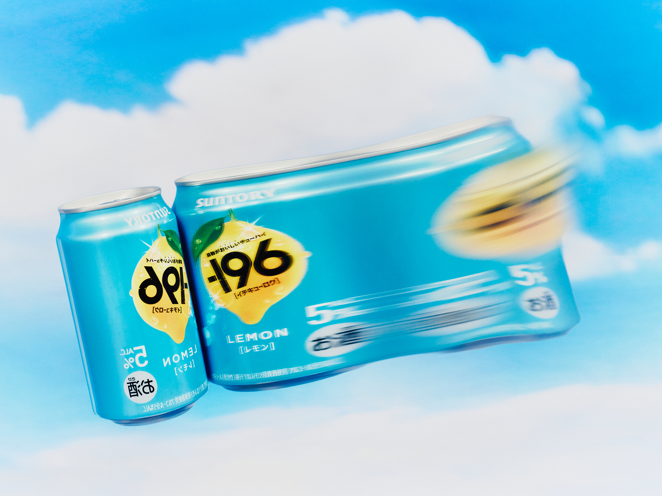
Each can in the –196 Standard Line is constructed from just two essential visual elements: a sky-blue background inspired by a clear, cloudless sky, and a single, abundant fruit illustration placed boldly at the center. The blue is carefully calibrated—not simply as a color, but as a psychological cue. It evokes openness, brightness, and the feeling of fresh air, similar to the moment when someone looks up from a busy day and notices the sky. On a crowded shelf, this blue does not compete aggressively; instead, it creates a sense of space, allowing the product to be seen naturally.

The fruit illustration plays an equally important role. Positioned prominently and without unnecessary decoration, it enables immediate flavor recognition, even from a distance, eliminating hesitation at the point of purchase. At the same time, the fruit communicates abundance, juiciness, and natural positivity, symbolizing the product’s reliance on honest fruit freshness rather than artificial impact. There is no need to read closely or process multiple claims—the design speaks directly and intuitively.
Notably, the packaging avoids explicitly labeling the product as a “Standard Line.” Only the small –196 logo remains, placed with restraint, like a craftsman’s mark rather than a headline. This decision reflects the brand’s evolution. Where –196 once expressed strength through volume and intensity, it now expresses confidence through clarity and restraint. The design does not insist; it assures.
When placed on shelf, the –196 Standard Line behaves differently from conventional RTDs. Surrounded by products that compete through color, text, and visual density, the Standard Line stands with a calm, upright presence. It does not shout, yet it is unmistakably visible. The sky-blue field gently draws the eye, the fruit communicates instantly, and the minimal typography delivers meaning without demand. By refusing to over-explain or over-decorate, the product asserts its identity with quiet strength. It is this honesty and self-assurance that allows it to stand out naturally.

As a result, the consumer experience changes in a subtle but meaningful way. The act of choosing becomes easier, lighter, and more intuitive. There is less to decode, less to compare, less to consider. Consumers simply recognize what the product is and what it offers, and feel comfortable picking it up. The design reduces not only visual complexity, but also emotional friction, aligning perfectly with the original insight that alcohol should not add stress.
For the –196 brand, the Standard Line represents a significant transformation. It expands the brand’s identity from “strong and intense” to “clear, honest, and approachable,” inviting in consumers who previously felt that –196 was not meant for them. As a permanent line rather than a limited edition, it becomes a new reference point—a redefinition of what “standard” can mean within the brand.

Beyond the brand itself, the –196 Standard Line also proposes an alternative direction for the RTD category as a whole. In a market long driven by escalation—stronger, flashier, more stimulating—it suggests that modern consumers are not always seeking impact. Increasingly, they are seeking clarity, calmness, and a momentary release from mental noise. By prioritizing readability over complexity and emotional openness over intensity, the Standard Line reflects a broader shift in how people want everyday products to fit into their lives.
Ultimately, the value of the –196 Standard Line is intentionally simple. It captures the feeling of looking up at a clear sky during a busy day. It delivers the natural, optimistic energy of the first bite of fresh fruit. And it transforms both the act of choosing and the act of drinking into a small, restorative experience. You don’t need to think. You don’t need to hesitate. You simply pick it up, take a sip, and feel slightly more hopeful about tomorrow. In this sense, the –196 Standard Line is not just a product, but a quiet companion—one that brings a touch of clarity into everyday life, and redefines what “standard” can be.