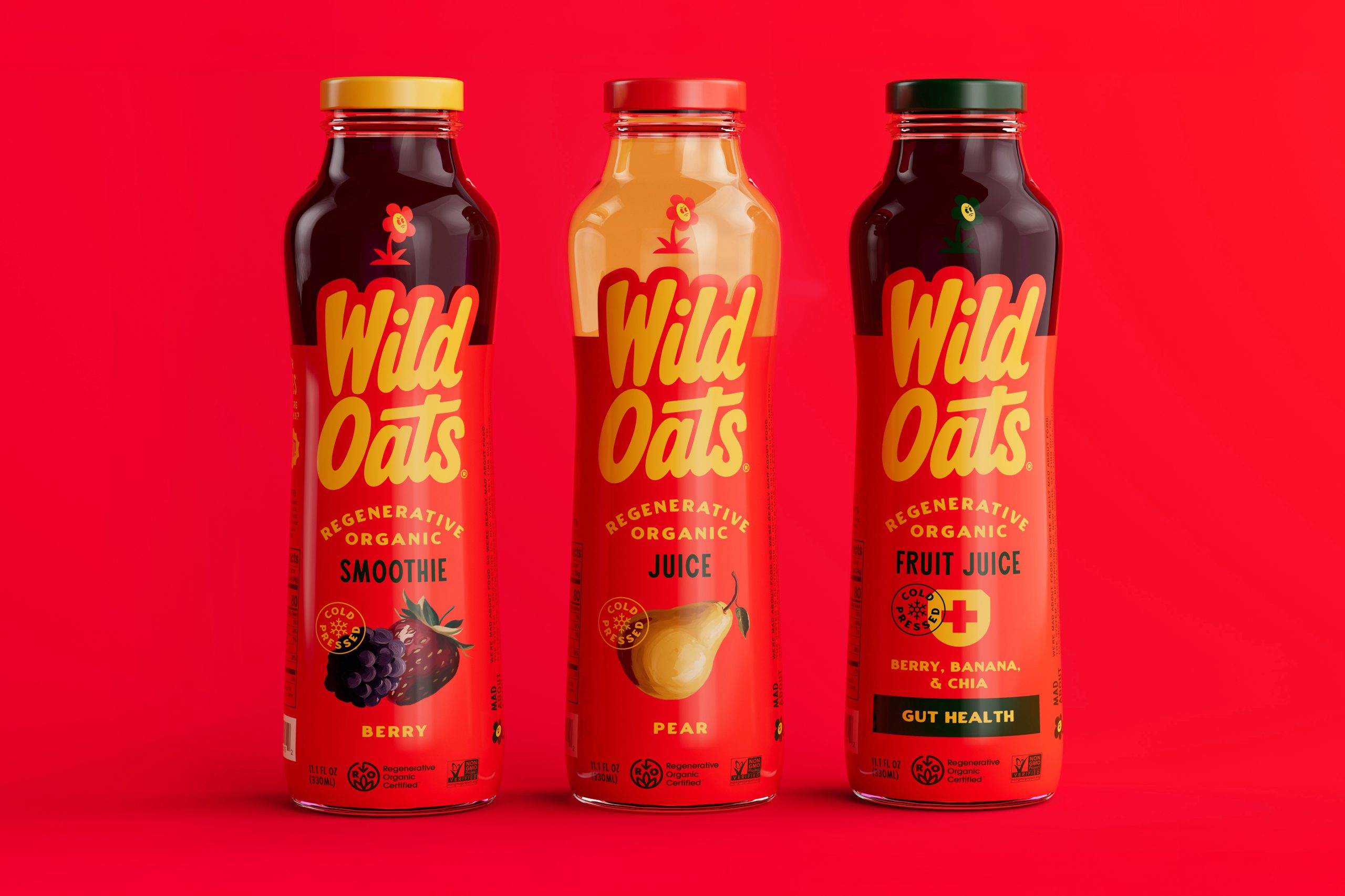
We’re so accustomed to organic and natural food brands whispering in shades of sage green, oat beige, and recycled kraft, so when something screams red from the cold-pressed juice shelf, I stop in my tracks.
Wild Oats helped define the natural foods movement in the 1990s before disappearing after an acquisition. It has now returned with a raging red identity from Sukle, seemingly channeling genuine anger at what has happened to the food system it once helped build.
A small illustrated flower icon sits above the wordmark with the simplicity of a folk art stamp, a nod to the natural world that grounds the otherwise electric design in something rooted and real. What Sukle has built here is a packaging system that uses color boldly, turning regenerative organic certification into something that feels urgent and exciting rather than niche and earnest, which is exactly the energy the natural foods movement needs right now.