Turner Duckworth Redesigns Blue Diamond’s Barista Almond Milk
By
Published
Filed under
By
Published
Filed under
Blue Diamond’s Barista Almond Milk has always tasted great, but up until recently, its packaging didn’t quite speak to the coffee shop market. As any coffee drinker well knows, coffee shops and cafés are all about vibes.
Okay, maybe not all about vibes, the coffee should probably taste good too, but a critical factor for success is the aura, energy, look, and feel of the space and brand. Blue Diamond identified that their almond milk packaging wasn’t nailing this aspect of the market, and Turner Duckworth swooped in to fix it.
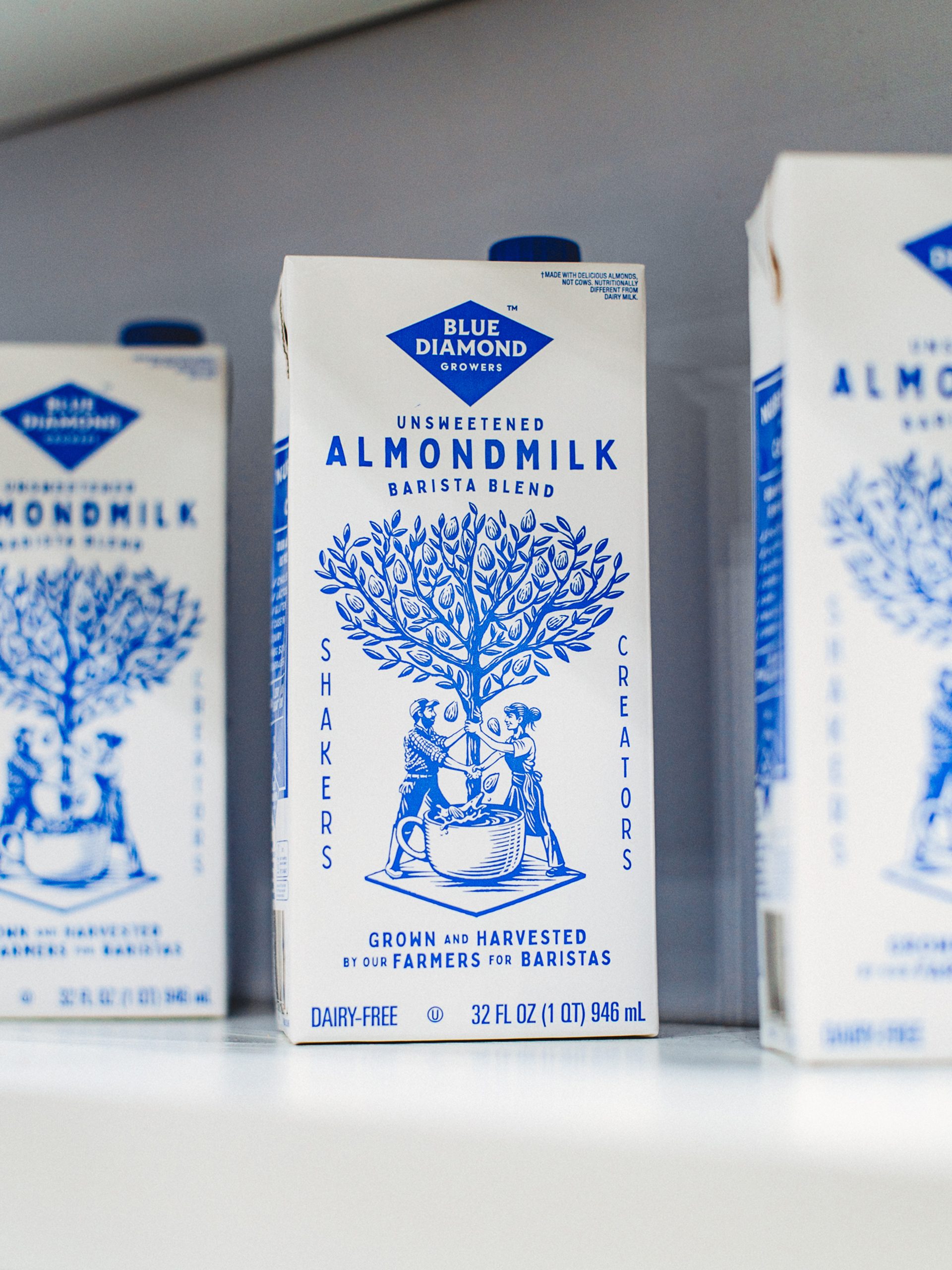
They created a new brand system that puts the Blue Diamond grower-owned brand story at the center of the packaging, positioning the “shakers” and the “creators” together in harmony. The limited color palette of a rich classic blue on white feels provincial, classic, and sweet, with indirect nods to toile or china. The storybook illustration—created by Tobias Hall—ushers in warmth and playfulness, along with the irregular woodcut textures of the typography and line quality throughout.

Today, baristas aren’t short on options. They’re not just choosing milks that perform well, but those that feel right. Is it responsibly sourced? Does it look the part? Does it reflect the values of the people behind the counter?
Blue Diamond’s Barista Almond Milk was developed to meet the demands of quality coffee—neutral taste, great stretch, and perfect foam. But as a brand, it spoke more to the supermarket shelf than the independent café. In short, it didn’t look like it belonged.
So, we designed an identity that did.

The new look and feel, built with baristas and coffee counters in mind, brings Blue Diamond’s grower-owned story to the forefront. A stripped-back aesthetic mirrors the small-scale nature of the cooperative—farmers and orchards working together. Once expressed, the story aligns naturally with the values of the cafés it’s made for.
At the centre of each carton is a new brand emblem: a symbol of partnership between “Shakers” and “Creators.” Every almond is quite literally shaken from the tree, connecting grower and barista in a shared craft. This is supported by a suite of illustrations that bring coffee culture to life through irregular woodcut textures, expressive lines, and characterful forms.
A palette of blue and white—nodding to both brand equity and familiar dairy codes—is applied with lo-fi simplicity, creating a direct, from-the-orchard feel. This lo-fi aesthetic extends across touchpoints, from silkscreened tees and totes to A-boards, loyalty cards, and signage.
The result is a cooperatively grown almond milk that now belongs as much in coffee shop culture as it does in quality coffee.


