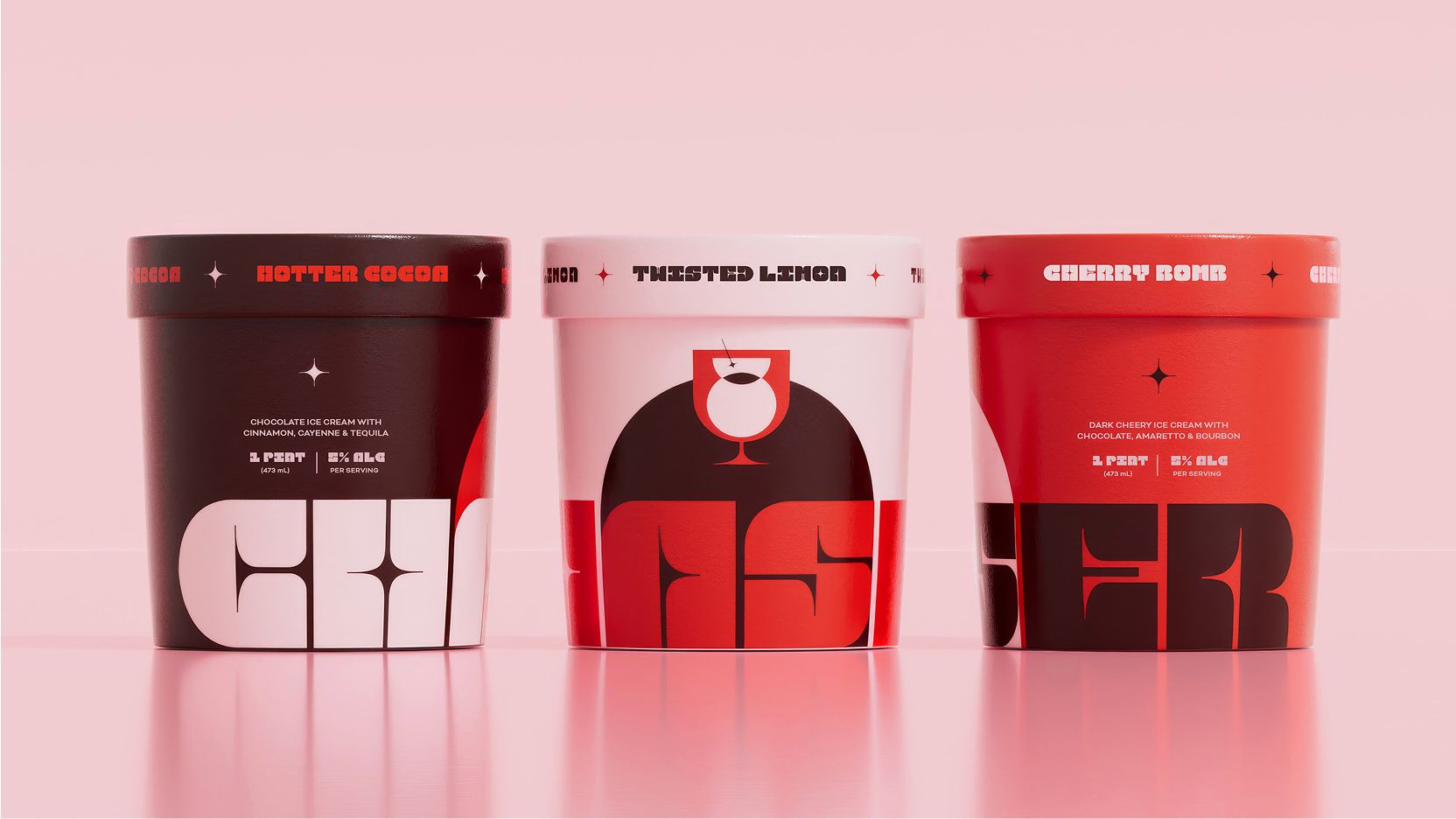
Boozy ice cream is a world of its own, and SO Dsgn‘s work on Chaser took it in a graphic route.
The whole identity for the concept project centers on a martini glass silhouette that becomes an arch sitting right behind the logotype, as both a cocktail reference on every pint. That custom typeface pulls from art deco cinema signage, giving the brand an almost 1970s lounge attitude rather than anything cutesy or dessert-coded. It is a smart way to signal an adults-only treat without leaning on the usual liquor-bottle clichés that so many spiked-dessert brands default to.