Wellness packaging, specifically in the eye health and vision space, has never really been anything to write home about.
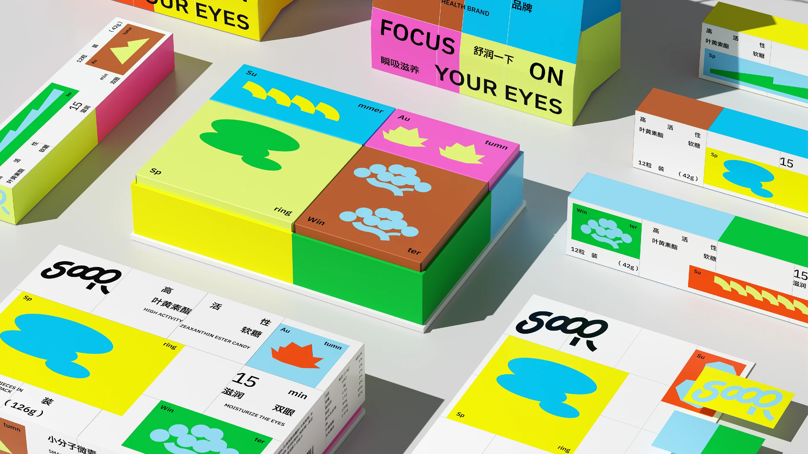
Instead of one label wrapped around the whole box, Atomerg Studio splits the package into four distinct panels, one per season, each carrying its own color and icon set. Spring turns pale yellow-green with a soft tree mark, summer turns orange with wave-like lines, autumn turns brown with cloud-shaped leaves, and winter cools down to blue and green with mountain and tree icons. The effect reads almost like a set of stacked building blocks rather than a supplement carton, and that shift matters.
This kind of segmented, almost architectural packaging is showing up more and more. SOOR proves that a health product can lean fully into color and geometry without losing any of its credibility.