Tozi Azteca’s Redesigned Packaging Is A Modern Take On Aztec Architecture
By
Published
Filed under
By
Published
Filed under
There’s a fine line between honoring a brand’s historical roots and making it seamlessly mass-marketable without losing the magic of what makes the brand special or intriguing in the first place.
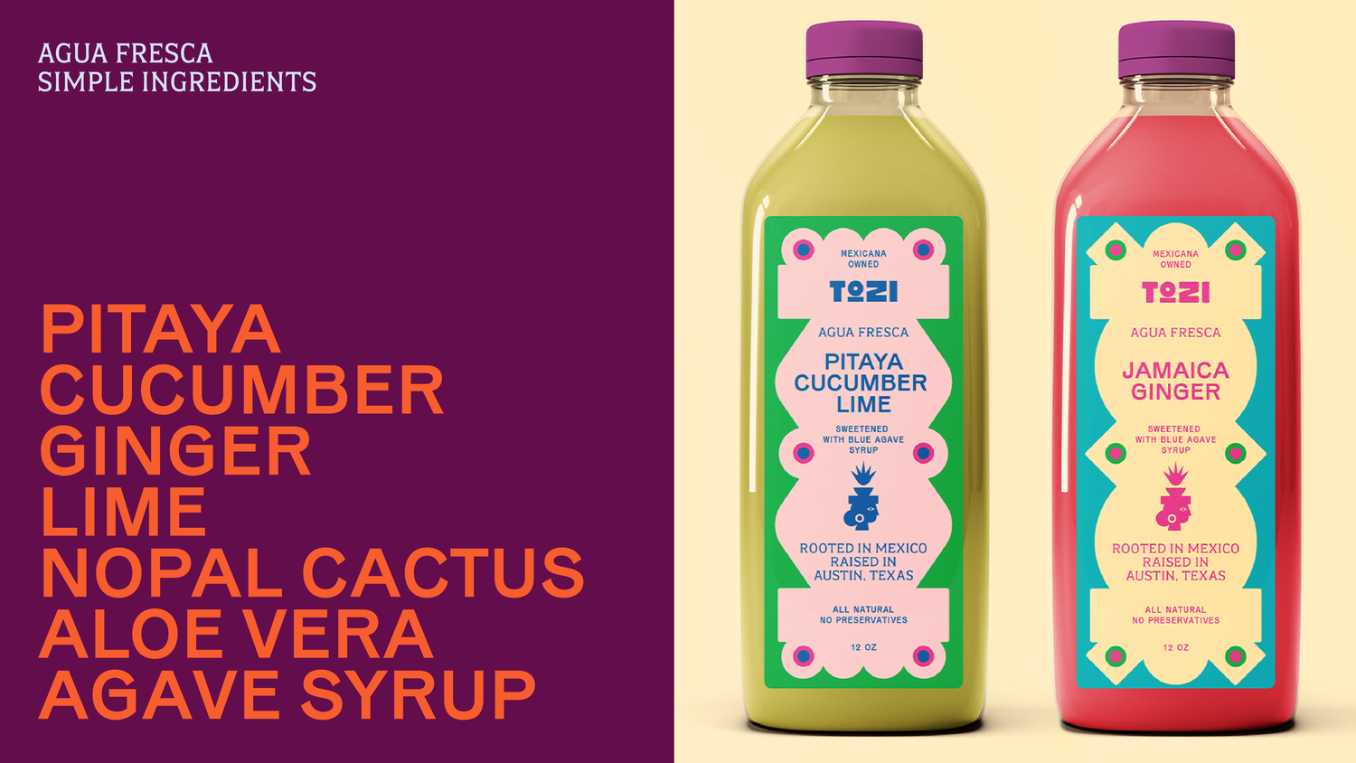
If Only Creative‘s Marisa Sanchez-Dunning collaborated with Mexican designer Sofia Llaguno to design a vibrant, bold visual identity for Tozi Azteca Superfoods, a Mexicana-owned brand rooted in ancestral knowledge and innovative nutrition. The brand’s redesigned packaging makes a visual statement that certainly honors the brand’s Aztec inspiration while still appealing to a modern, health-conscious audience.

“Our mission was to help Tozi level up—from a start-up you’d find at your local farmer’s market to a retail-ready, Whole Foods and Walmart star aimed at traditional Latino households in addition to Gen Z Latinos, plus, anyone who is mindful of their health and wellness,” says Sanchez-Dunning.
Central to Tozi’s design is the bright color palette. Upbeat magentas, lime greens, and sunshine yellows are paired with deep purples and blues, creating an interplay that displays a dynamic approach to design and pays homage to the vivid hues seen in Mexican art and textiles. “We wanted to build a design system with a big color palette that represented Mexican culture’s vibrancy, diversity, and celebration,” shares Sanchez-Dunning.
The typography also plays a critical role in anchoring the brand’s identity. The wordmark features bold, geometric lettering with symmetrical cuts and edges, a nod to the angular forms of Aztec stone carvings and architecture. Sanchez-Dunning notes, “The geometric design within the packaging design was inspired by ancient Aztec architecture. From the logo of Tozi, the Aztec goddess featured on the packaging, to the hierarchy that the text lays in on the packaging.”

Additionally, the minimalist logomark distills the Aztec goddess’s inspiration into a sleek figure. This design balances cultural significance with simplicity, making it easily recognizable across diverse applications, from bottles to tote bags. At the same time, the crown atop her head features a diverse range of graphic symbols. “On the agua fresca, you’ll see agave above Tozi’s head; meanwhile, you’ll find elote (corn) above Tozi’s head on both the tortilla chips and tortillas,” says Sanchez-Dunning. The switching out of the icons also lends itself to new products and offerings from the brand, giving the upstart a future-forward branding system.
So, while Tozi is a brand with roots in the farmer’s market, the leveled-up design system created by If Only Creative makes it a brand that can hold its own in a mass-market retailer without sacrificing the historical and ancestral roots of what makes it a distinctive brand. Through bright colors and geometrical design elements, the feeling of vitality loaded into this design system makes it visually crave-able.


