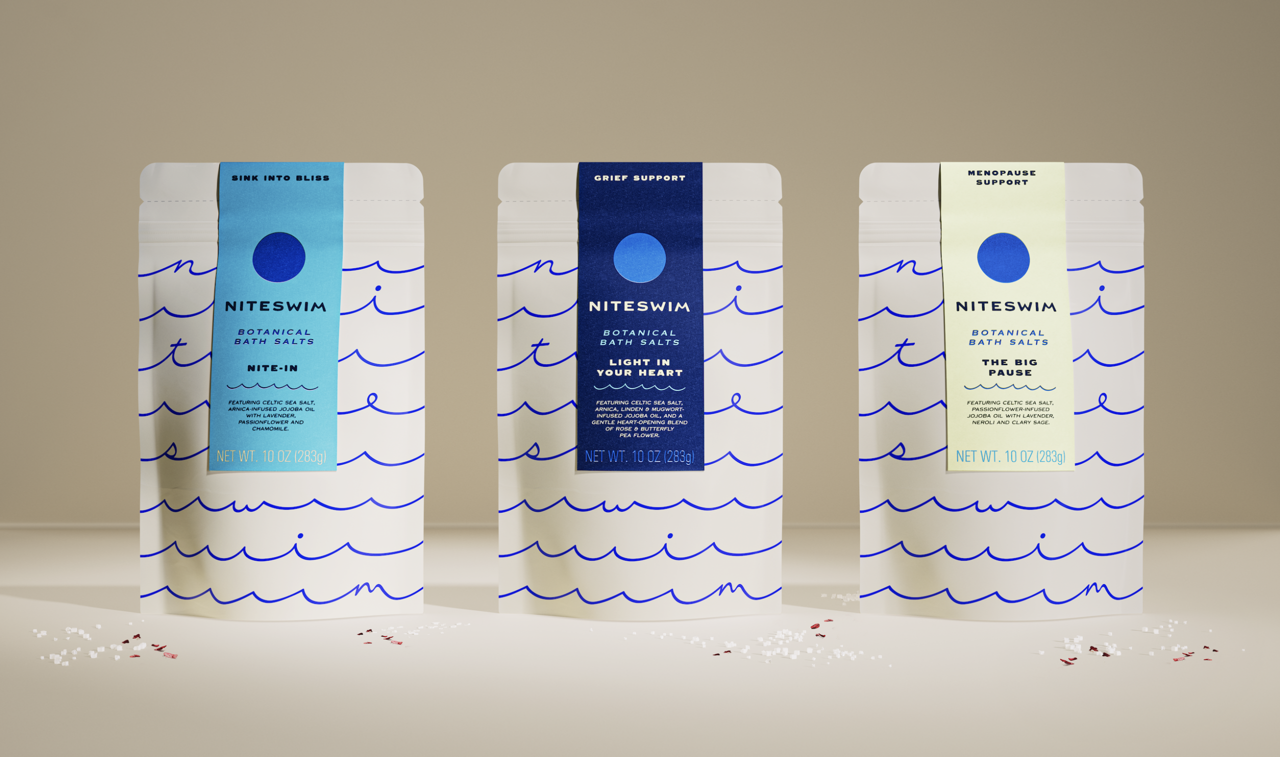
Sister Mary’s Packaging For Niteswim Makes Waves After Dark
By
Published
Filed under

Published
Filed under

Sister Mary treats Niteswim’s packaging as a quiet nighttime ritual rather than just another bath product. The deep navy surface reads like open water after dark, punctuated by electric blue circles that nod to moonlight and tidal timing.
Hand-drawn wave lines move rhythmically across the pack, suggesting immersion and repetition but with an approachable edge. Where competitors chase softness and scent-inspired cues, Niteswim builds a graphic narrative around night, water, and intentional pause.
Emily Cristoforis, Head of Strategy at Sister Mary, shares more about the design process below.
Add project credits with Dieline PRO | Log in
Get unlimited access to latest industry news, 27,000+ articles and case studies.
Have an account? Sign in
To provide the best experiences, we and our partners use technologies like cookies to store and/or access device information. Consenting to these technologies will allow us and our partners to process personal data such as browsing behavior or unique IDs on this site and show (non-) personalized ads. Not consenting or withdrawing consent, may adversely affect certain features and functions.
Click below to consent to the above or make granular choices. Your choices will be applied to this site only. You can change your settings at any time, including withdrawing your consent, by using the toggles on the Cookie Policy, or by clicking on the manage consent button at the bottom of the screen.