In 1954, Rabbi Moshe Feinstein ruled that observant Jews in the US could drink regular milk, yet plenty of families still pay more for Cholov Yisroel, dairy supervised from the moment of milking.
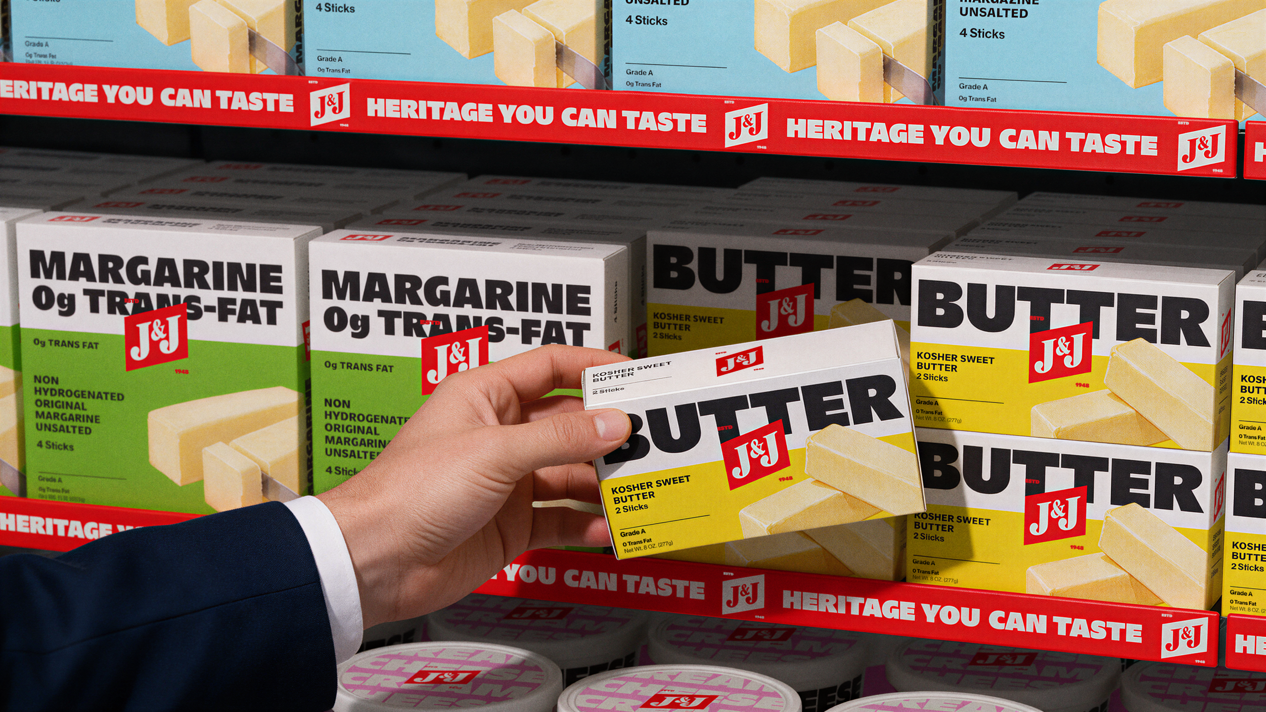
J&J Dairy has served those homes since 1948, but its packaging had started to fade on the shelf. So M/OTG went digging through the archives and found an old flag on J&J’s early packaging. The studio decided to plant it dead-center on every pack, a red flag with white serif J&J lettering layered over giant black product names. “Cottage Cheese” and “Butter” stretch so wide they barely fit, making them impossible to miss.
I love how confident this redesign is. As Chief Brand Officer Yaniv Vaknin put it, the easy move would have been to shrink everything back down to something “acceptable.” Instead, the flag and the type are bold. One tells you it’s J&J, and the other tells you what’s inside. Often, the best ideas are often already sitting in a brand’s own history, waiting for someone brave enough to make them bigger and better.