Popchips Unveils Bold New Packaging and Launches Drool-Worthy Flavors
By
Published
Filed under
By
Published
Filed under
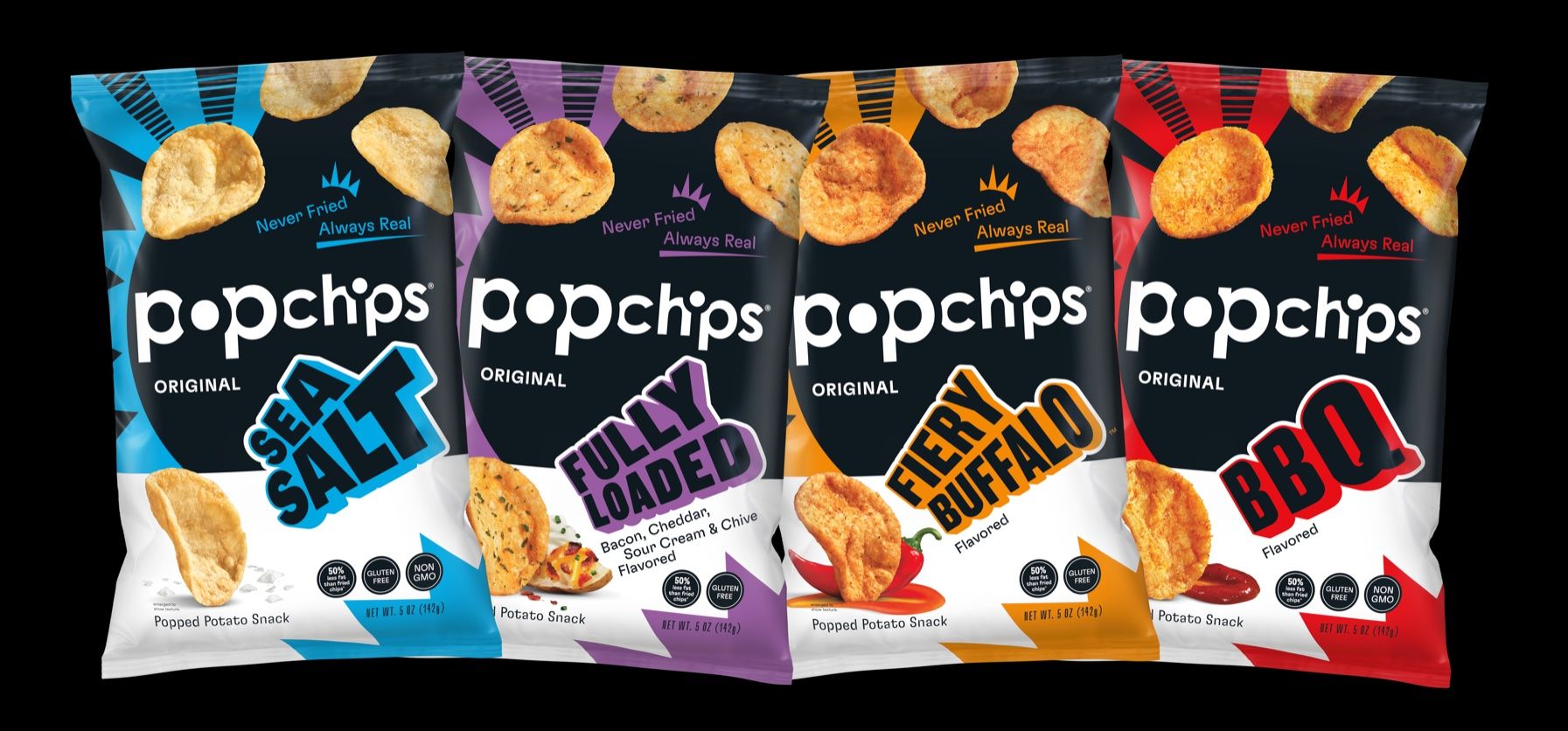
Popchips recently unveiled its new packaging design, created by Hatch Design, in tandem with new flavor releases. The new branding and packaging system play on the brand’s bold association, and the loud and proud graphics make a fearless impact. The popped, not fried, potato chips are distinct on their own, but when paired with packaging that also pops, you have yourself a brand that quickly and intensely differentiates itself.
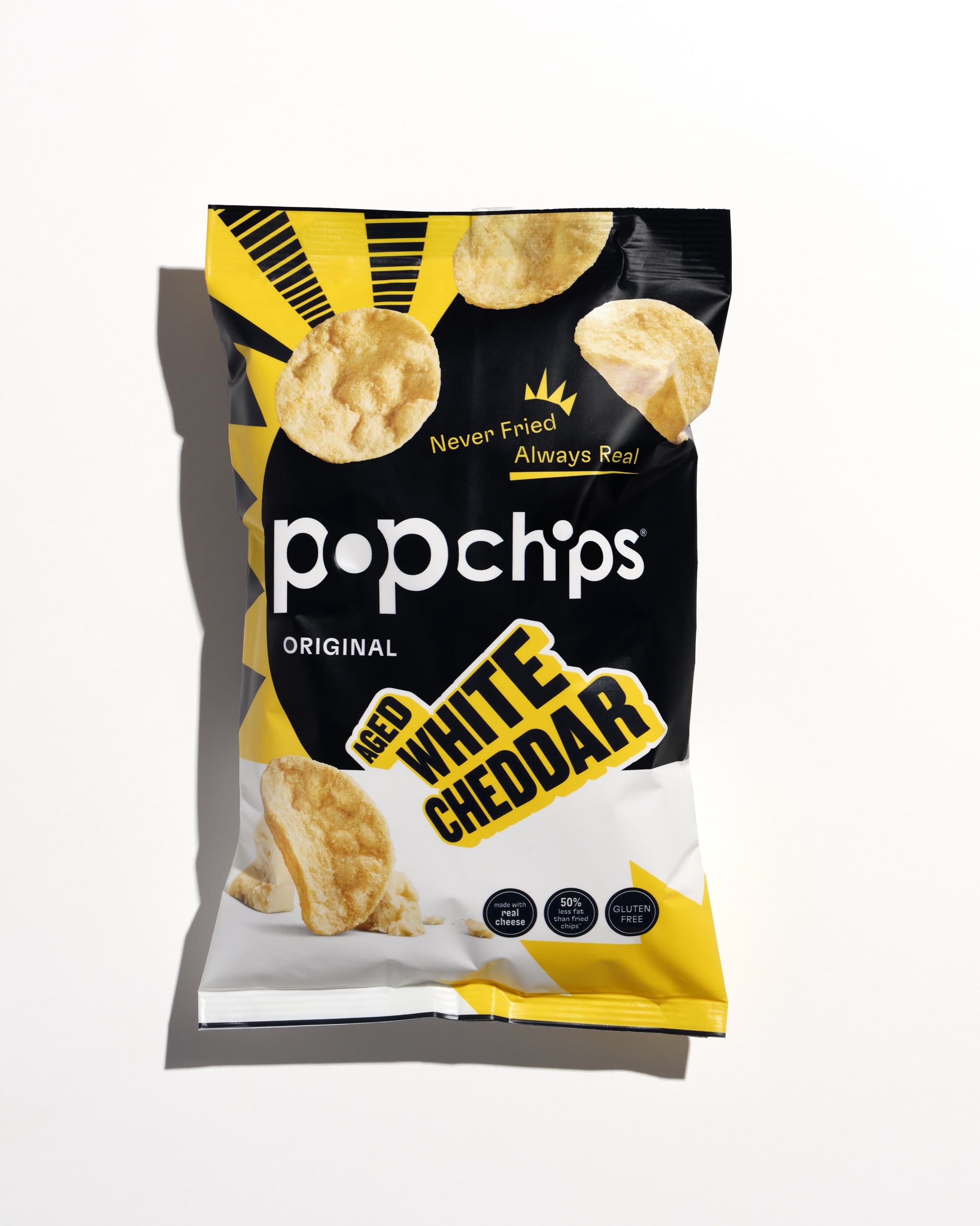
Popchips, the better-for-you salty snack brand known for its popped, never fried potato chips, today announces a complete brand overhaul with a reimagined visual identity and the debut of two new delicious flavors. After conducting in-depth market research to redefine its brand strategy, Popchips has revitalized its distinct package design. The two new innovations, Fiery Buffalo and Fully Loaded, serve as an answer to consumer demand for salty snacks that don’t compromise on taste, because better-for-you doesn’t have to mean boring.“We started with exploring what matters most to the consumer and worked backwards to strengthen our brand strategy,” said Michael Campi, Vice President of Marketing for Velocity Snack Brands, the parent company of Popchips. “We know Popchips buyers have a loud and proud love for snacking and won’t sacrifice on flavor, so we made that energy a common thread throughout the visual identity.”
Get unlimited access to latest industry news, 27,000+ articles and case studies.
Have an account? Sign in