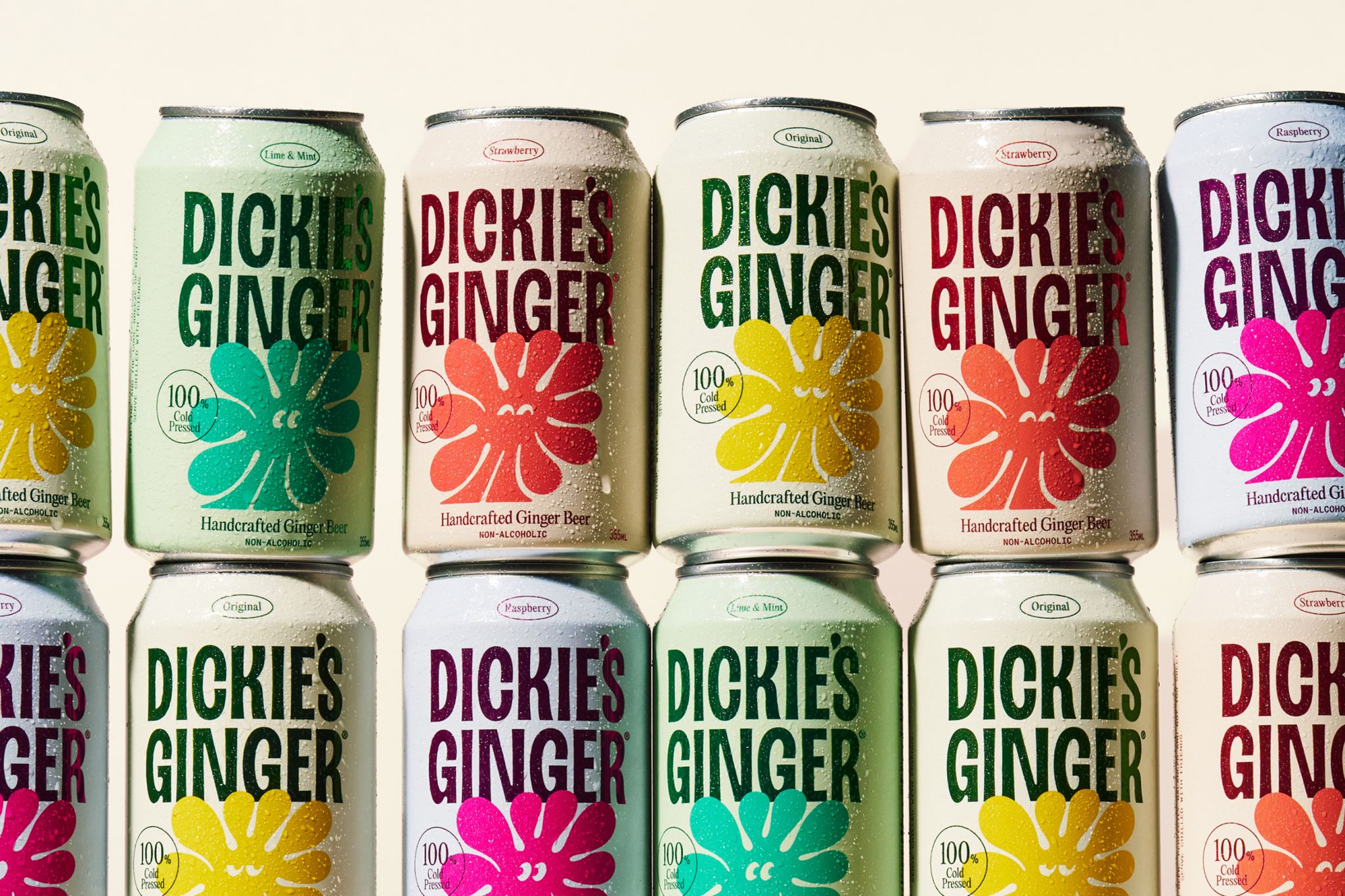
You’d be wrong if your first thought is that this is a daisy. Dickie’s Ginger, designed by Pendo, builds its identity around a cast of abstract characters hand-cut from actual ginger root, scanned and traced into a flexible illustration system. The look takes inspiration from DIY creative culture with expressive typography and bold illustration that keep the brand feeling handmade.
The color play leans into soft pistachio, lavender, blush, and cream backgrounds, letting saturated, flavor-coded blooms and lettering pop: Lime and Mint go teal, Raspberry goes hot magenta, and Strawberry runs warm coral. The towering condensed logo is loud and a little scrappy in the best way, while tiny oval flavor badges and monospaced details keep everything organized.
Peter Ladd, creative director and co-founder of Pendo, dives into the strategy behind the design below.


















