Energy drinks are finally chilling out and trading flames and lightning bolts for softer design cues.
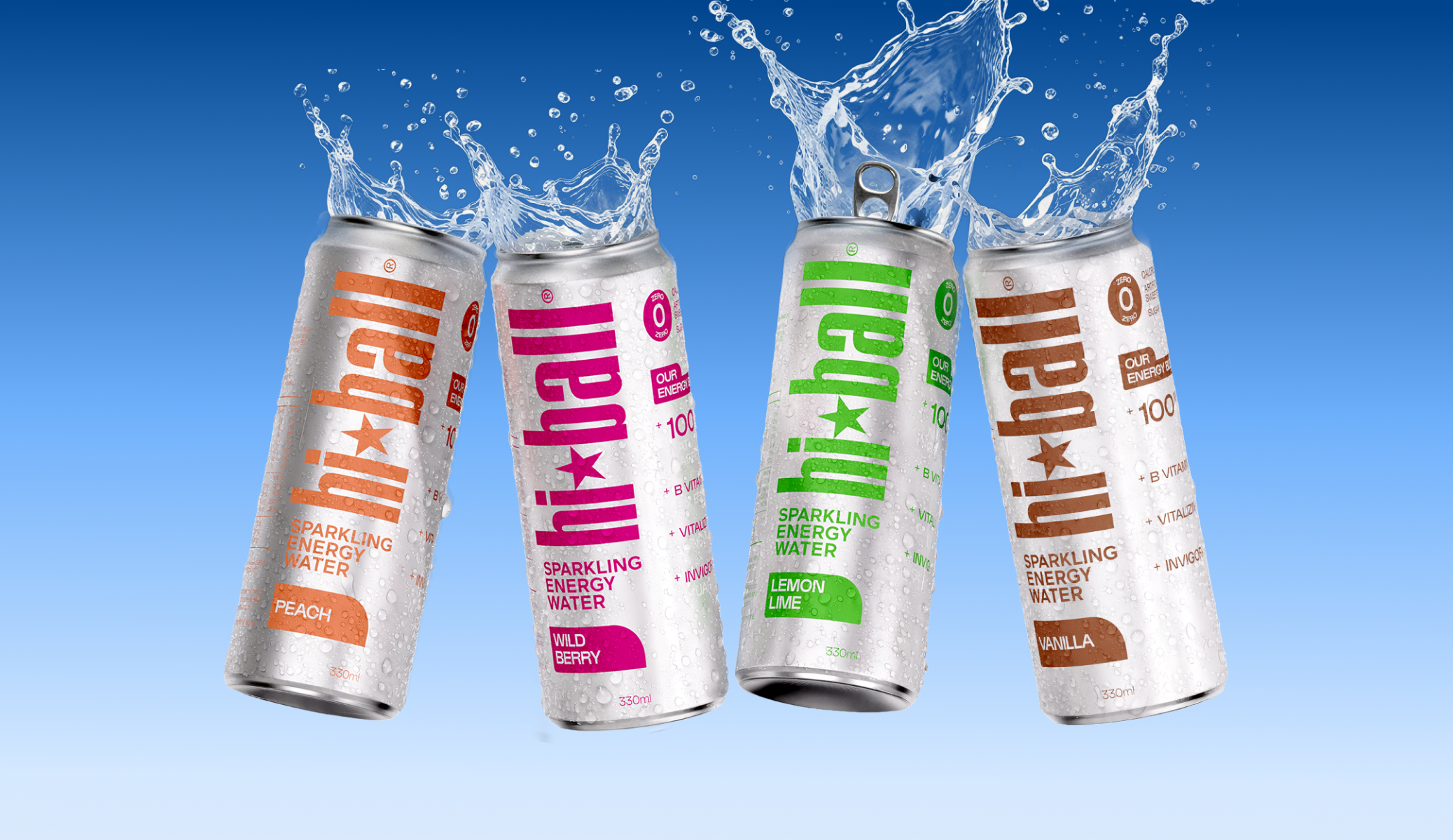
Hi*Ball’s UK debut, redesigned by Founders Makers, rides that wave with confidence. The original American can leaned so hard into bold graphics and a stark white finish that testing showed people mistaking it for craft beer, so the redesign strips things back to a raw brushed aluminum surface.
Each flavor gets its own punchy color block instead of an illustration, and the typography leans industrial, giving it a scrappy, athletic energy that feels more gym bag than nightclub. The in-between positioning, refreshment first, energy second, is where the category is heading as brands move away from over-caffeinated branding and toward something a little more everyday. Hi*Ball is leading the charge.