I find kids’ snack packaging such an interesting space. Designing something that’s craveable to kids while simultaneously signaling to parents that the brand is better for you or a good choice for their kids is not simple.
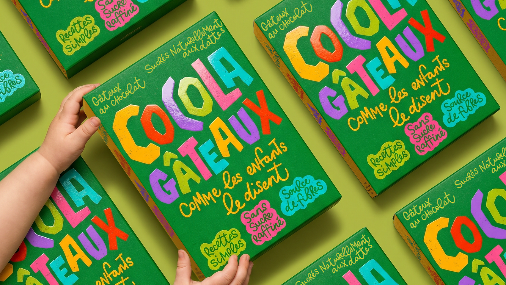
Designer Gulya Gomez built the concept brand Cocola Gâteaux around a toddler’s mispronunciation of “chocolat,” and that spark of imagination shows up everywhere on the box. The letters themselves are the illustration, oversized and hand-cut looking, each one a different shade of citrus yellow, cherry red, lavender, lime, hot pink, and turquoise, arranged like a stack of building blocks a kid just knocked over. That palette pulls straight from picture book covers, the kind with thick outlines and slightly wobbly edges that feel drawn by hand. Supporting claims like “sans sucre raffiné” get tucked into scalloped speech bubble shapes so even the nutrition facts read like part of the story.
Most healthy kids’ snacks still lead with what’s missing, but this one leads with pure delight and lets the good stuff follow quietly behind it.