One thing that irks me is when a brand works too hard to look and feel like a heritage brand when they’re not.
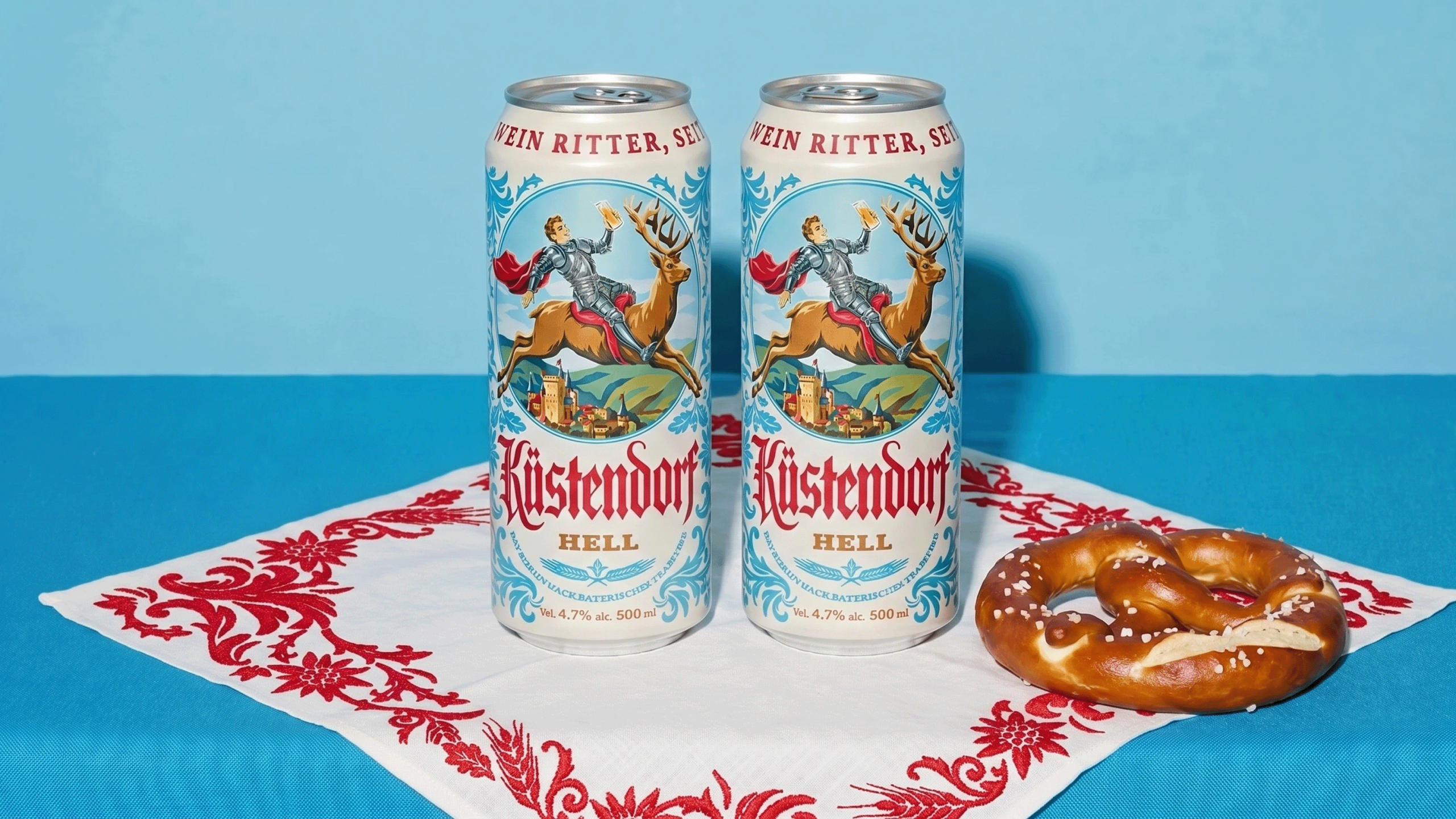
However, Kustendorf, designed by 2sharp, cracked the code on it without feeling like a cliché costume. The palette is pale and clear throughout, all soft blues and creamy whites, which mirrors the lightness of the beer within. The central illustration of a knight riding a stag, glass raised with a smirk while the animal looks mildly annoyed, pulls from old Bavarian print posters and heraldic crests, the kind you’d find tucked in a village tavern. The blackletter wordmark and dense ornamental borders give off a sense of craft.
Nothing about this design is trying too hard, but there’s still so much character and wit that it creates a packaging system full of charm.