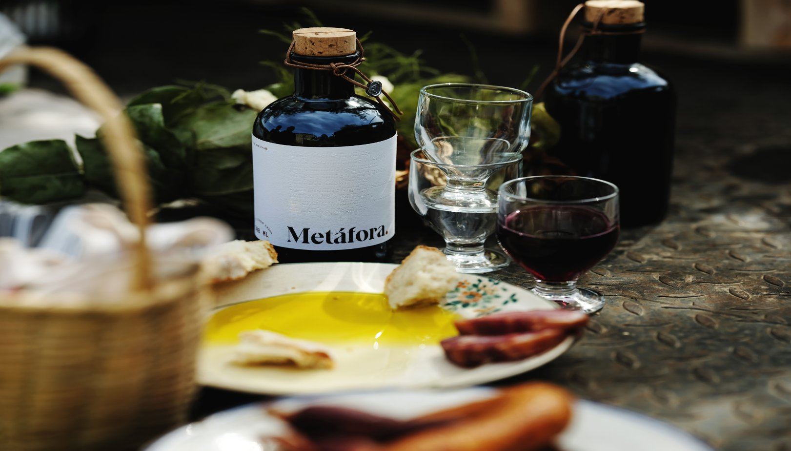
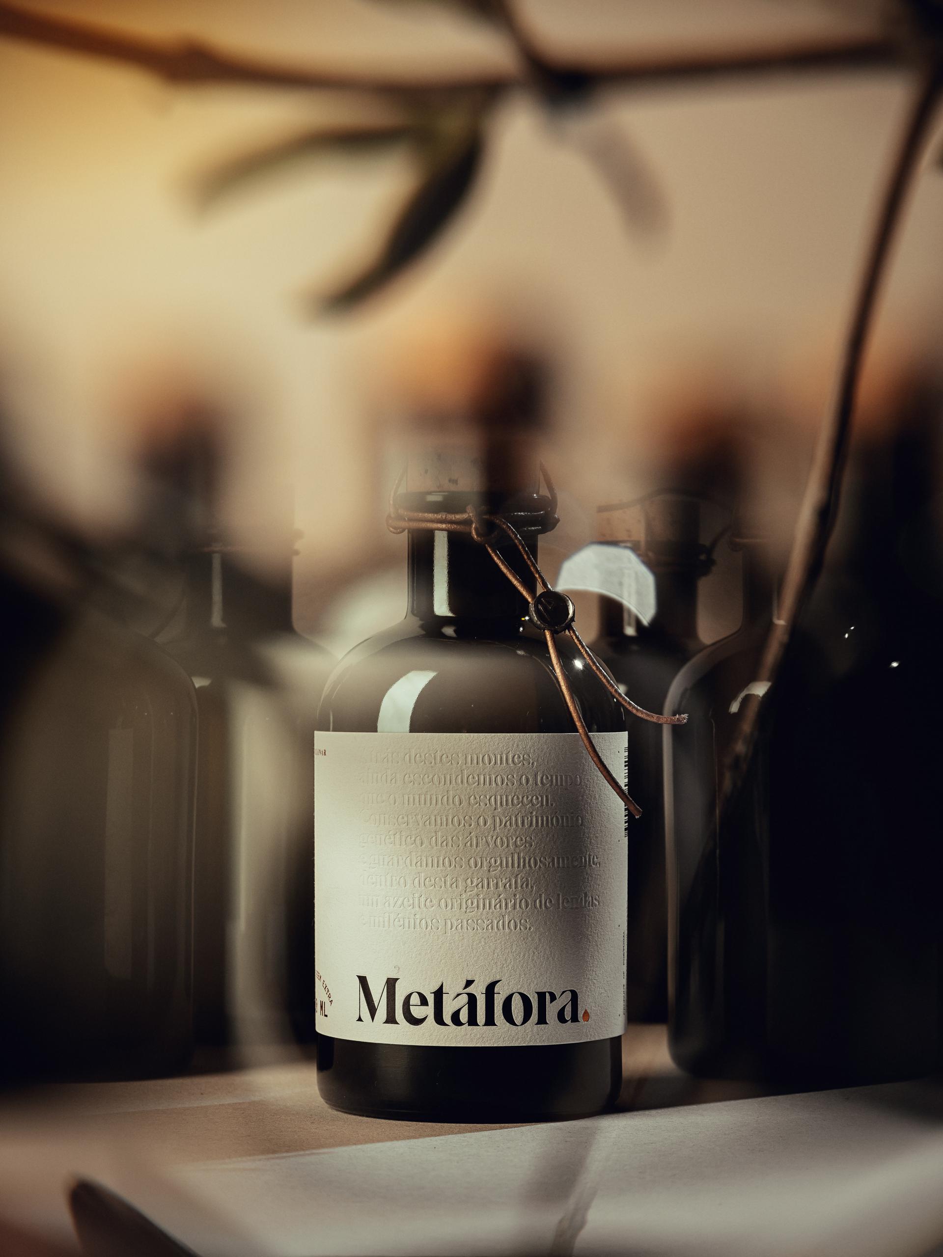
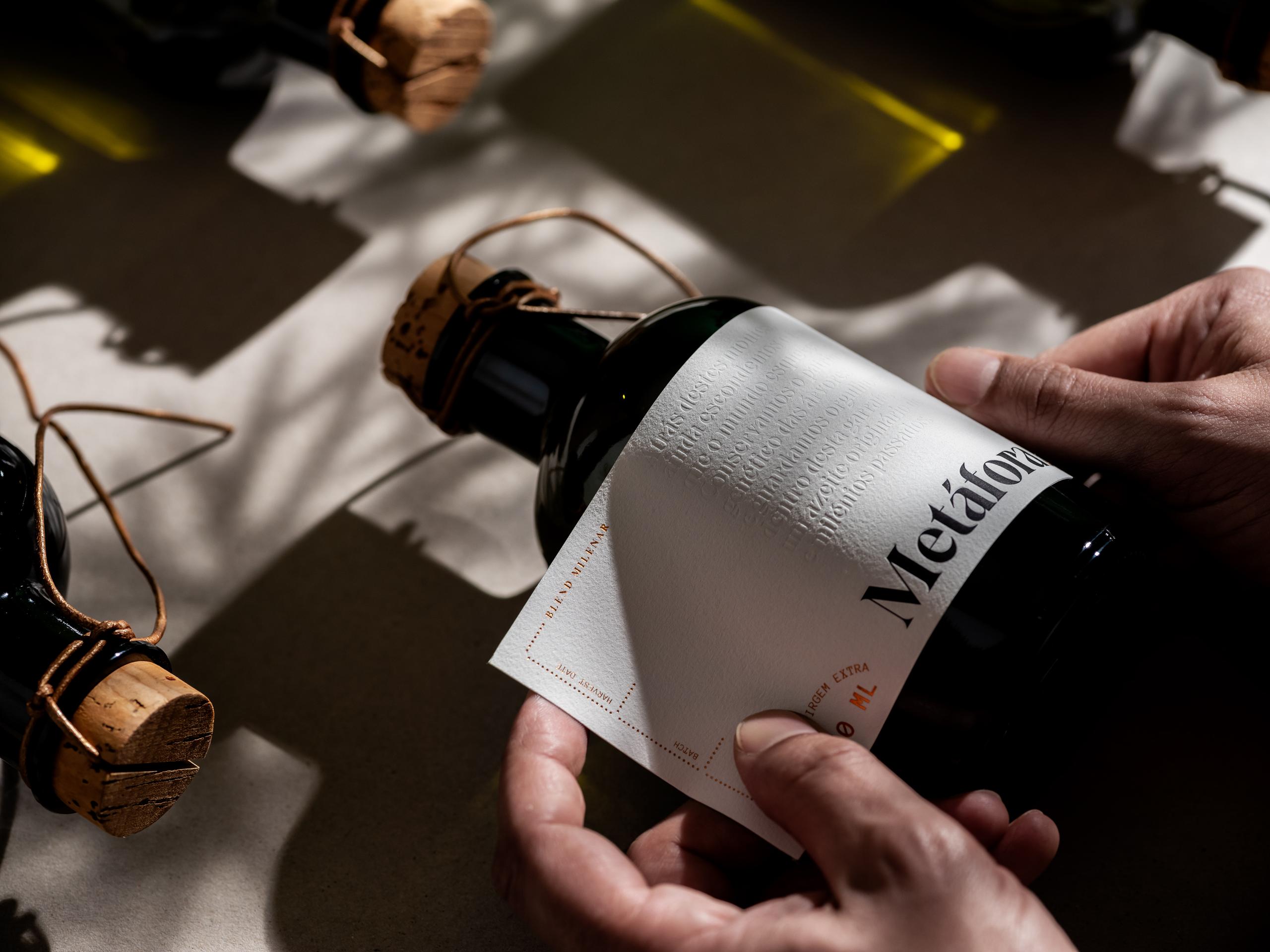
Pacifica worked to craft Metáfora’s design with olive oil and its respective translucent state in mind. According to Pacifica “The minimal graphical approach connects the purity of the product and respective artisanal environment, with the premium features intend to be communicated. The complementarity between charismatic and serifed typography, historically intertwined with the written word, and a monospaced “typewriter-like” typography”

















