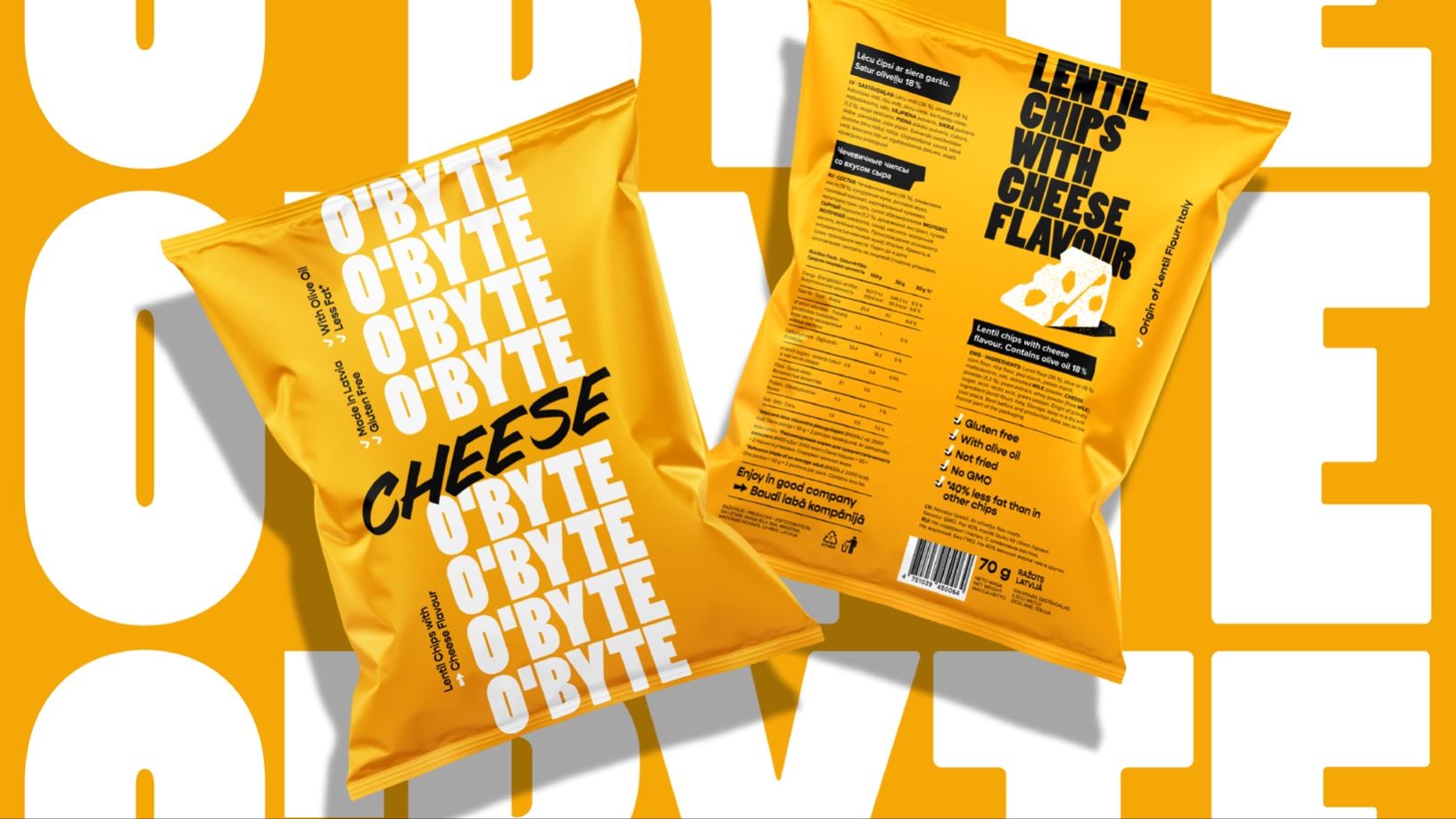
Asketic Design Studio created a stunning, typographic-based packaging design system for O’Byte. The bold, memorable logotype paired with bright hues makes an impressive system that goes against the classic chip bag design format. The strong visuals immediately impact consumers, creating a moment of recognition and a strong potential for future brand recognition.

The inspiration behind the brand’s visual identity is the dynamic rhythm of the city and finding a moment of rest in between. A brave, fun & eye-catching design for a range of crisps for an audience that wants to turn their snacking into an enjoyable guilt-free moment of joy. The aim of the project was to create a design with dynamic & fearless visual language that avoids traditional product category cliches. Using bold, attention-grabbing logo type-treatment, vividly joyful colors, and confident copy texts, O’BYTE gives you a visual punch that is really hard to ignore on the shelf.

















