Mesobis’ Packaging Sits At The Intersection Of Brutalist Art And Modern Design
By
Published
Filed under
By
Published
Filed under
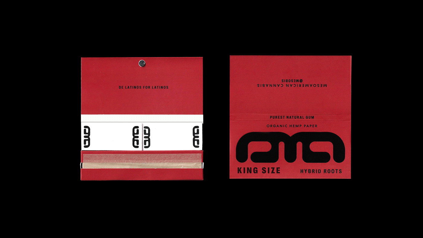
Inspired by the brutalist art movement, Mesobis’ packaging design takes a minimalist, structural technique. Designed by Andres Higueros, it’s wonderful to see how 1950s architectural style converges with a modern, fluid approach. Plus, who doesn’t love packaging with vivid colors paired with an edgy black and bold typeface?

Mesobis is a growing community of cannabis-loving creatives on a collective mission to bridge cultures throughout space & time/life & death. The branding developed is inspired by the brutalist art and monuments present throughout Latin America through the pyramids of the different civilizations. Every detail tells a story and connects us with their sacred roots and their powerful story. The logotype and icon design is the result of combining the sacred inspiration from the Mayan symbols with a futurist touch.
Get unlimited access to latest industry news, 27,000+ articles and case studies.
Have an account? Sign in