Keey Studio Turns Graper’s Bottles Into Collectible Works of Art
By
Published
Filed under

By
Published
Filed under
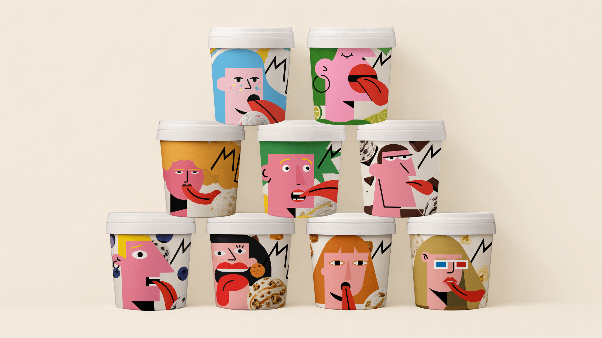
Graper’s packaging by Keey Studio doesn’t play it safe, and that’s the point. The flat, flask-style bottle already sets it apart on the shelf, but it’s the label art that pulls you in. The punchy color stories are paired with geometric, cubist illustrations that match each flavor profile.
Thanks to the bold type and expressive face graphics, each bottle becomes its own character, blending wine cues with pop-art energy. It’s artistic and sculptural, while the abstract spirits make you question whether or not you’ve had too much to drink or have just found an appreciation for the abstract.
Designer Phan Quốc Cường shares more of the process behind the design below.
Get unlimited access to latest industry news, 27,000+ articles and case studies.
Have an account? Sign in